The network for creativity
Join 1.25M professional creatives like you
Connect with clients, get discovered, and run your business 100% commission-free
Creatives on Contra have earned over $150M and we are just getting started
Back to feedPost
Taste Test
Two themes. One portfolio system.
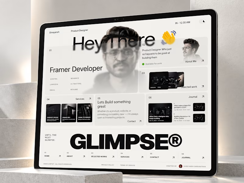
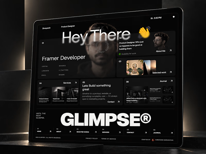
Glimpse® works in both Light and Dark, while keeping the same layout, content structure and interactions underneath.
If you were building your portfolio today, which one are you choosing?
And if you're curious enough to try it yourself → Glimpse is live.

2 voted
100%
0 voted
0%
2 votes
Closed

Holding one layout, content structure, and interaction set under both themes is the real craft here. Dark lets the cards sit quieter while light keeps the type airy, and it still reads as one portfolio.

Maintaining Consistency across both the themes was one of the main goals.

Ui was so amazing. Dark Mode is feels so good.
Glad You liked it.😊

Dark gets my vote here. The project thumbnails stand out nicely, and the oversized type gives it plenty of personality.
Appreciate it! 🙌 I was aiming for that balance between personality and letting the work breathe. Glad the dark version resonated with you!

The network for creativity
Join 1.25M professional creatives like you
Connect with clients, get discovered, and run your business 100% commission-free
Creatives on Contra have earned over $150M and we are just getting started





Related posts

Which one brings more clarity to the hero section?
I was exploring a hero section concept for an AI product and tried two different visual directions.
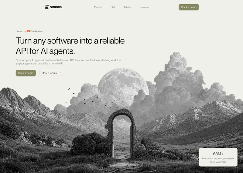
Visual-led — focuses on explaining the idea through the interface/visual.
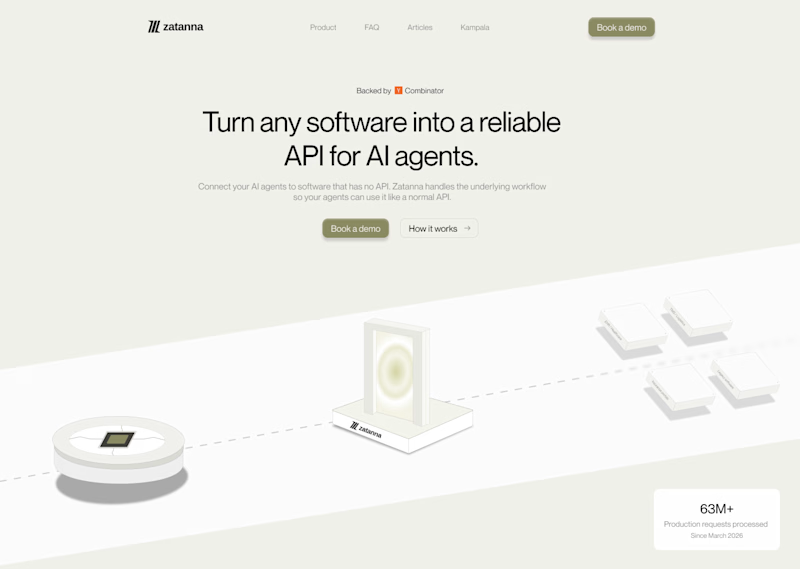
Isometric — uses a visual system to represent how the product works.
Both look good, but the real question isn't which one looks better.
Which one helps you understand the product faster?
That's something I always try to think about when designing hero sections — the visual should help explain the product, not just make the page look good.
Which one would you choose?
7 voted
58%
5 voted
42%
12 votes
Closed

The visual direction looks great, but I think Isometric does a better job of explaining the product.


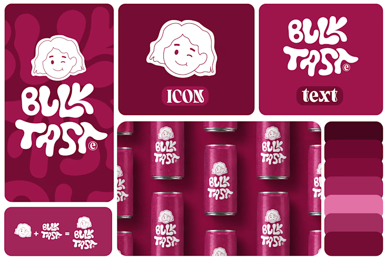
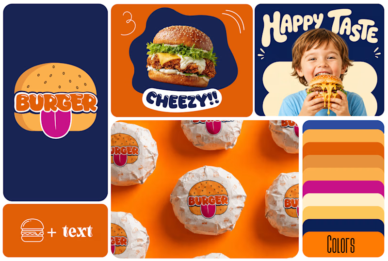
Which One Brand Identity Is looing good? A or B..
7 voted
50%
7 voted
50%
14 votes
Closed
Both look good, but I’d go with B. The colors and playful visuals feel more energetic. 🔥

Solene: skincare e commerce website, built in Framer
Skincare shopping should feel as good as the routine itself. For Solene, I designed and built a full online store with a soft, warm identity: a bold maroon and pink palette, big expressive type and real-skin photography.
What's inside:
A hero that sets the brand tone straight away
A Bestsellers section for quick browsing
Category pages for Cleanse, Hydrate and Protect
A shop page with price slider, filters, sorting and hover image previews
An Our Story page with brand values
A clean, confident footer
Need a website for your beauty or lifestyle brand? Let's talk.


The hover image previews on the shop page caught my eye - they let shoppers sense texture instantly without an extra click.