The network for creativity
Join 1.25M professional creatives like you
Connect with clients, get discovered, and run your business 100% commission-free
Creatives on Contra have earned over $150M and we are just getting started
Back to feedPost
Taste Test
Tweaking the hero section designs for an AI translation startup. Going off of the post I made a few weeks ago, I added some motion and detail to the existing designs.
Which style do you think looks best?
22 voted
50%
22 voted
50%
44 votes
Closed
I’d go Gradient. Cleaner separation between background and copy
Thanks Razvan!
Big fan of the dithered motion but both are great!
Thanks man! Leaning towards the dithered as well
The dithered feels more relative
Yeah I think so too!
Love the added motion David! The dithered option with the gradient mesh texture gives it such a unique, tech-forward aesthetic. The gradient is beautiful but feels a bit more conventional. For an AI translation product, I'd go dithered - it stands out.
Great insight Stephanie! Thanks I do agree it stands out more and feels more fresh
I love Gradient
Thanks Adonis!
I like both, but I preferer the second one
Nice, im all about the use of pixels or retro gradients
The retro gradient/pixel wave is huge right now
Gradient one looks cooler to me
Thanks Rishi!
For me! its gradient
Thanks Khunsa!
Ooo these both look clean, but the gradient one feels super smooth and polished. The vibe is kinda futuristic in a low-key confident way, really nice work. 👌
Thanks! I love that insight haha, I am leaning towards the gradient also. I feel it just fits better with an audio translation site than the pixelated wave
Awesome Work
Thanks!
Love them both, but the subtleness of the dither has won me over
Good choice!
i like dithered more! For some reason the gradient seem so to have hard lines and prefer a smoother effect.
That makes sense!
The network for creativity
Join 1.25M professional creatives like you
Connect with clients, get discovered, and run your business 100% commission-free
Creatives on Contra have earned over $150M and we are just getting started
Related posts
Just wrapped up a custom website project in Framer for my client!
Focused on creating a clean, modern, and responsive experience that looks great across all devices. From layout design to smooth interactions and performance optimization, every detail was crafted to help the brand stand out online.
1 Built with Framer
2 Fully responsive design
3 Fast-loading pages
4 Modern UI/UX
5 Easy-to-manage structure
Always excited to help businesses turn their ideas into high-converting websites.
#Framer #WebDesign #WebsiteDevelopment #UIUX #FreelanceDesigner #ContraCreator #ResponsiveDesign #NoCode
nice
Launch your website in a week.
> Limited spots
> Designed & developed in Framer
> Up to 5 pages
> Fix 6000$ cost
> Fixed price: $6,000
Nice 👍
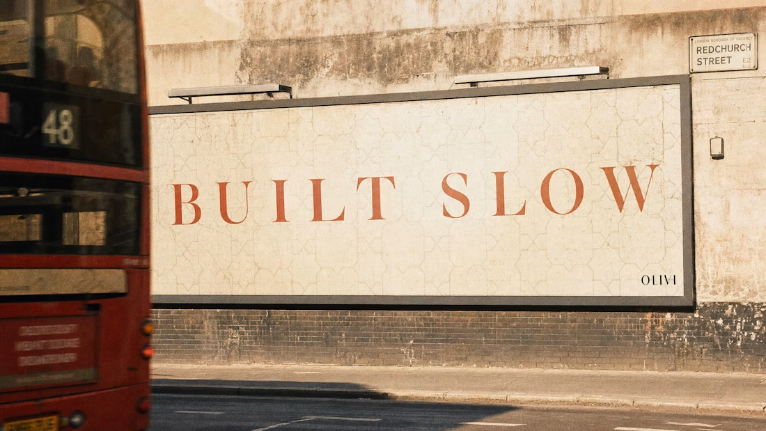
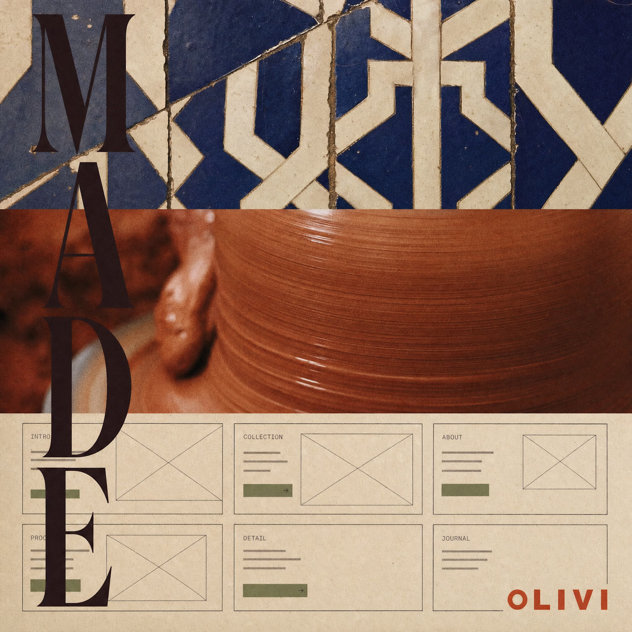
Started with a brief.
Ended somewhere I didn't plan. This is what happens when you give a brand full chaos mode: Mediterranean tile geometry, risograph print, a ghost billboard on Redchurch Street, and a linen overshirt nobody asked for.
OLIVI is becoming something. Case study incoming.
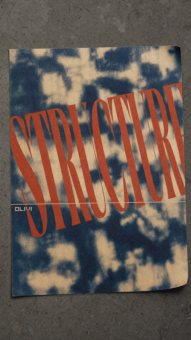
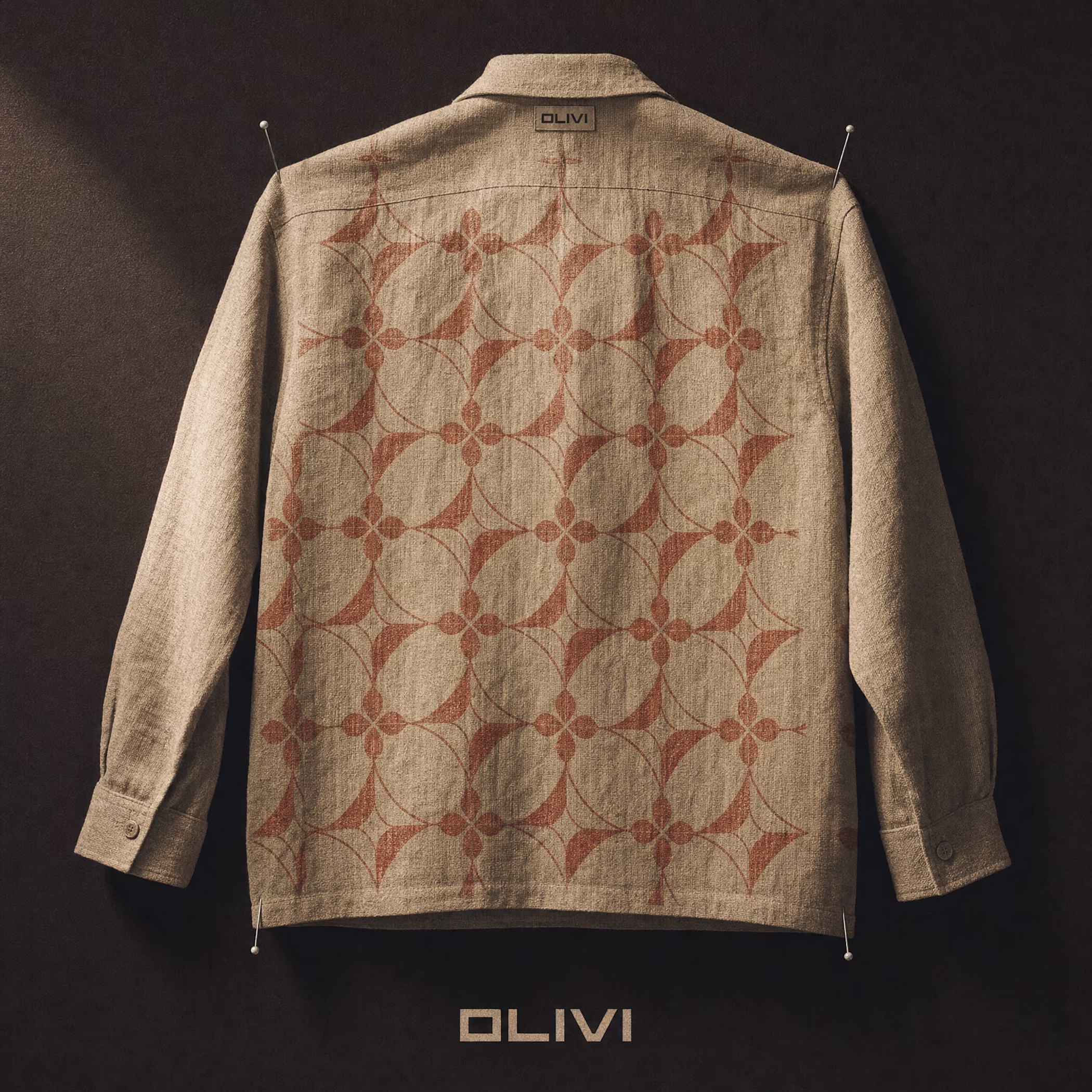
The pattern of on the cloth remind me with "batik" pattern. Are you guys live in somewhere in indonesia or Malaysia?
Trending
Claude
Claude has entered the design space. How are you using Claude Design?
Contra University
Learn from expert creatives how to earn more using next-gen AI tools.
MagicPath
The canvas is infinite, and exploration is becoming the workflow. How are you using MagicPath?
creativeaiflow
Creative AI workflows are evolving. What tools do you use, and what are their strengths and weaknesses?
freelancerlife
Freelancer life is wins, pivots, and everything in between. What’s yours right now?