The network for creativity
Join 1.25M professional creatives like you
Connect with clients, get discovered, and run your business 100% commission-free
Creatives on Contra have earned over $150M and we are just getting started
Back to feedPost
Taste Test

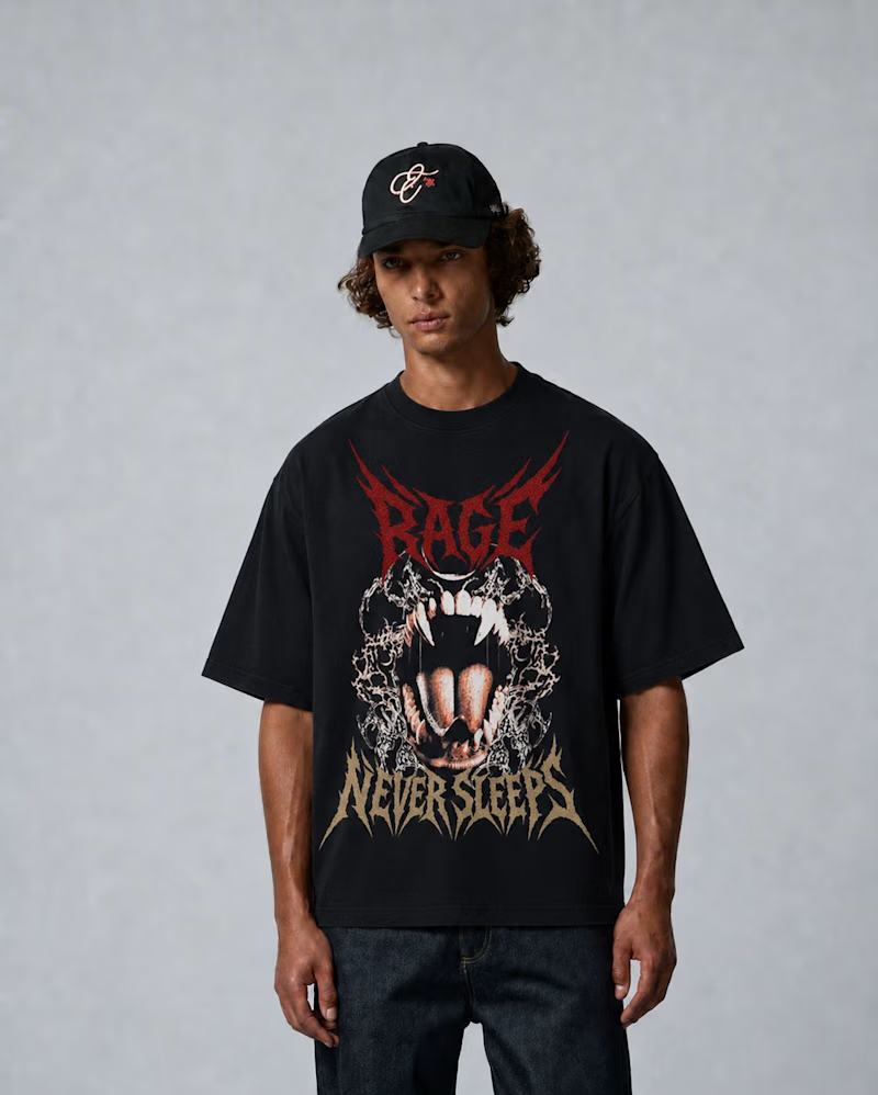
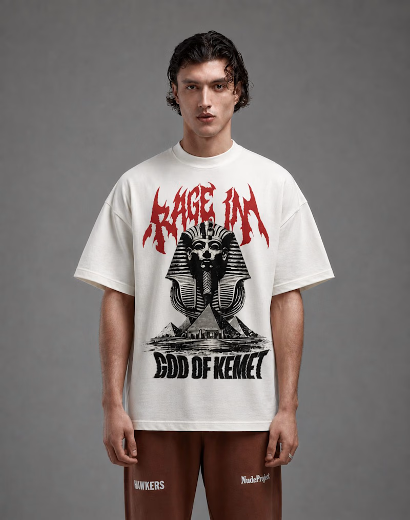
Designing merch concepts for a brand built around the theme “RAGE.”
Two different directions:
A — aggressive streetwear energy
B — mythological/editorial-inspired aesthetic
Still developing the collection, but wanted to share part of the creative process.
Which direction feels stronger? A or B?
#merchdesign
0 voted
1%
0 voted
1%
0 votes
Closed
The network for creativity
Join 1.25M professional creatives like you
Connect with clients, get discovered, and run your business 100% commission-free
Creatives on Contra have earned over $150M and we are just getting started











Related posts

Website design for Atelier Monolit, an architecture visualization studio.
In this design, the typography, the spacing, and the images are the main protagonists. In times of AI and speed, I believe it’s very important to take the time to think and create what we truly want, and not just what’s trending. In my case, I wanted a minimalist and editorial layout, and that’s not something easy to achieve with just a couple of prompts.


The pale blue canvas, tiny nav and generous empty space let the concrete render carry the page. Very calm, very architectural, and the small body copy sits tidy beside it.

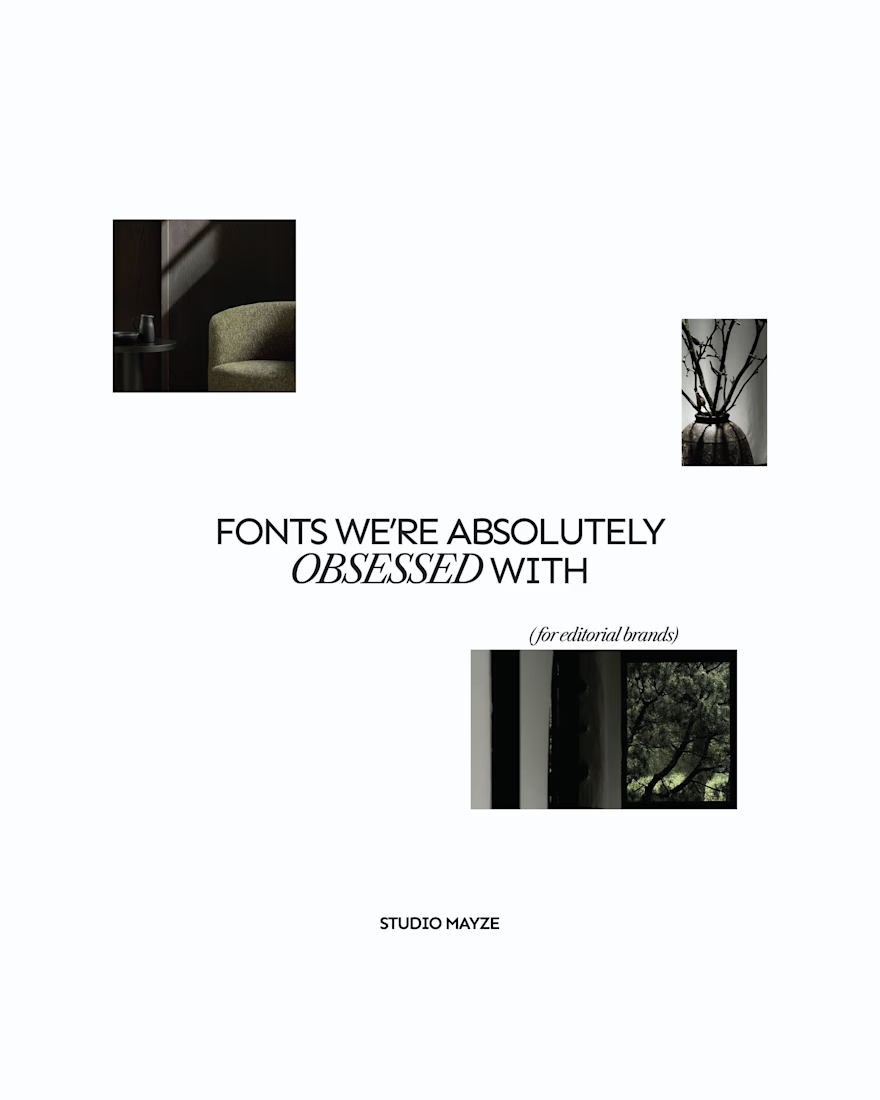
A few editorial typefaces we’re absolutely obsessed with right now.
These are some of the fonts we keep coming back to at Studio Mayze when we want a brand to feel considered, distinctive and a little more editorial without pushing the design too far.
Good type can do a lot of the heavy lifting. The right one can completely change how a brand feels before you’ve even added anything else.
Each slide shows the typeface in use at the top, with the font name underneath, so you can see how it could look in context rather than just as a specimen.
These are three of our favourites at the moment. Want to see the full selection? We’ve shared all of our favourites over on Instagram.
Which one would you pick? 👀


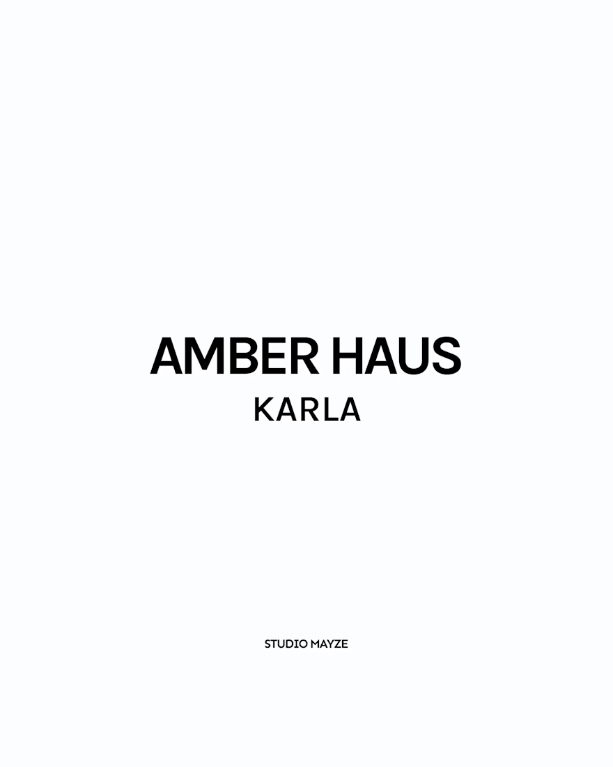
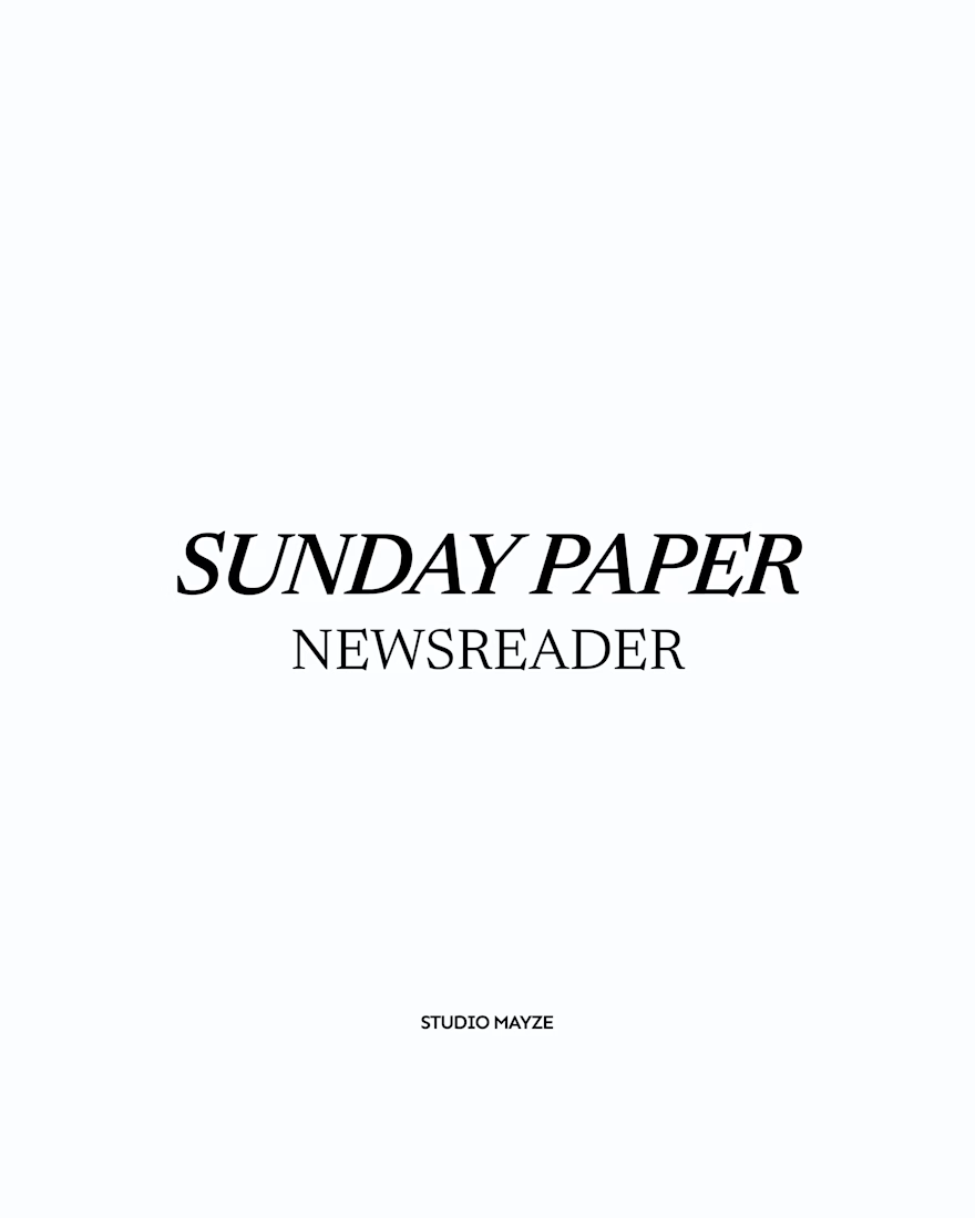
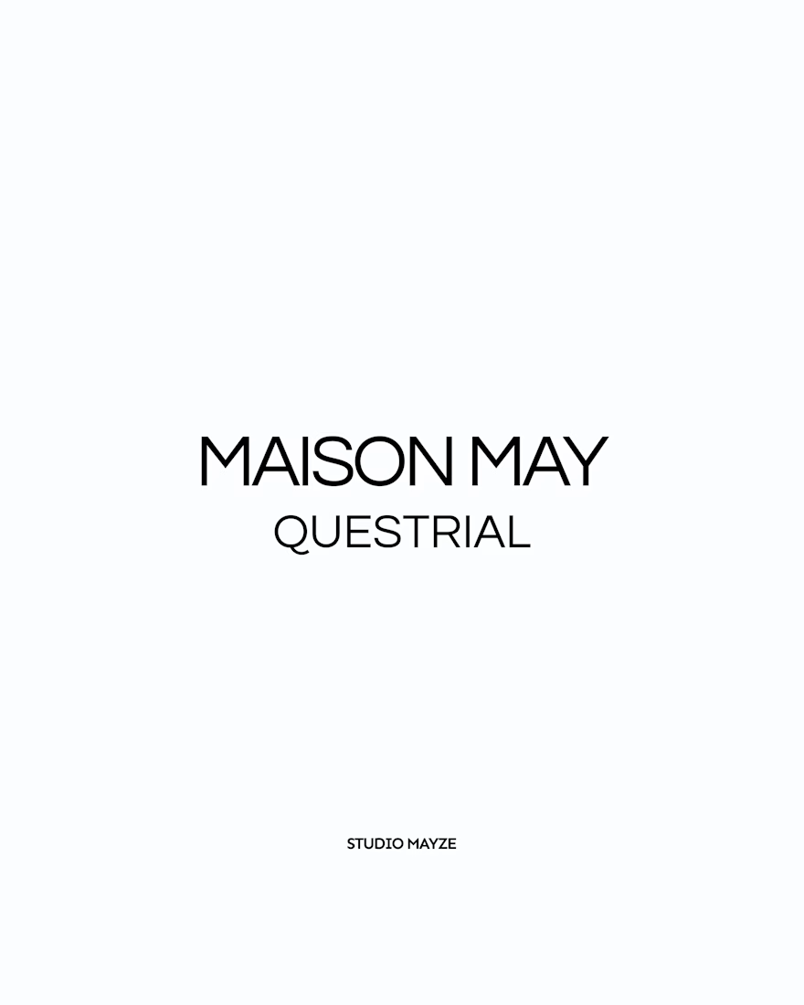

Showing each typeface in context rather than as a bare specimen is such a good idea, you can feel the mood before you even read the name. Sunday Paper in Newsreader is my pick, that slanted serif has real character. Do you tend to reach for one of these for the body of a brand, or are they mostly headline voices for you?

A hot take in branding: Should premium always play it safe?
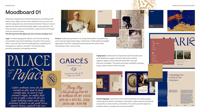
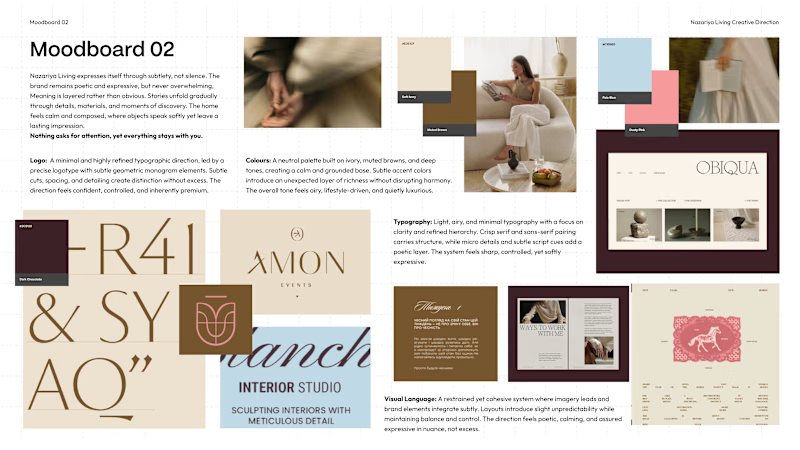
We recently explored two contrasting creative directions for a premium carpet and home décor brand based in Jaipur, India.
Moodboard 01: Challenges category conventions with a maximalist, editorial approach. Inspired by visual journals, printed matter and the stories objects carry.
Moodboard 02: Embraces familiar premium codes. Neutral colours, conventional logo forms and spacious layouts that let the products take centre stage.
Both serve a purpose, but the brand's core idea is “Stories Worth Keeping.”
Which direction would you remember for a brand that sells more than objects, but the stories behind them?
01 or 02?
6 voted
75%
2 voted
25%
8 votes
Closed


I’d pick Moodboard 01. It feels more distinctive and gives the brand a story people can remember.