The network for creativity
Join 1.25M professional creatives like you
Connect with clients, get discovered, and run your business 100% commission-free
Creatives on Contra have earned over $150M and we are just getting started
Back to feedPost
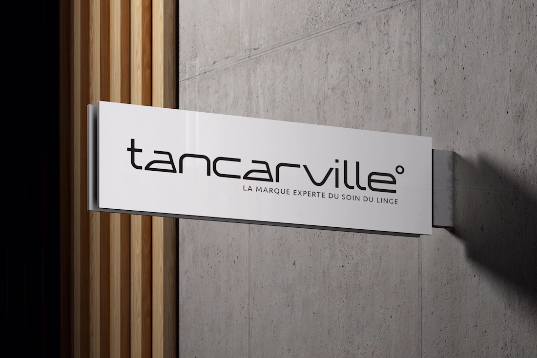
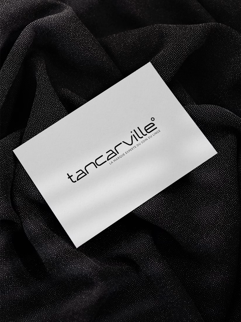
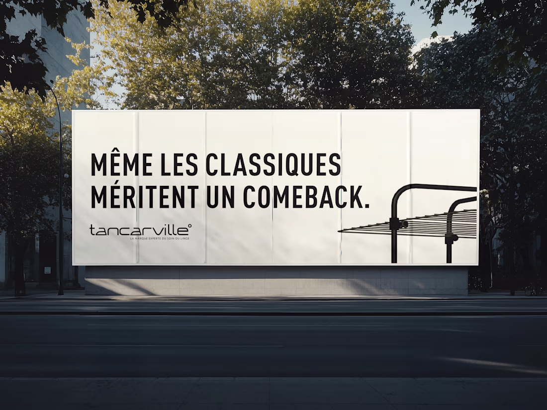
A new minimalist approach, thanks to a clean and modern sans-serif typeface, conveys an image of simplicity and sophistication. The two "a"s have been specially stylized to evoke an iron, a subtle nod to the world of laundry care, the heart of the brand's identity. This visual detail reinforces Tancarville's technical and expert aspect, while remaining true to the brand's DNA.
Finally, a small "bubble" has been added to the end of the word to recall the temperature symbol, a direct reference to the ideal temperature for laundry care and the precision that Tancarville embodies in its products. This graphic choice harmoniously completes the design, adding a modern touch while anchoring the logo in its world. A logo that is simple, evocative, and perfectly suited to Tancarville's image: a trusted brand, an expert in laundry care.
The network for creativity
Join 1.25M professional creatives like you
Connect with clients, get discovered, and run your business 100% commission-free
Creatives on Contra have earned over $150M and we are just getting started
Related posts
Lately I've recognized this direction on the rise and been inspired to create a collection of 18 images blending the Classical Art - Renaissance oil painting mastery with digital pixel/ASCII aesthetics, Classcii. It is a mix of centuries, a modernized and futuristic direction of the classic.
Each image is crafted around a specific tension, the classical figure or scene rendered in full oil mastery, while the digital/ASCII layer intrudes at a specific point.
Using the @Contra Labs ecosystem to choose the most adequate Ai models from the Creative Arena Leaderboard, I wanted to briefly share my personal taste and evaluation on the outputs these models generated, based on the benhchmark methodology.
For the imagery references I used Seedream 5 Lite and Google Nano Banana 2, whereas for the Image to Video I used Kling 3.0 and Veo 3.1 Fast.
In terms of Visual quality & aesthetics overall I would rank them fairly simillar with Seedream having a slight edge on the composition, specfically achieving more symmetrical outcomes featuring center alignment and a better use of whitespace, opposed to Nano Banana 2 where the use of rule of thirds is more prominent, making it visually in comparison less balanced.
Considering the Prompt adherence & accuracy, I find both models very much aligned, having Nano Banana 2 more intensified use of asscii / pixels across all outcomes, which according to my minimal taste I would rank this a weakness rather than a strong side.
Finally, in terms of Motion Realism I would unanimously rank Kling 3.0 as the better option here, considering the fluidness and physics consistency among majority of the elements in the reference. Additional advantage will be the ability to perform better at no prompt insertion compared to Veo 3.1 fast.
You can download the collection here.
Super work
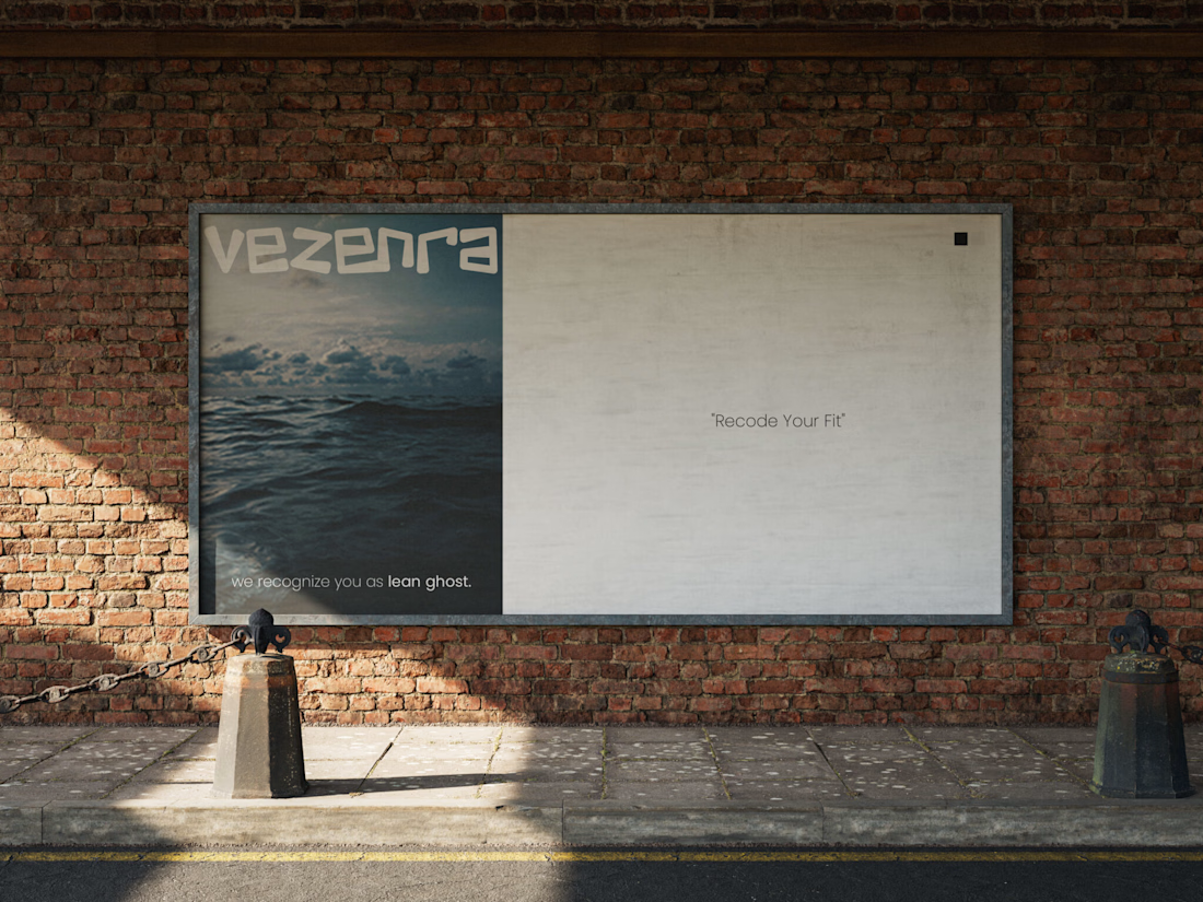
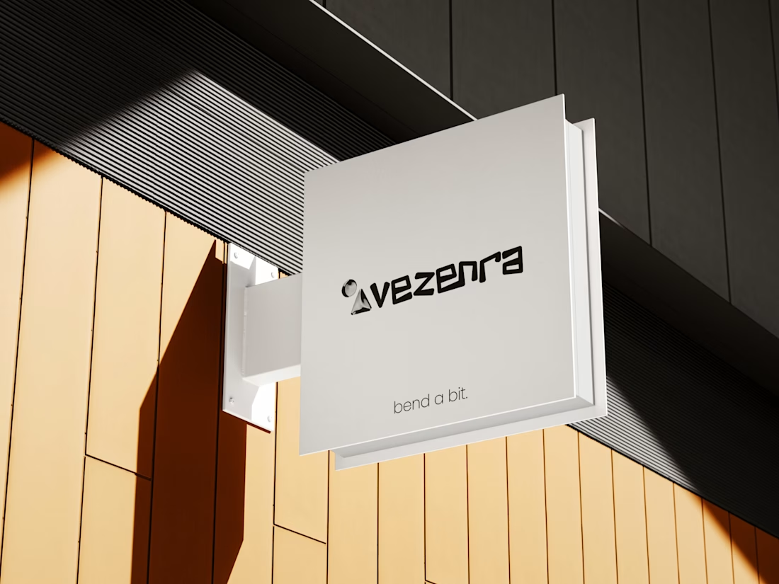
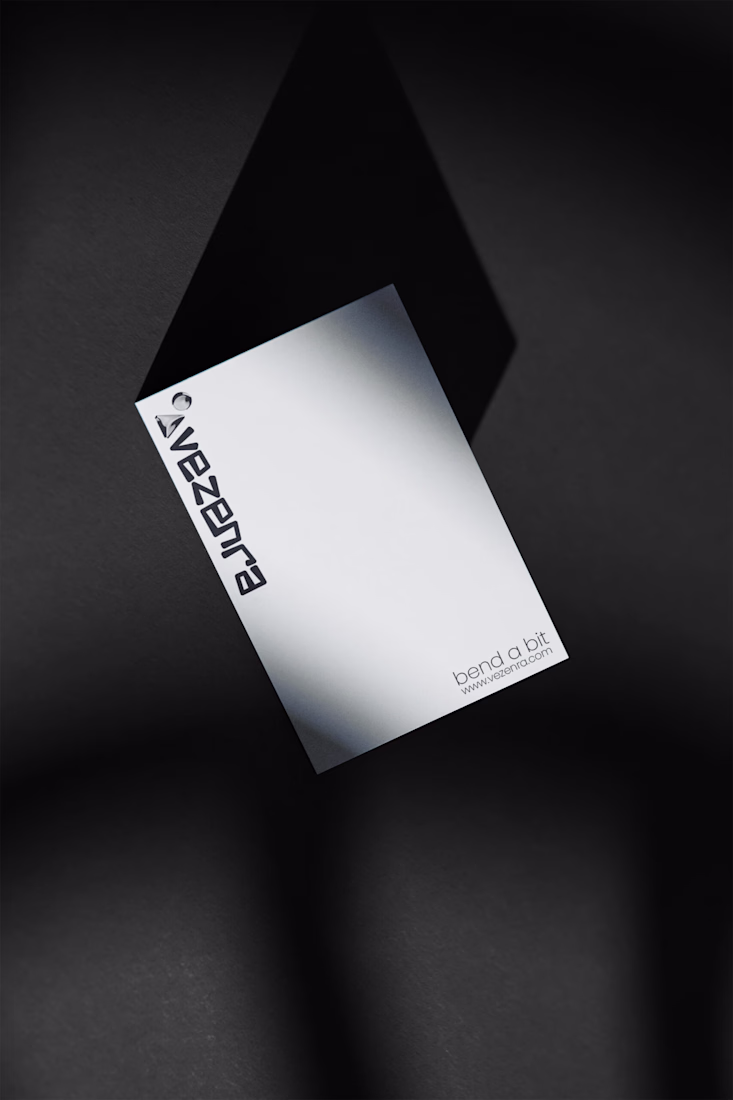
514 Digital presents the complete brand identity for Vezenra, a next-gen apparel brand built on the philosophy of bending boundaries.
From custom logo design and brand identity to e-commerce UI/UX, merchandise, packaging, signage, and social media design, every part was crafted around a signature mono palette of black and white with sharp geometric precision sticking to the vision of the brand owner.
More brand reveal of vezenra incoming!
This is clean 👏
Venture Out explores the space where colour intensity and contrast collide, creating a dynamic balance between movement and form. It captures a visual harmony shaped by energy, rhythm, and bold expression.
motiongraphicsmotiondesignmotiondesignerArt DirectionCreative DirectionMotion DesignAdobe After EffectsAdobe Illustrator
This is a Smooth Animation. Love it 😍
Trending
Runway
AI video generation is exploding. What are you dreaming up in Runway?
Contra University
Learn from expert creatives how to earn more using next-gen AI tools.
creativeaiflow
Creative AI workflows are evolving. What tools do you use, and what are their strengths and weaknesses?
portfolioreview
The best portfolios tell a story, not just show a grid. Share yours for feedback.
freelancerlife
Freelancer life is wins, pivots, and everything in between. What’s yours right now?