The network for creativity
Join 1.25M professional creatives like you
Connect with clients, get discovered, and run your business 100% commission-free
Creatives on Contra have earned over $150M and we are just getting started
Back to feedPost
Taste Test

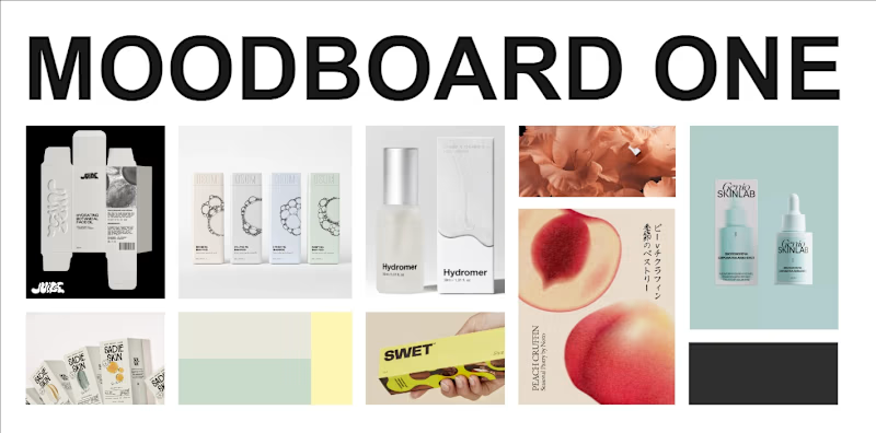
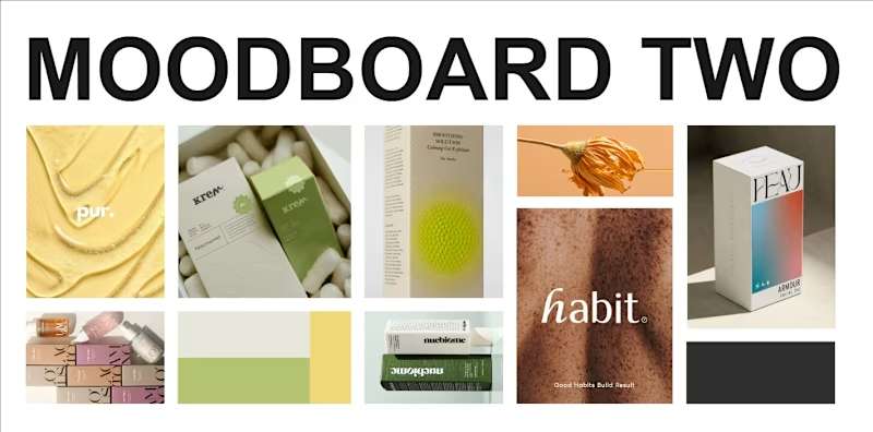
Oki, so these moodboards are for an organic beauty oil packaging. The brand will have a minimal aesthetic and I chose these styles to help it stand out from its competitors.
The 1st moodboard has a quiet, muted feel with a very minimal layout. The second one is a bit brighter (not too much), having a clean layout thats slightly less minimal.
I know both styles are minimalist, but they create very different moods and brand personalities.
Which one do you like better?
0 voted
0%
3 voted
100%
3 votes
Closed

The network for creativity
Join 1.25M professional creatives like you
Connect with clients, get discovered, and run your business 100% commission-free
Creatives on Contra have earned over $150M and we are just getting started











Related posts

Two camera distances for the same Movable Ink cut. One leans in, one shows the whole layout. 1 or 2.
10 voted
50%
10 voted
50%
20 votes
Closed

2 is more stunning the animations feels unique and that's unbelievable 🎉🎉🔥🔥
great job Blahomyr❤️❤️

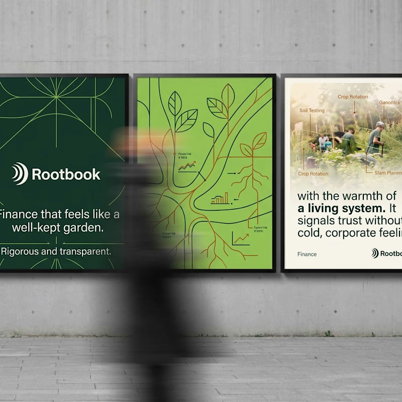
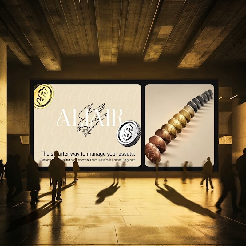
What does trustworthy finance look like to you?
A) Rootbook: Finance that feels like a well-kept garden.
B) Altair: The smarter way to manage your assets.
Two finance brands I’m designing, two completely opposite worlds. Which one gets your money?
28 voted
61%
18 voted
39%
46 votes
Closed

Rootbook wins for me. A finance brand that feels like a well kept garden is such a refreshing idea.

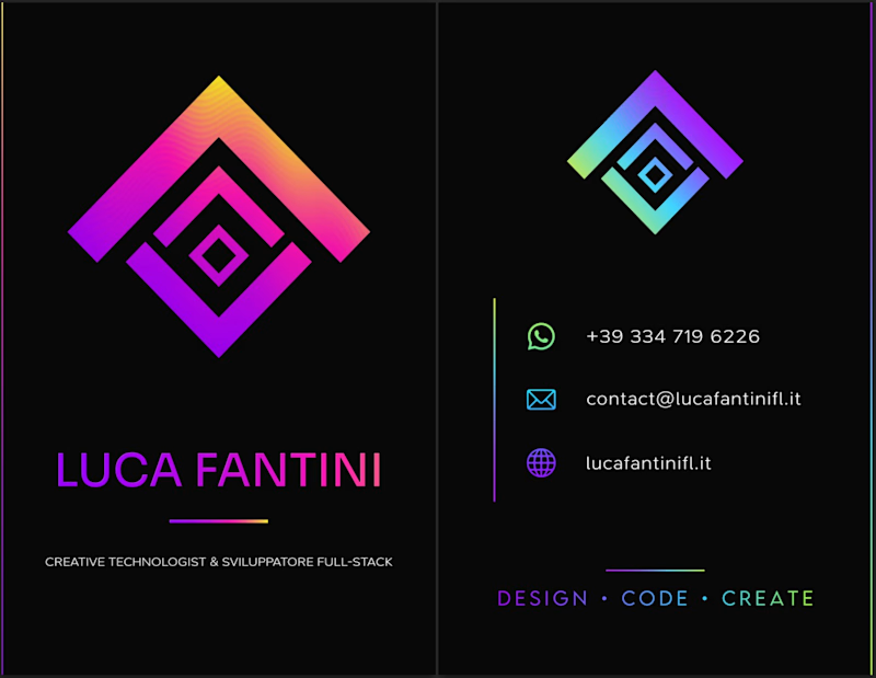
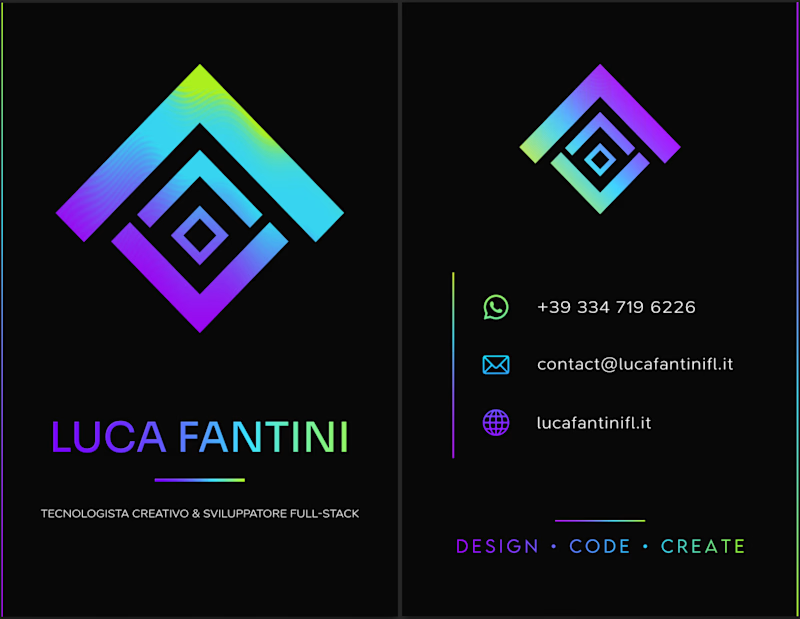
i've been making my business card today, which version do you prefer? what do you think about it?
2 voted
18%
9 voted
82%
11 votes
Closed

I'd lean toward the single palette. The cooler gradient keeps the contact icons readable, while the magenta in the second one starts competing with the logo mark. Worth proofing the neon on paper too, since it can shift a lot in CMYK.