The network for creativity
Join 1.25M professional creatives like you
Connect with clients, get discovered, and run your business 100% commission-free
Creatives on Contra have earned over $150M and we are just getting started

The network for creativity
Join 1.25M professional creatives like you
Connect with clients, get discovered, and run your business 100% commission-free
Creatives on Contra have earned over $150M and we are just getting started

Challenges
View all


Related posts

Vinetta is a Website for a winery is worked on.
I built it with Framer.
I wanted it to be consistent with the aesthetic imagery of the wine world

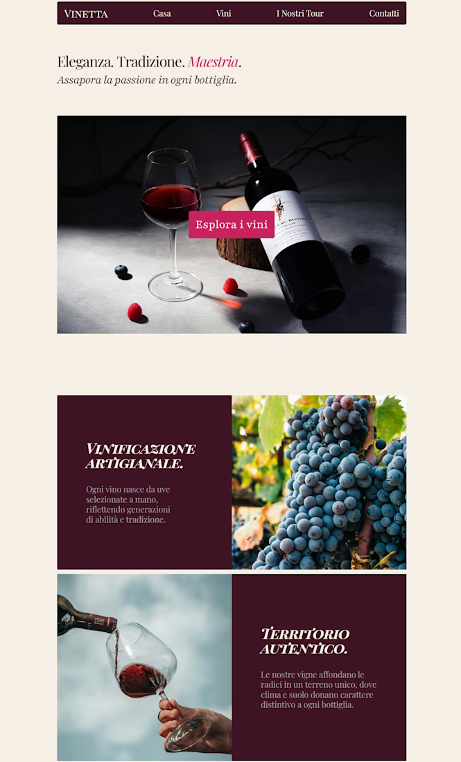

Those burgundy type panels sit next to the pour like wine labels, not captions. The pink Esplora i vini chip stays in the same palette instead of breaking out as a generic button.

Work in progress: the hero section for a new concept I'm building from scratch in Framer called Earth. "A new way to build."
Still finishing everything below the fold, but happy with how this section came together, especially the small video preview card cycling through states on the right.
The hero type earns its size. “A new way to build” stays readable over the globe while that small preview card cycles states without crowding the headline.

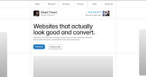
The headline is direct and the mockup stack gives the hero some depth. I'd pull the FAQ off that first fold so the project shots get a clean read before anything else.