The network for creativity
Join 1.25M professional creatives like you
Connect with clients, get discovered, and run your business 100% commission-free
Creatives on Contra have earned over $150M and we are just getting started
Back to feedPost
Vinetta is a Website for a winery is worked on.
I built it with Framer.
I wanted it to be consistent with the aesthetic imagery of the wine world

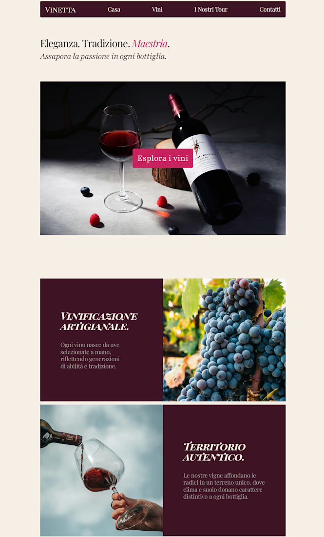

The visual tone feels well matched to the wine world.

Thank you! I was afraid to make a mistake 😊

Those burgundy type panels sit next to the pour like wine labels, not captions. The pink Esplora i vini chip stays in the same palette instead of breaking out as a generic button.
Thank you for your advices
The network for creativity
Join 1.25M professional creatives like you
Connect with clients, get discovered, and run your business 100% commission-free
Creatives on Contra have earned over $150M and we are just getting started

Challenges
View all


Related posts


what does a full website for an ai agent need?
parley has workflow pages, pricing with a comparison table, a cms blog, contact and waitlist. all free
2,262 remixes in the last 3 months

Excellent card hovers & layout! 🙌

Built this 2-page dental clinic website in Framer.
On desktop, the hero section includes service cards that move into place as you scroll and reveal information about each service.
On tablet and mobile, I placed the cards in the services section below the hero instead.
There simply isn't enough space to fit the same interaction without making the hero too crowded, so I kept the layout simpler on smaller screens.

Great Work and the thought behind responsiveness without trying to fit things and simply letting them be a part of the layout without unnecessary animations was a good choice. Just a suggestion the reveal effect with a slight stagger would look great on the mobile i think 😁😁


We just released Spotlight Reveal: a free, interactive Framer component that turns any video or image into an interactive reveal experience. A dark overlay covers the media as visitors move their cursor, a circular spotlight follows and uncovers what's underneath. One click reveals everything 🔦
See it here: https://www.framer.com/@rabenrifaie/components/

this is so cool! need to try this spotlight effect on my portfolio