The network for creativity
Join 1.25M professional creatives like you
Connect with clients, get discovered, and run your business 100% commission-free
Creatives on Contra have earned over $150M and we are just getting started
Back to feedPost

Cora Health — Social Commerce for Wellness
Description:
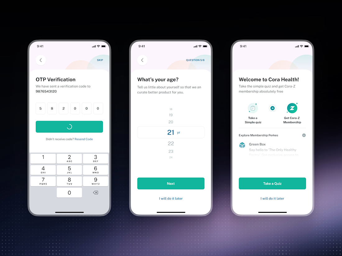
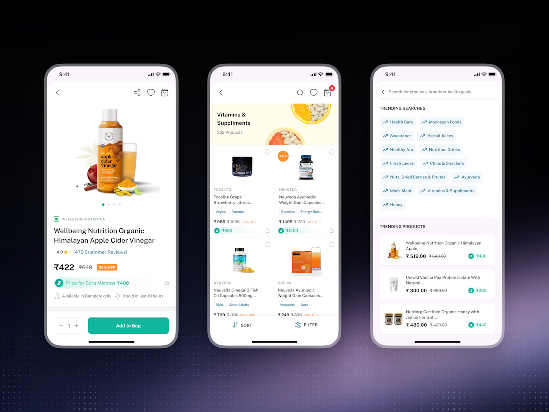
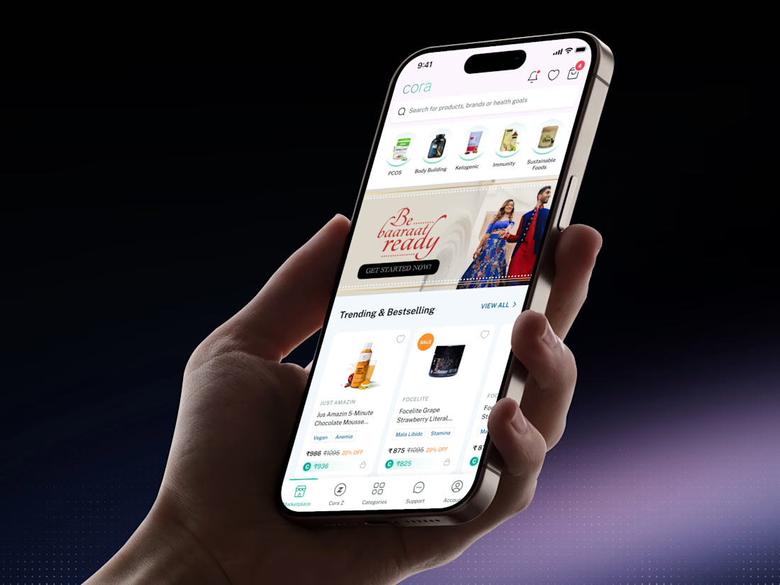
Cora Health is a social commerce marketplace for everyday health and wellness. We designed a mobile experience that helps people discover the right products through recommendations from a trusted community — turning an overwhelming catalogue into a curated, personal shortlist.
Built around one idea: the best wellness advice comes from people you trust, not algorithms.
------------------------------------------------------------------------------------------
Our Role:
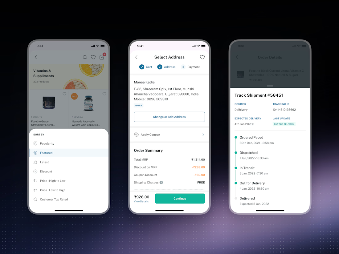
We designed Cora Health's mobile experience end to end. After mapping how people actually research and buy wellness products, we built a flow that surfaces trusted community recommendations at exactly the right moments — guiding users from "I'm not sure what I need" to "this is right for me" without friction.
---------------------------------------------------------------------------------------
Delivered: user flows, high-fidelity UI, a scalable design system, and developer-ready Figma handoff.


The network for creativity
Join 1.25M professional creatives like you
Connect with clients, get discovered, and run your business 100% commission-free
Creatives on Contra have earned over $150M and we are just getting started





Related posts


Professional work

AI Sales Agent SaaS Landing Page
A modern AI Sales Agent & Sales Intelligence SaaS website designed for startups and growing businesses looking to automate sales workflows, streamline lead management, and boost revenue through intelligent automation and real-time insights. The design combines a premium SaaS aesthetic with a conversion-focused user experience, featuring clear product messaging, interactive sections, and a scalable interface built to support modern sales teams.

Amazing design

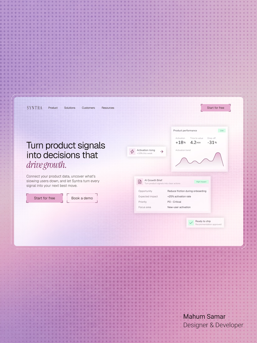

The italic accent on "drive growth" ties the headline together nicely. Soft gradient keeps the cards readable.