The network for creativity
Join 1.25M professional creatives like you
Connect with clients, get discovered, and run your business 100% commission-free
Creatives on Contra have earned over $150M and we are just getting started
Back to feedPost
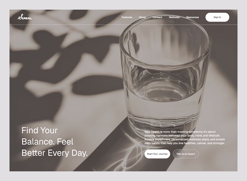
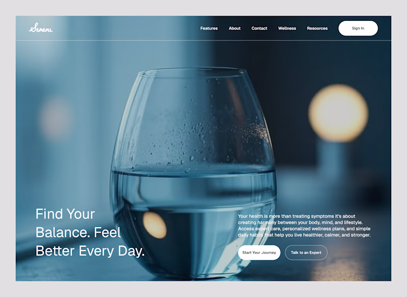
Taste Test
Exploring two visual directions for the same hero concept.
Version 1
A clean glass cup using natural light and reflections to create a calm, minimal feel. The focus here is clarity, simplicity, and a more realistic atmosphere.
Version 2
A transparent glass set against a soft blue backdrop. This direction leans into a more polished, modern aesthetic with stronger contrast and a subtle tech-inspired feel.
Both communicate transparency but in very different ways.
Which direction would you choose for a premium health & wellness landing page: Version 1 or Version 2? I'd love to hear why.
3 votes
Ends in 22h
Version 2 for me
Excellent choice
Version 2 has it
Thought the same thing
The network for creativity
Join 1.25M professional creatives like you
Connect with clients, get discovered, and run your business 100% commission-free
Creatives on Contra have earned over $150M and we are just getting started
Related posts
🌿 Brand and art direction for nunu — a quiet botanical skincare brand built around natural oils, soft rituals, clean ingredients, and calm visual storytelling.
The direction combines macro product photography, green botanical textures, minimal packaging, soft UI details, and a restrained visual system for modern skincare.
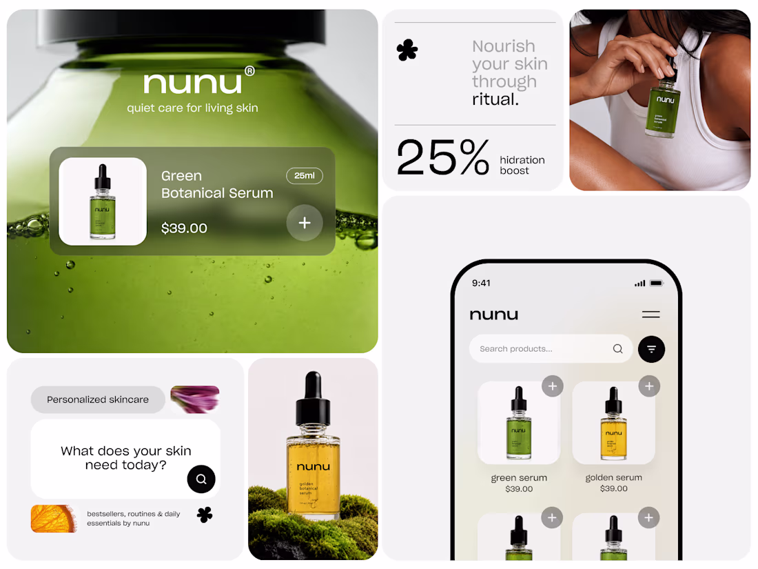
Incredibly clean and calming art direction! The mix of soft UI, minimal typography, and rich botanical textures is executed perfectly. Brilliant work! ✨🌿🧴
Dark mode is better
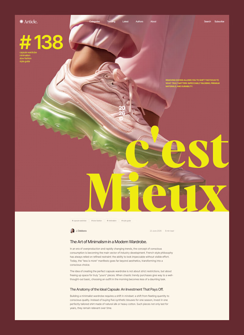
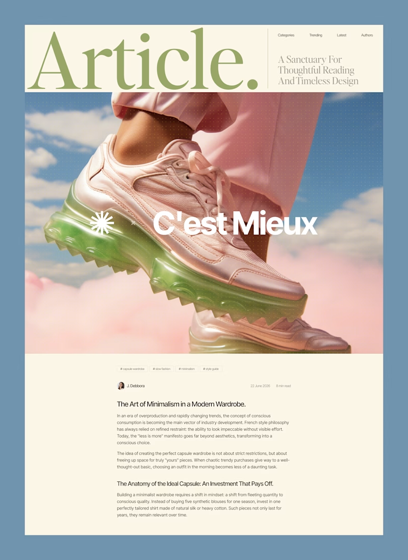
Changing the design layout changes the price tag of your product.
Same sneaker, same article text. But look at how the visual execution completely shifts the perceived value of the brand.
When client projects come to me, I always test how far I can push the typography and composition to match their specific business goals.
A lot of companies scale their operations but forget to scale their visual language, leaving a massive gap between how good they are and how they look. I fix that by designing interfaces that match your actual revenue.
Which direction speaks to your brand’s next chapter?
19 voted
48%
21 voted
52%
40 votes
Closed
Quiet Luxury for me
Trending
Claude
Claude has entered the design space. How are you using Claude Design?
Contra University
Learn from expert creatives how to earn more using next-gen AI tools.
MagicPath
The canvas is infinite, and exploration is becoming the workflow. How are you using MagicPath?
creativeaiflow
Creative AI workflows are evolving. What tools do you use, and what are their strengths and weaknesses?
freelancerlife
Freelancer life is wins, pivots, and everything in between. What’s yours right now?