The network for creativity
Join 1.25M professional creatives like you
Connect with clients, get discovered, and run your business 100% commission-free
Creatives on Contra have earned over $150M and we are just getting started
Back to feedPost
Taste Test
Your AI agent just did 9 things: pulled 412 orders, matched them to Stripe, caught a duplicate £248 charge, drafted a ledger entry, opened a ticket. Whole run cost $0.011.
Now the real design question — what does the user actually SEE?
A — The transcript. A paragraph of text and a collapsed "Used 3 tools".
B — The run canvas. Nine colour-coded rows: what ran, what it cost, what got flagged, and one step that stops and waits for you before money moves.
Same agent. Same run. Two completely different products.
Vote A or B — and tell me why. I build the B version for a living.

0 voted
1%
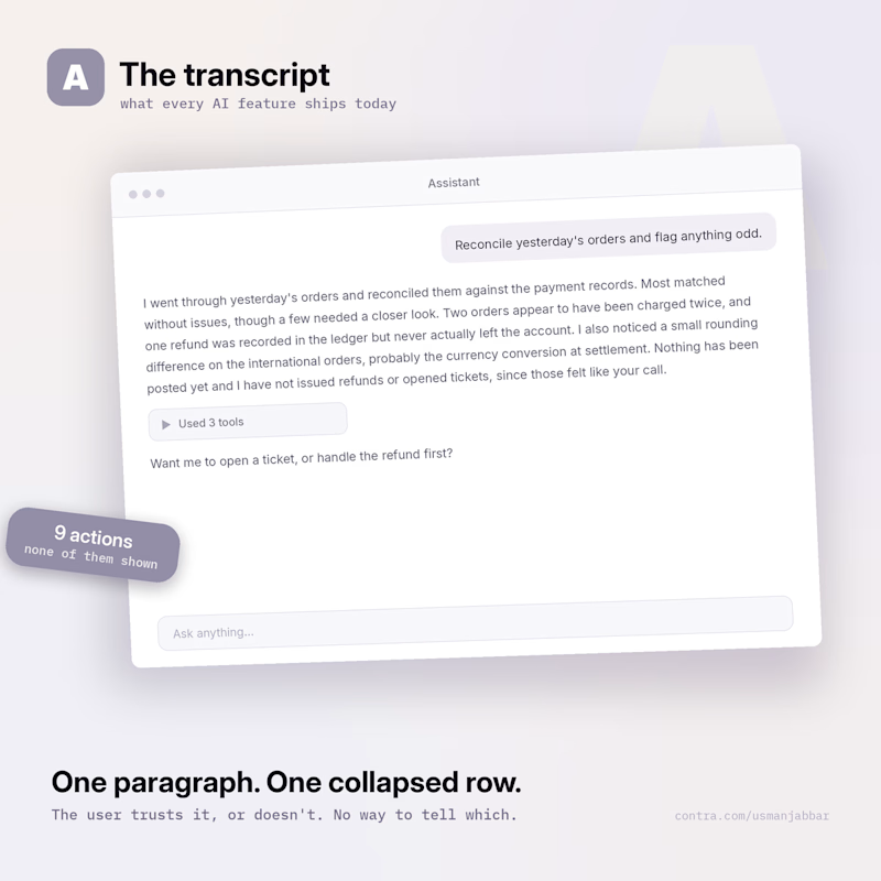
0 voted
1%
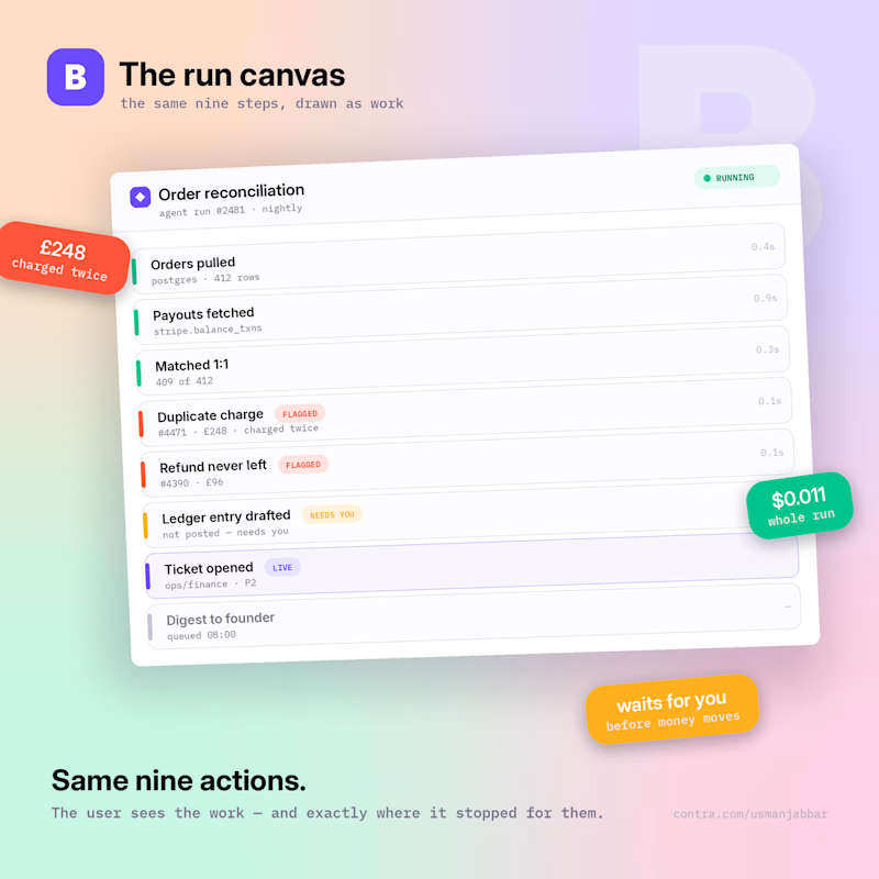
0 votes
Closed


One thing I'll defend about B: the amber row. The agent drafted the ledger entry and then stopped — it did not post it. Nine steps ran, one deliberately didn't. You can only design that stop if the UI has somewhere to put it; a transcript has nowhere to show a pause. Curious...

B, and the amber row is the reason. I built a replay viewer for agent runs - timeline, every command with its output, cost per step - and the thing I got wrong first was making the rows tool calls. Nine tool calls is a transcript with colour on it.
What a reviewer actually wants...
The network for creativity
Join 1.25M professional creatives like you
Connect with clients, get discovered, and run your business 100% commission-free
Creatives on Contra have earned over $150M and we are just getting started





Related posts


Collage

This year, I worked on a mental health app where I explored using water to represent brainwaves and quality sleep.
I think it communicates the idea much better than the typical green energy orb. 🌊
What do you think?
27 voted
43%
36 voted
57%
63 votes
Closed

Love the energy orb. which one is your pick here?

The 2027 calendar won't draw itself, and the printing won't order itself either 🐐 It's the Year of the Goat, so this one has to be the GOAT. Question of the day: 1 — a cartoon goat with attitude 2 — an artsy one, like last year's Drop a number below, and I'll go sharpen my pencils (and horns)
#midjourney
6 voted
30%
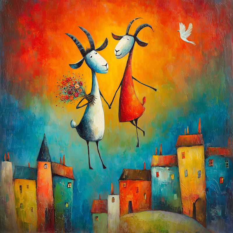
14 voted
70%
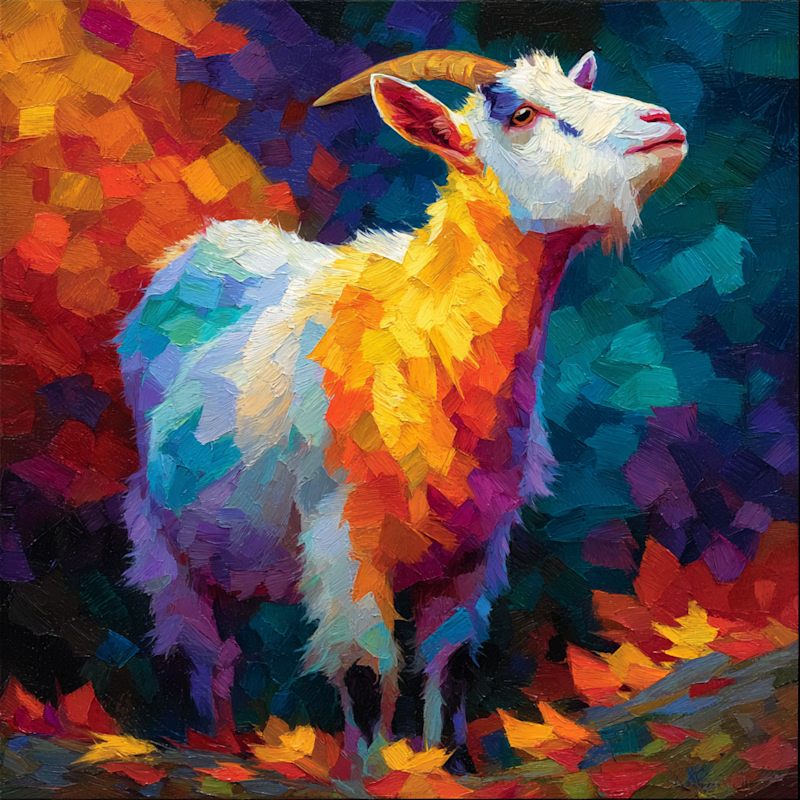
20 votes
Closed

The cartoon style has so much character!