The network for creativity
Join 1.25M professional creatives like you
Connect with clients, get discovered, and run your business 100% commission-free
Creatives on Contra have earned over $150M and we are just getting started
Back to feedPost

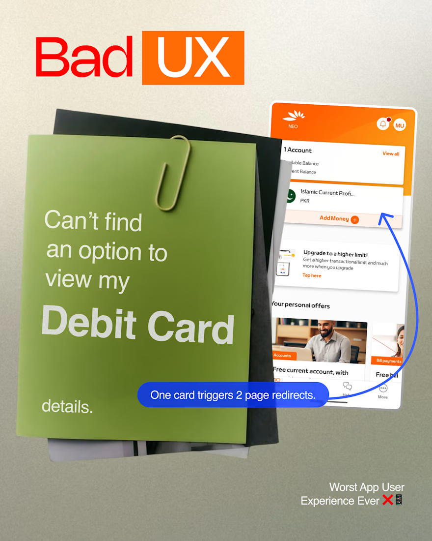
Friction vs. Flow: A Quick UX Audit of Banking Apps 💳
Primary user actions in fintech apps usually come down to three core tasks: checking balances/card details, viewing transaction history, and sending money. When these actions require multi-step navigation, user experience drops significantly.
The Issue (Mashreq App):
Hidden Navigation: Core functionality like accessing debit card details is buried under secondary menus.
Excessive Friction: Locating basic card info requires triggering two separate page redirects, adding 2–3 minutes of unnecessary searching.
The Benchmark (NayaPay):
Seamless accessibility to core user flows directly from the main dashboard.
Minimal click depth for essential tasks.
UX Takeaway:
Primary utility functions should never be hidden behind marketing offers or secondary cards. Prioritizing information architecture based on core user intent reduces friction and improves retention.
How do you balance feature promotion vs. core action accessibility in your app designs? Let’s discuss!👇
#InformationArchitecture #UserExperience

The network for creativity
Join 1.25M professional creatives like you
Connect with clients, get discovered, and run your business 100% commission-free
Creatives on Contra have earned over $150M and we are just getting started
Trending
retrofuturism
Share your favorite designs from the past exploring the distant future. Or your own take on the aesthetic 🚀
halftone
Dots. Texture. Grain. Let's see your designs using the halftone technique.

Midjourney
Creatives are showing off what they're making with Midjourney.
colorgrade
Video editors sound off: How do you enhance the mood of your video in color grading?
Related posts


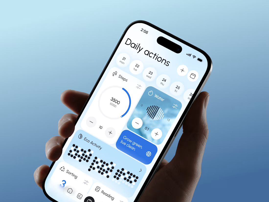
The eco-score sitting right next to steps and water is a smart move, it reframes sustainability as just another daily stat instead of a separate chore. Curious how you landed on gamifying it that way versus something more like a streak or badge system.

First look at a new redesign for an award-winning video production company working with global brands and agencies.
Still an early direction. More soon.


Awesome work🔥🔥🔥


New badge, who dis? ✅💙
Lynksen is officially a @Webflow Certified Partner. That means our profile now carries the Webflow Expert badge for anyone hiring through Contra.
Lisbon-based, shipping worldwide. 🌍
WebflowwebflowcertifiedpartnerswebdesignLow-Code/No-Code DevelopmentWeb DesignWebflow DevelopmentContraFigma


Great news, congrats 💙💻