The network for creativity
Join 1.25M professional creatives like you
Connect with clients, get discovered, and run your business 100% commission-free
Creatives on Contra have earned over $150M and we are just getting started
Back to feedPost

Just wrapped up Bloom💐 - a personal AI stylist for real spaces & collections during the Bubble x Contra Challenge


App Name: Bloom💐
Tagline: Your Vibe Reimagined
Version: Test
Category - Lifestyle
Meet Bloom - your personal AI stylist for real spaces & collections.
Upload any photo of your room, garden, desk, wardrobe, or collection. Bloom analyses it, understands your current vibe, suggests...
The network for creativity
Join 1.25M professional creatives like you
Connect with clients, get discovered, and run your business 100% commission-free
Creatives on Contra have earned over $150M and we are just getting started




Related posts

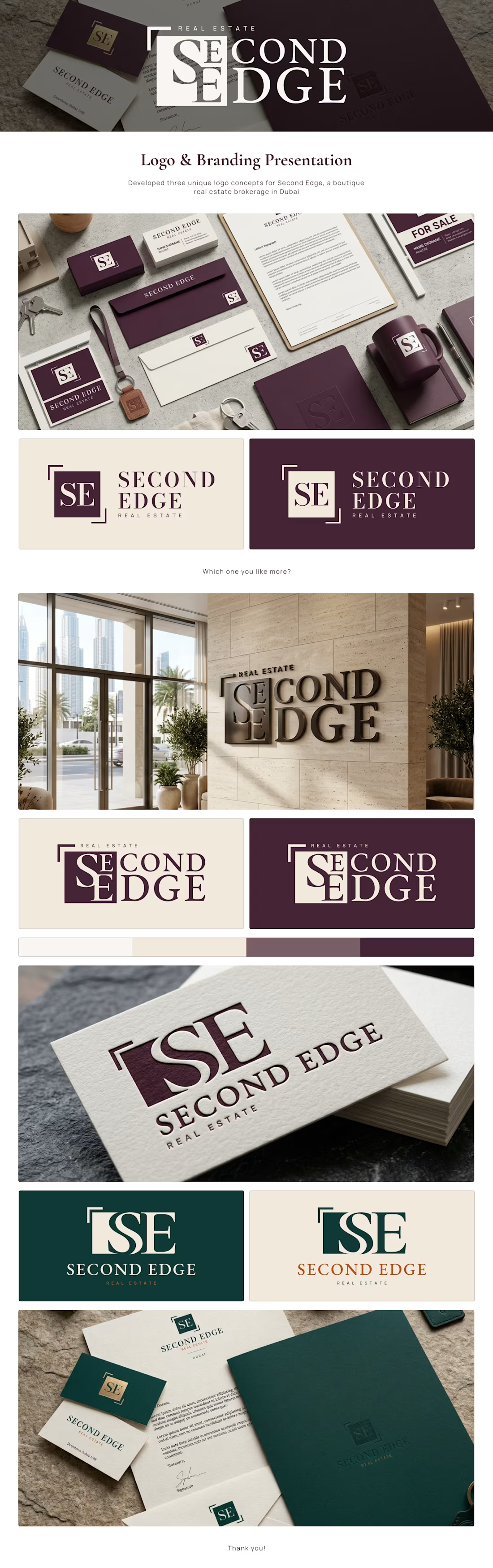
Developed three unique logo concepts for Second Edge, a boutique real estate brokerage in Dubai! 💯


impressive project!

Sharing my entry for the Video.js challenge! 🖤
This one took a lot more trial and error than I expected 😅 but I really enjoyed working on it. Still a few things I'd love to improve, but happy with how it turned out!
Would love to hear what you think!

Trial and error clearly paid off, SOMA looks great. Good luck Megi!

A little creative experiment I'm working on ✳️
Playing with bold typography, playful motion, and unexpected interactions for a UGC creator portfolio.
Still a work in progress, but having way too much fun with this one.


The big stacked WORK / RESULTS / RATES menu next to the loose purple stickers keeps the portfolio playful while the navigation stays easy to scan. Do the stickers react on hover, or are they tied to scroll?