The network for creativity
Join 1.25M professional creatives like you
Connect with clients, get discovered, and run your business 100% commission-free
Creatives on Contra have earned over $150M and we are just getting started
Back to feedPost

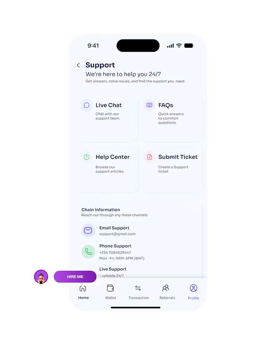
Day 21 (Light Mode) ☀️
Day 21 of my UI design challenge.
Today I designed the Support page, and I’ll be honest: it’s the screen I used to skip when I was starting out. It felt like the boring one.
Then I thought about when people actually open it. It’s rarely a good moment. A transfer didn’t go through, something looks wrong, or they’re just stuck and a bit anxious.
So I kept asking one question: how do I make someone feel looked after within five seconds of landing here?
I ended up giving people a few ways to get help, so they can pick whatever suits them in that moment. Some want a quick answer, some want to talk to a person. I kept the light version open and airy, because a stressed person doesn’t need a busy screen.
Tomorrow I’m showing the same page in dark mode 🌙
When something goes wrong in an app, what do you do first: search for answers or go straight to a human?
#UIDesign #UXDesign #ProductDesign #DesignChallenge #Day21
The network for creativity
Join 1.25M professional creatives like you
Connect with clients, get discovered, and run your business 100% commission-free
Creatives on Contra have earned over $150M and we are just getting started






Related posts

Dashboard design for AllWays Holiday.
Clarity is what makes a good dashboard.
Every section, metric and action should help users understand what's happening and what needs their attention.
Designed to make managing travel operations easier.

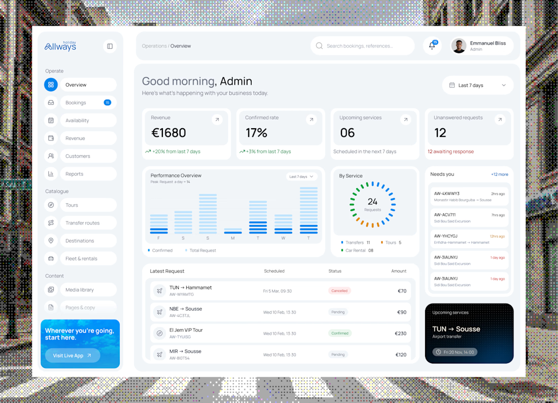

"What needs their attention" is the part most dashboards miss. Clean KPI cards up top, then the list below makes it easy to act. Did you consider pulling urgent bookings or issues into their own highlighted block, so ops teams see problems before they scroll?

Big news! We opened an agency. To deliver the best mascot work the world has seen, me @Mary Delaney and @Arsen Airyan are teaming up with mascot.berlin
Check it live, and stay tuned for more!

Looks cool, kepp going!


Love the attention to detail! The smooth scrolling, subtle animations, and interactive elements make the mobile experience feel clean, modern, and engaging. Great work! 👏