The network for creativity
Join 1.25M professional creatives like you
Connect with clients, get discovered, and run your business 100% commission-free
Creatives on Contra have earned over $150M and we are just getting started
Back to feedPost

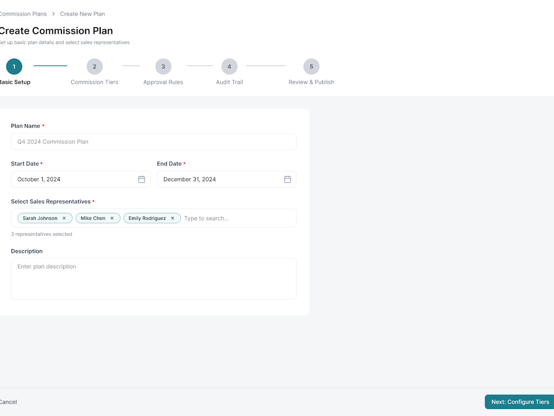
Commission configuration is not a form problem. It is a decision-safety problem.
In this case study, I show how I structured plan setup around tier coverage, validation, payout preview, ownership, and approval context so finance administrators could inspect consequences before publishing.
The most important design choice was keeping difficult financial logic visible instead of hiding it behind a cleaner-looking interface.
The screens are reconstructions, and I have excluded outcome metrics I cannot independently verify.


The network for creativity
Join 1.25M professional creatives like you
Connect with clients, get discovered, and run your business 100% commission-free
Creatives on Contra have earned over $150M and we are just getting started













Related posts

A modern SaaS website concept designed in Figma, featuring clean layouts, intuitive navigation, consistent visuals, and a user-friendly experience across different screen sizes.


Built this in Framer as a concept project. Goal was to make it feel run by ex-journalists. Choices: editorial serif (Libre Baskerville), a dark photo with one color accent, and copy that positions against blast-style PR.
Where I’m unsure: text legibility over the photo and whether the two CTAs compete. What would you change?


That's great design it feels professional I like how the background mixed with interface ❤️❤️
Great job Cheree🎉🎉

Pulse Athletics... Branding & App design✨
Check it out
#app #sport #productdesign #uiuxdesign #uidesigner #uxdesigner #pulse #branding #brandidentity #brandstrategy #brandguidelines #logo #homepage


That's really stunning app design🔥🔥🔥
Great job Ziva🎉🎉🎉