The network for creativity
Join 1.25M professional creatives like you
Connect with clients, get discovered, and run your business 100% commission-free
Creatives on Contra have earned over $150M and we are just getting started
Back to feedPost
Bettermile started as a corporate innovation lab and has since evolved into an internationally operating SaaS provider for last mile solutions, they wanted their website and identity to reflect that.
The passion Bettermile's team has for last-mile logistics is contagious. My job wasn't to reinvent who they are, it was to give their website and brand the structure to finally present them as the industry leaders they are.
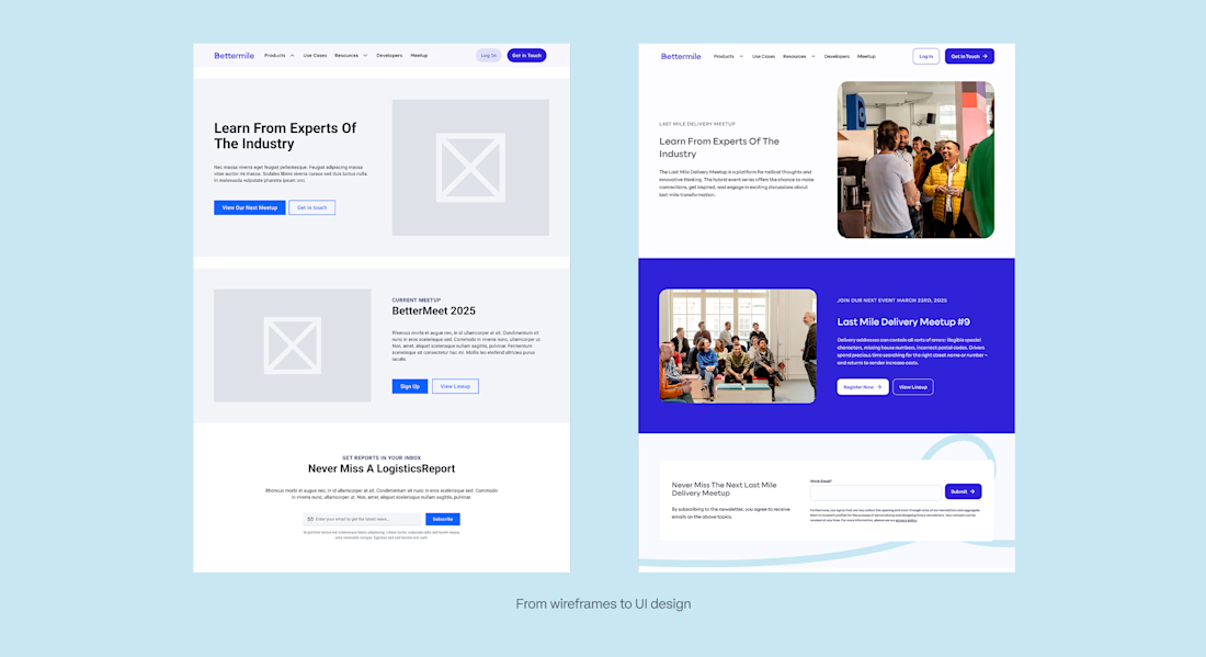
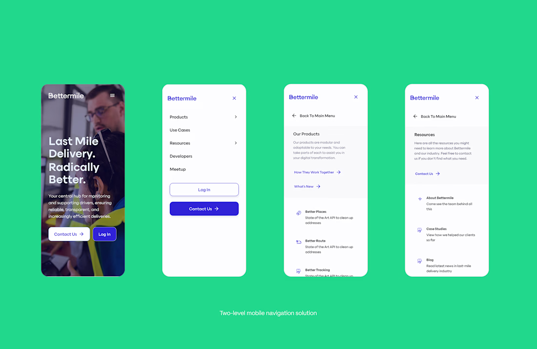
Modularity is a big part of who Bettermile is, so my goal was to give them a website they can easily update themselves through defined page types and flexible page sections.
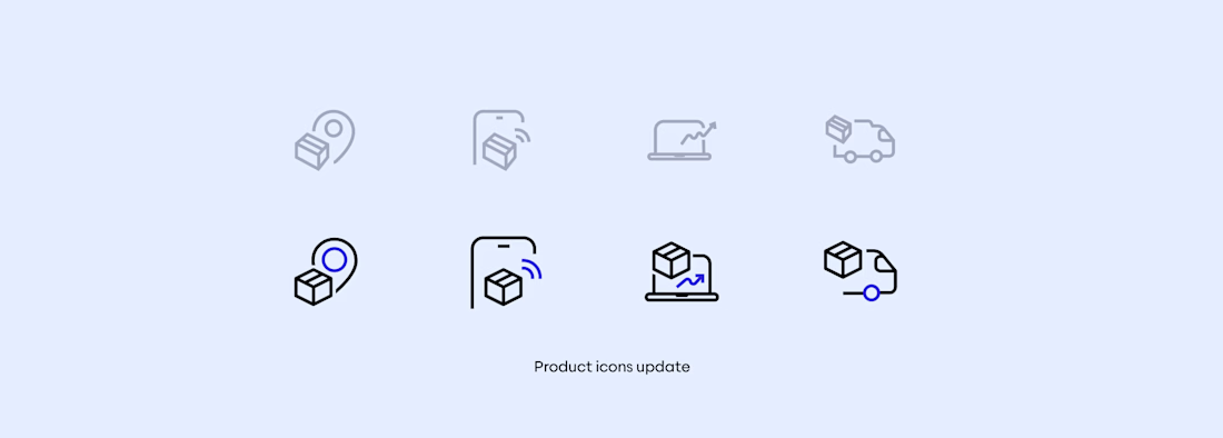
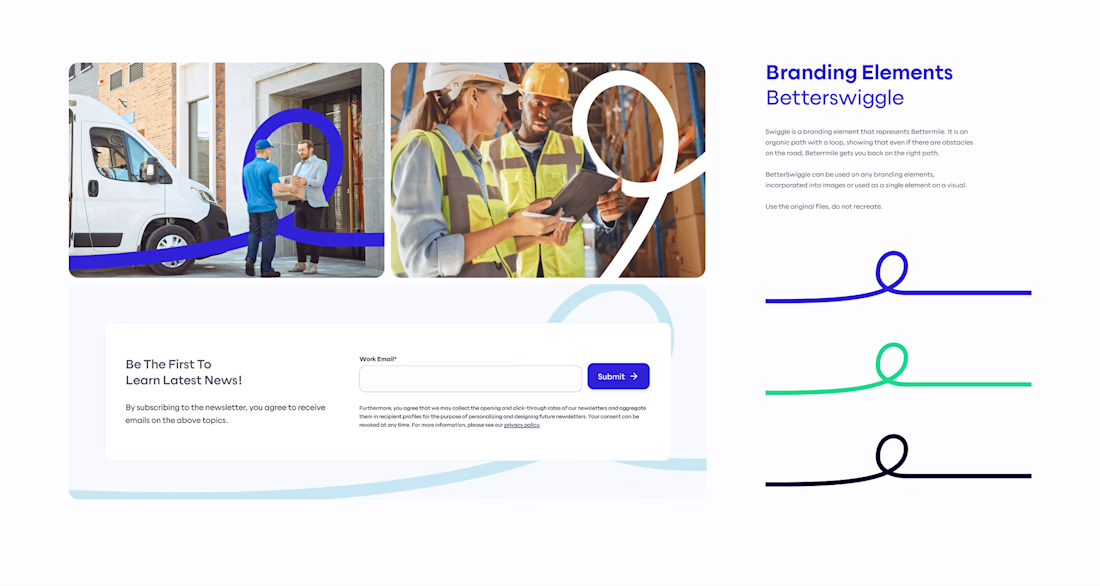
Together with the refresh of the website, we redefined the branding representing who Bettermile is today, making it more modern and tighter. New vibrant colors, new fonts, improved brand.


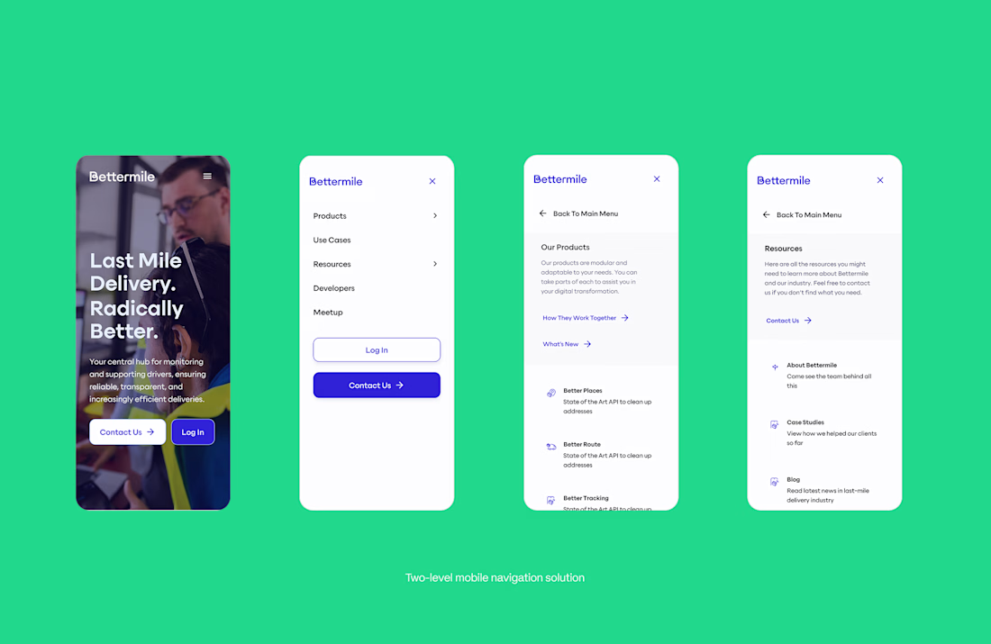
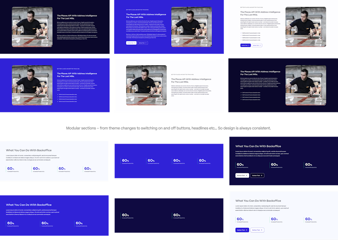
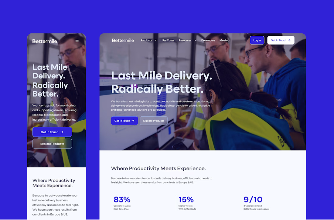
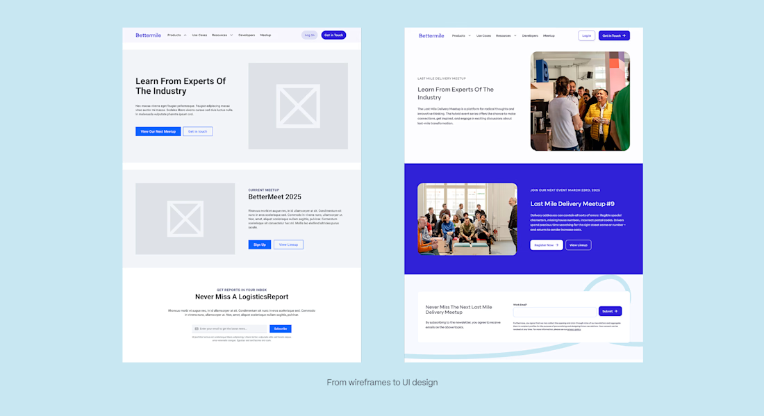

More photos from the process, branding etc...
The network for creativity
Join 1.25M professional creatives like you
Connect with clients, get discovered, and run your business 100% commission-free
Creatives on Contra have earned over $150M and we are just getting started





Related posts


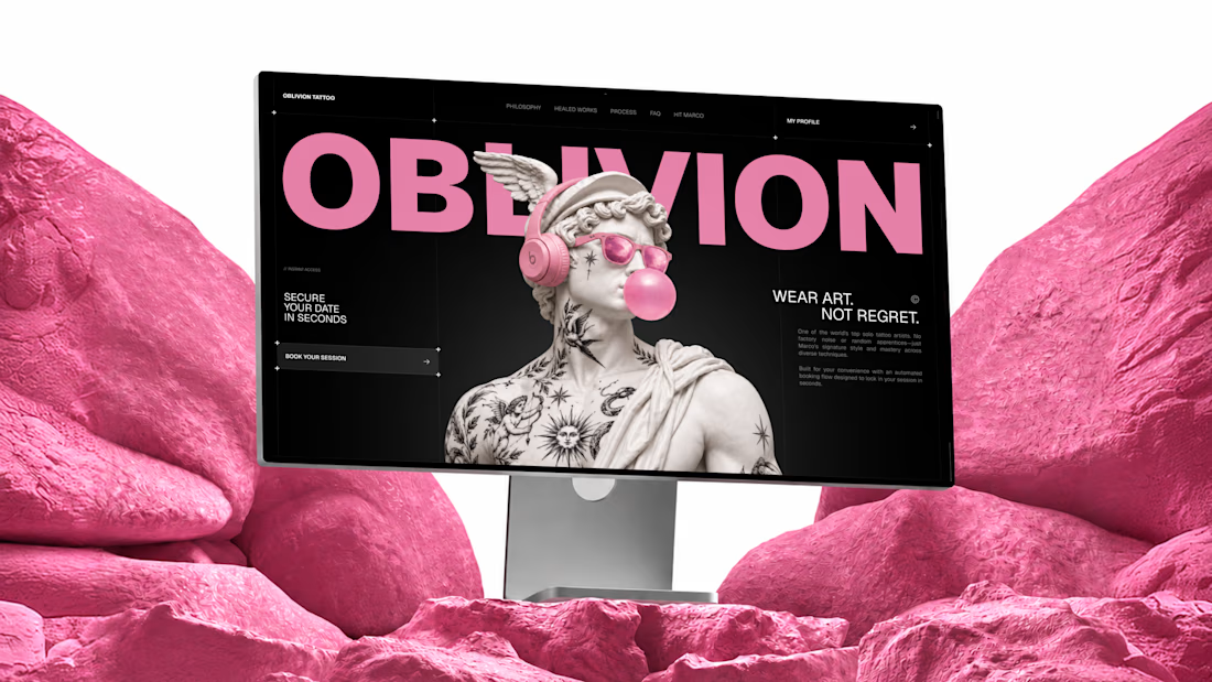
I built OBLIVION Tattoo service for the @Lovable #lovablechallenge
OBLIVION is a private tattoo studio in Kraków, Poland, run by one artist.
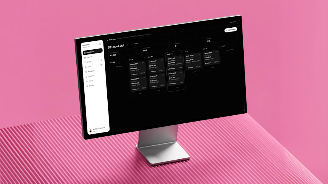
As a solo artist, Marco handles every inquiry, reference, estimate, booking, and schedule change himself.
OBLIVION turns complex tattoo inquiries into confirmed appointments by collecting the full client brief, estimating the work, finding real availability, and keeping the entire booking in one connected artist workspace.
One system, three jobs:
1) Attract — custom animated landing page
https://oblivion-tattoo.lovable.app/
2) Book — guided tattoo booking flow
https://oblivion-tattoo.lovable.app/booking
3) Manage — demo artist admin panel
https://oblivion-tattoo.lovable.app/demo
*The public demo admin resets after refresh. The real admin is private, fully persistent, and connected to live bookings, clients, chats, availability, and studio data.
A smoother booking experience for the client, and far less manual work for the artist.



A calm, editorial landing page for an architecture studio, built around daylight and materials. We'd love to hear your thoughts! 🏛️


The warm timber slats against the pale page feel calm. Did you build the motion in Jitter?


