The network for creativity
Join 1.25M professional creatives like you
Connect with clients, get discovered, and run your business 100% commission-free
Creatives on Contra have earned over $150M and we are just getting started
Back to feedPost
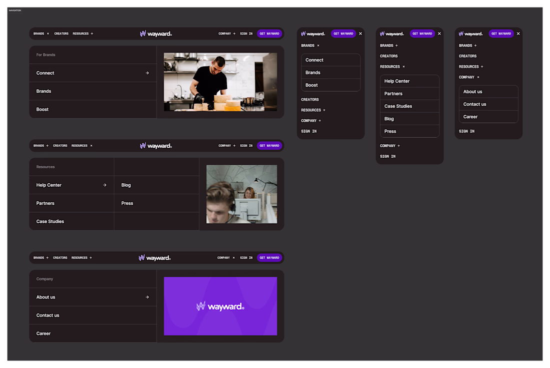
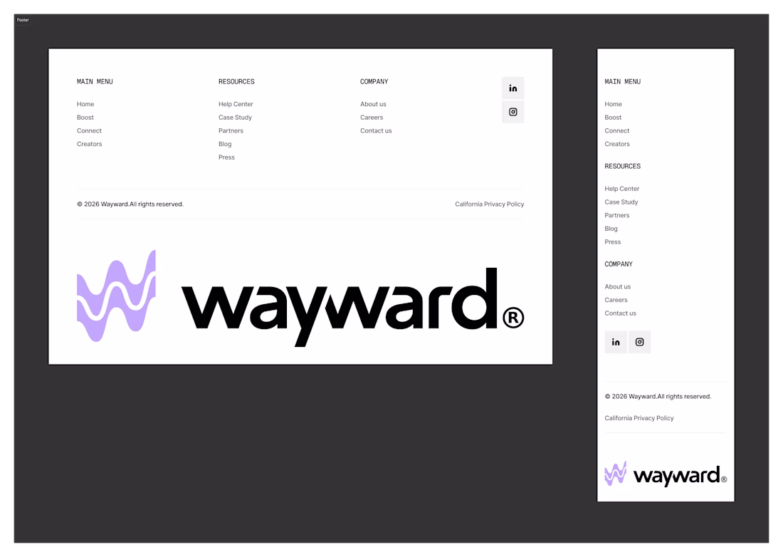
Responsive Navbar and Footer Component Design for Wayward
Good navigation makes complexity feel simple.
Open to take on new projects -> https://contra.com/studioduo
Stunning
Awesome work!
The dropdown spacing on the Wayward nav is doing the heavy lifting. Most Webflow nav components fail at the breathing room between top-level and nested links. Yours actually lets the eye rest before deciding. The footer hierarchy follows the same logic which keeps the system honest.
Nice job on the attention to detail here. Should make the development in Webflow easier too.
This is amazing 😍 😍 😍 😍 😍 😍
Clean and functional! I love how you’ve handled the spacing here. Responsive navbars are the backbone of a great user experience, especially for mobile users. As a WordPress specialist, I’m always looking for that perfect balance between aesthetics and performance, and this footer layout is a great example of that. Keep it up
Nice!
nice work
The network for creativity
Join 1.25M professional creatives like you
Connect with clients, get discovered, and run your business 100% commission-free
Creatives on Contra have earned over $150M and we are just getting started
Related posts
Already a bit old (2025!!) but I still like the iOS app designs i did for Everyhealth 🌈
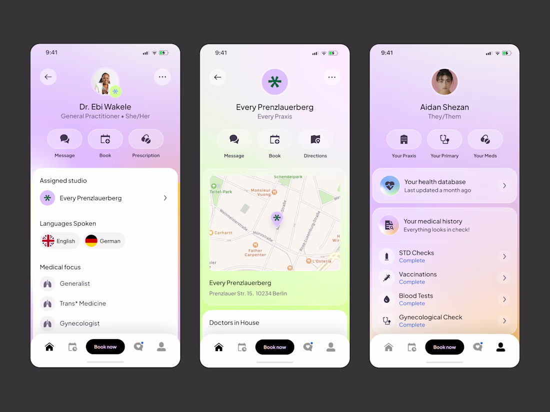
Really clean and calm UI ✨
Love the balance in Everyhealth design.
Curious—what was your main focus while designing it?
Fine-tuning is the hardest part of vibe coding. Spent way more time than expected on a small card hover experiment in Claude to prove it.
I really like your work.
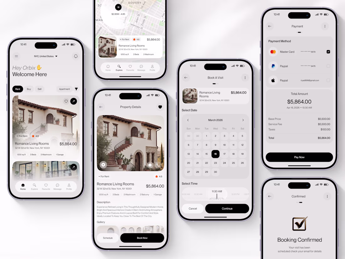
Real Estate Mobile App With Booking Flow
Designed a full end-to-end iOS property app covering every screen from listing browse to booking confirmation built for real estate platforms that need more than a feed.
𝗪𝗵𝗮𝘁 𝘄𝗮𝘀 𝗱𝗲𝗹𝗶𝘃𝗲𝗿𝗲𝗱:
⌐ Home feed with Rent/Buy/Sell toggles, filter controls, and personalized greeting
⌐ Map explore screen with NYC listings and live price range bubble ($2.85M–4.85)
⌐ Property details with full-bleed photography, 5 spec tags, description, and sticky Book Now CTA
⌐ Book A Visit screen with March 2026 calendar picker and 11:30 AM scroll-wheel time selector
⌐ Payment screen with Mastercard, PayPal, and Apple Pay options plus full cost breakdown ($5,864.00)
⌐ Booking Confirmed screen with checkmark closure and visit scheduled confirmation
Built for proptech startups, real estate platforms, and property marketplace founders who need a complete mobile booking experience, not just a listing feed.
If your platform needs a mobile app that takes users from browse to booked in four taps, this is the kind of work we do.
Tools: Figma
Let's build something better. 👋
Really satisfying to look at
Trending
Claude
Claude has entered the design space. How are you using Claude Design?
Contra University
Learn from expert creatives how to earn more using next-gen AI tools.
creativeaiflow
Creative AI workflows are evolving. What tools do you use, and what are their strengths and weaknesses?
portfolioreview
The best portfolios tell a story, not just show a grid. Share yours for feedback.
freelancerlife
Freelancer life is wins, pivots, and everything in between. What’s yours right now?