The network for creativity
Join 1.25M professional creatives like you
Connect with clients, get discovered, and run your business 100% commission-free
Creatives on Contra have earned over $150M and we are just getting started
Back to feedPost

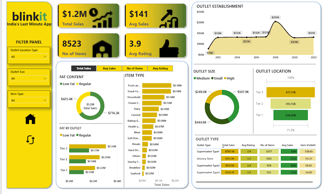
I designed and built an interactive, single-page Power BI dashboard analyzing sales performance for Blinkit, India’s quick-commerce grocery app, across 8,523 product records. The report tracks four core KPIs built with DAX measures: Total Sales (about $1.2M), Average Sales per item (about $141), Number of Items (8,523), and Average Customer Rating (3.92). It is supported by visuals that break sales down by item fat content, item type, outlet size, outlet location tier, outlet type, and outlet establishment year. A filter panel with slicers for location type, outlet size, and item type, plus a metric-switcher, lets users explore the data dynamically. The analysis shows that Low Fat products drive about 65% of sales, Fruits & Vegetables and Snack Foods are the top categories (roughly 15% each), Tier 3 cities lead on revenue (39%), and Supermarket Type 1 outlets contribute about 65% of total sales. The dashboard has a custom Blinkit-branded interface with navigation buttons, and it turns raw grocery data into clear insights that support inventory, outlet, and category decisions.

The network for creativity
Join 1.25M professional creatives like you
Connect with clients, get discovered, and run your business 100% commission-free
Creatives on Contra have earned over $150M and we are just getting started





Related posts



Super clean work!

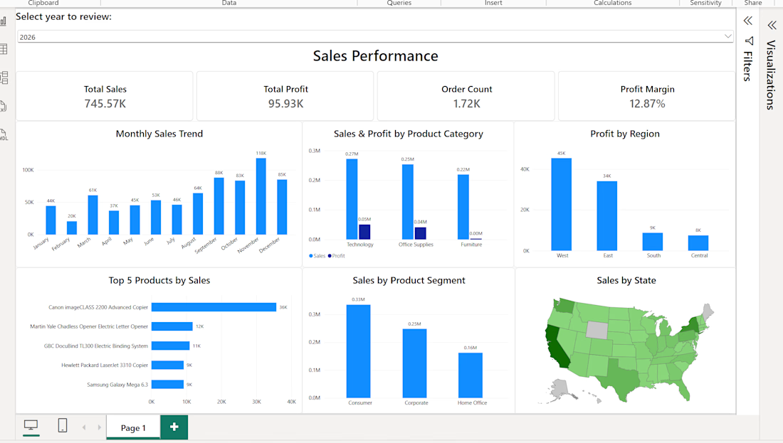
Developed an interactive one-page Power BI dashboard for monitoring retail sales performance. The report combines key KPIs with monthly trends and analysis across product categories, regions, customer segments, top products, and geographic markets. Interactive filtering allows users to quickly explore performance by year and other business dimensions.

Electronic Assembly Production Dashboard
Designed a futuristic industrial dashboard for electronic assembly and manufacturing operations. The concept focuses on real-time production monitoring, assembly workflows, quality control, station efficiency, and component tracking.
The interface combines 3D visualization + data-driven UI to make complex manufacturing information easier to understand and act on.


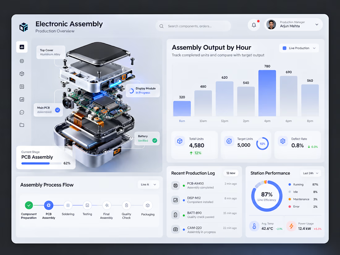

The exploded PCB next to the charts is a smart anchor for the layout. Does the 3D model rotate in the live version?