The network for creativity
Join 1.25M professional creatives like you
Connect with clients, get discovered, and run your business 100% commission-free
Creatives on Contra have earned over $150M and we are just getting started
Back to feedPost

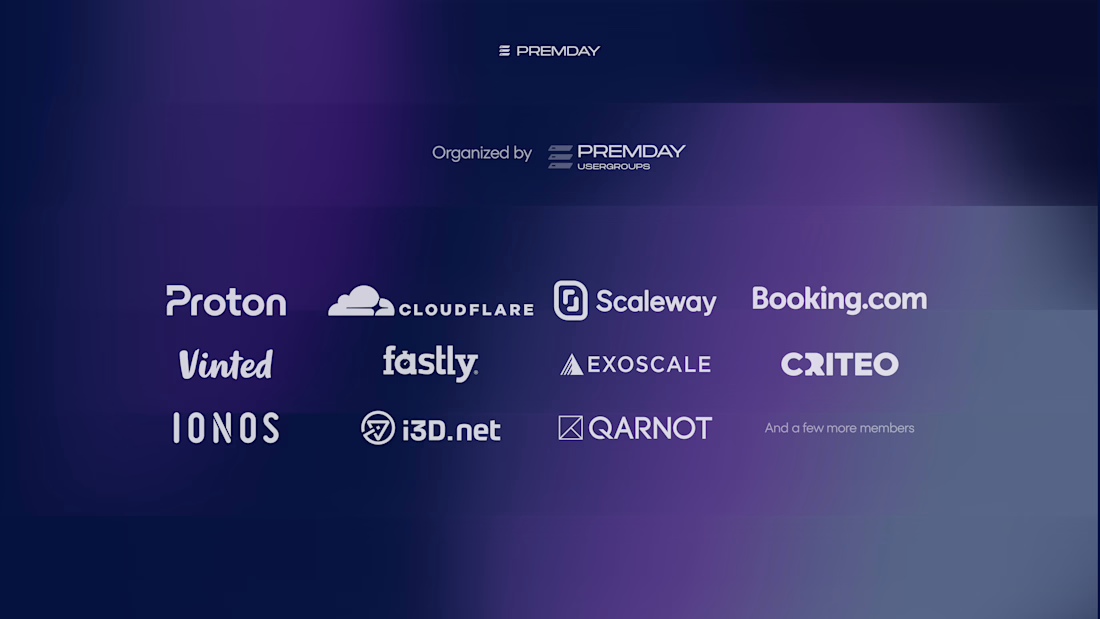
Amazing project, amazing team, amazing location and, by the way, amazing brands involved.
This is PremDay, a yearly infrastructure conference in Paris that brings together world-class infrastructure teams, production engineers, hardware vendors, and decision-makers to discuss real on-premise infrastructure experience.
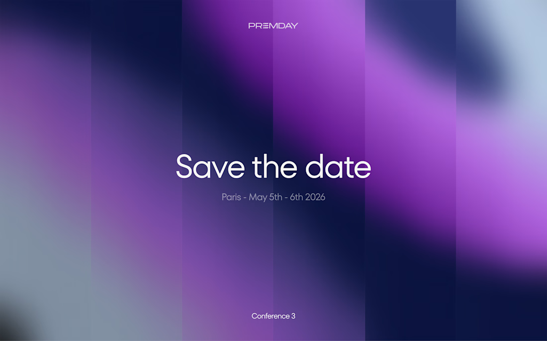
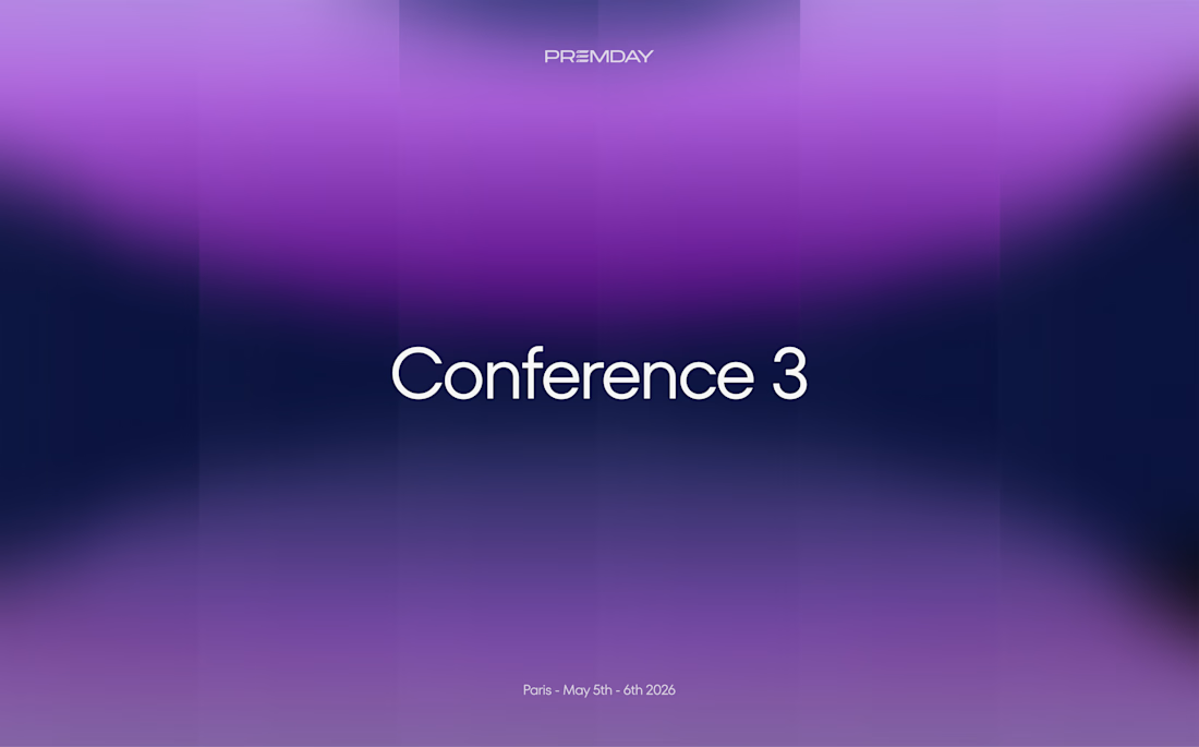
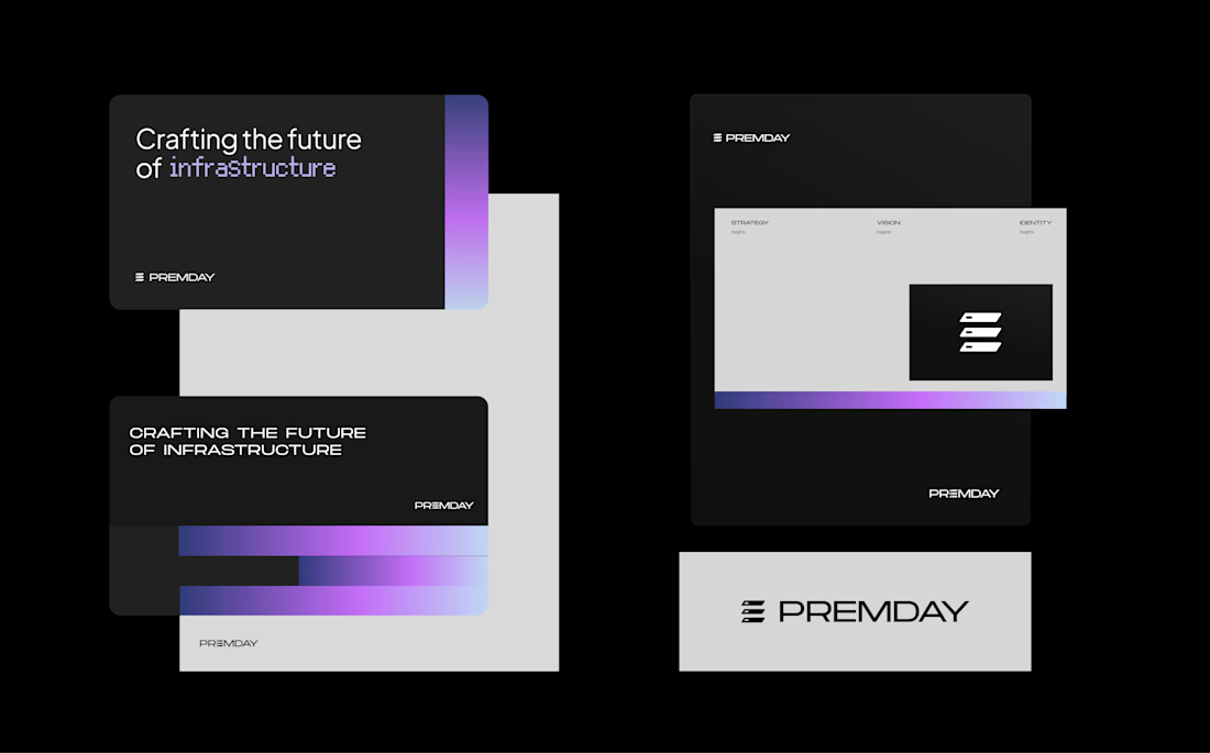
I had the chance to work closely with the organizing team on the PremDay rebrand, helping define a visual identity for a conference that is honest, technical, engineer-led, and focused on real operational experience.
The new identity was presented at the latest edition of the event, hosted this year at the beautiful Fondation Biermans-Lapôtre in Paris.
I’m sharing here some of the brand visuals, along with a few photos from the conference.
Special thanks to the organizers I worked with closely: Erwan Velu, Arno Dubois, and Sebastien Ceuterick.
We’re now working on the next phase: the PremDay website redesign.
The network for creativity
Join 1.25M professional creatives like you
Connect with clients, get discovered, and run your business 100% commission-free
Creatives on Contra have earned over $150M and we are just getting started

Challenges
View all


Related posts

A small sneak peek at a big case study that’s coming soon 💪
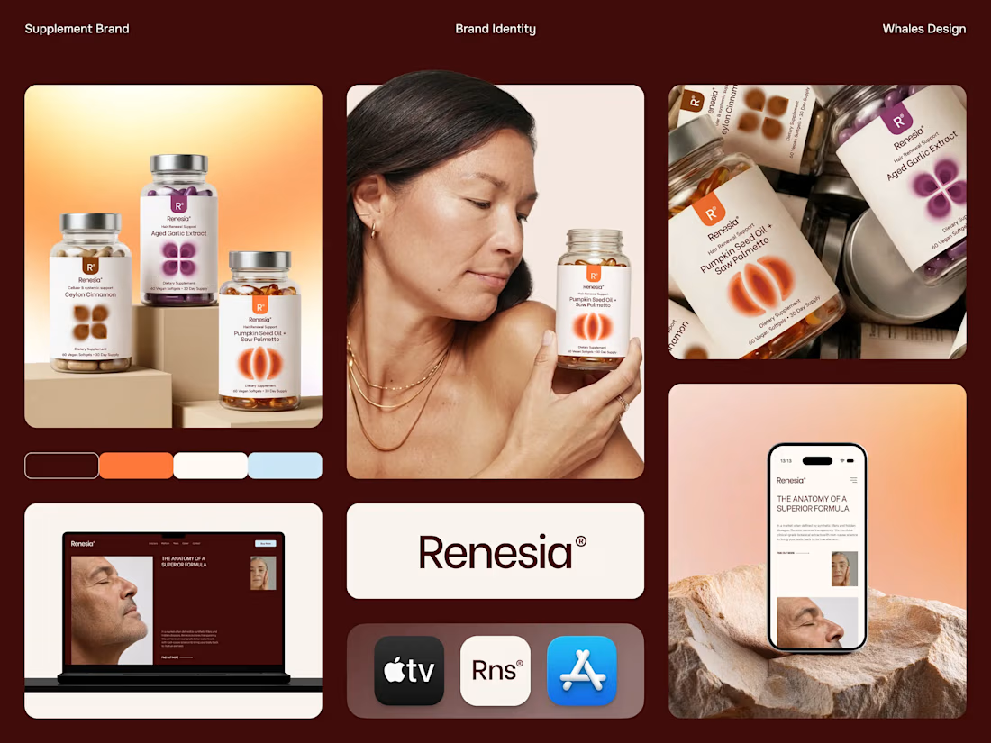


Fresh case study 🚀🚀🚀
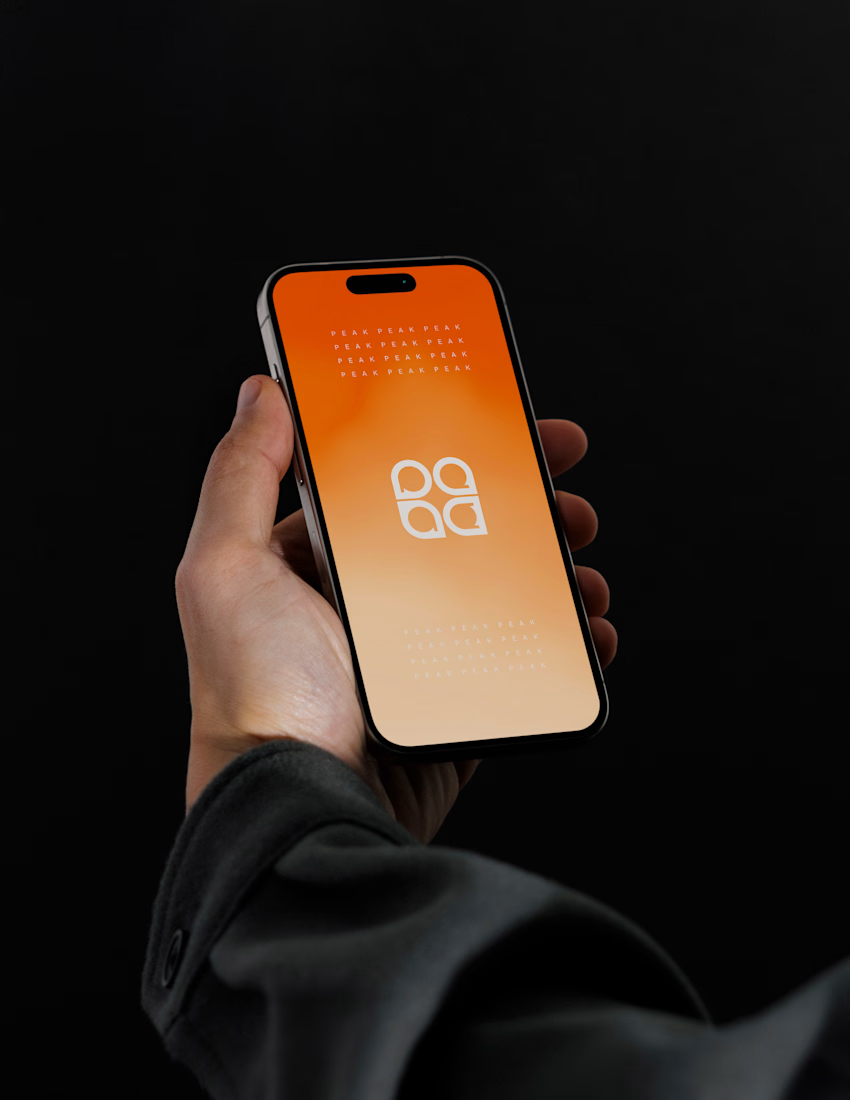
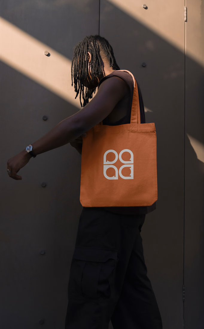
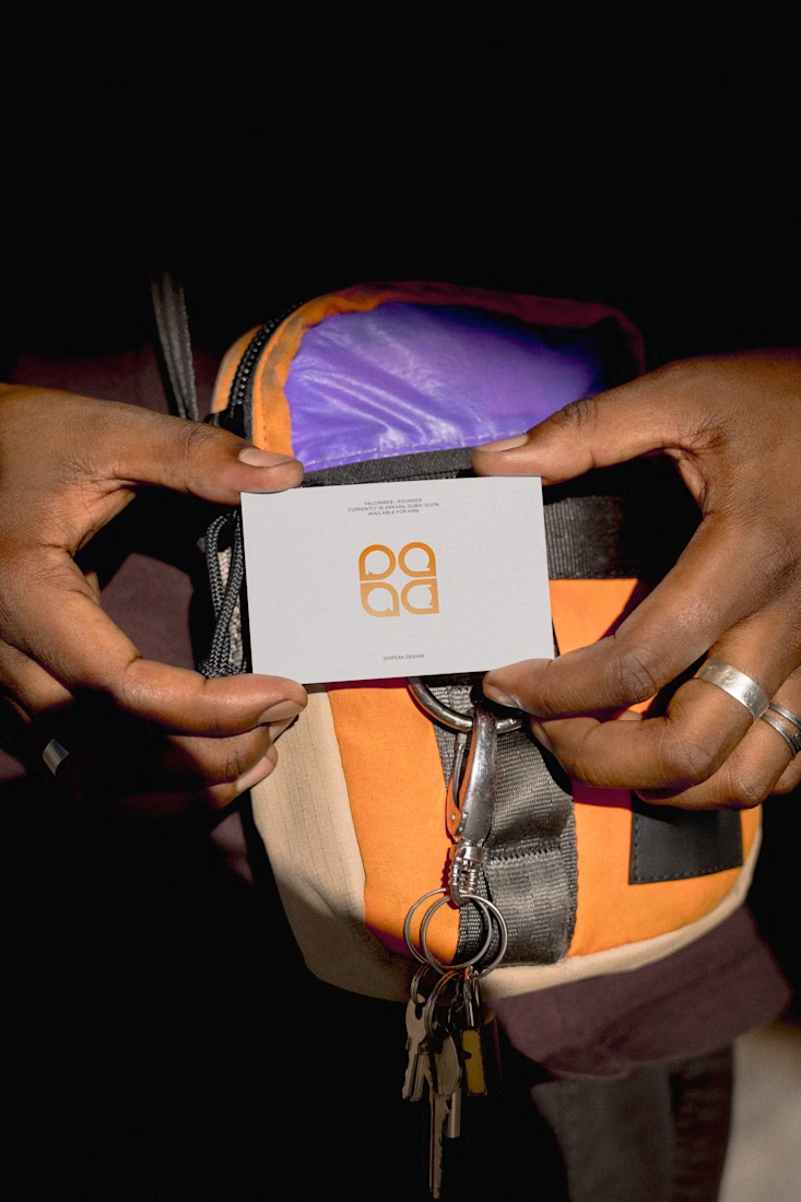
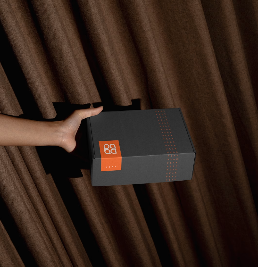
Brand identity for Peak, an all-in-one website builder for WordPress that I design and build. A four-letter mark, a warm paper-and-ember palette and one system that runs from the favicon to the packaging.

A four-letter mark that has to hold from favicon to packaging is a tough constraint. Did you draw one letterform first and build the other three from it, or design them together as a set from the start?

Beautyy


