The network for creativity
Join 1.25M professional creatives like you
Connect with clients, get discovered, and run your business 100% commission-free
Creatives on Contra have earned over $150M and we are just getting started
Back to feedPost
Taste Test

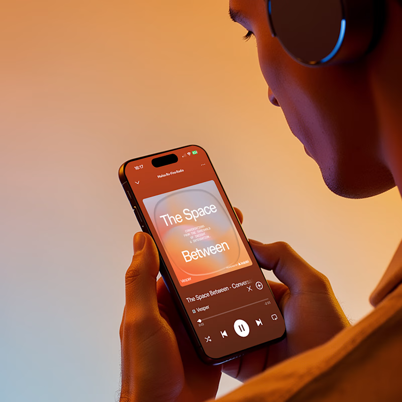
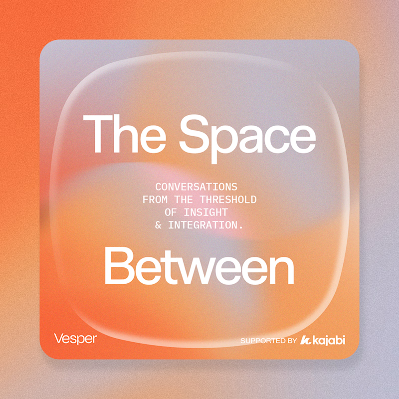
We designed the podcast section for Vesper, our Kajabi concept site. When it came to showing it off, we had two instincts: put it in someone's hands, or let it stand alone.
Same cover. Totally different feeling. Which one stops you?
Check out the full project!
23 voted
64%
13 voted
36%
36 votes
Closed

Voted Option 1. The phone in hand gives you the context the cover art can't on its own. For a mindfulness-adjacent podcast, seeing it held at rest in warm light creates the listening moment before anyone presses play. The standalone cover is beautiful, but it works harder on a landing page than in a feature showcase.

option 2 is the one with my vote since it actually IS the bit of this post that stopped me to vote & comment. something about the use of the shape outline & colors used almost make it feel extensive past the screen, kind of like an optical illusion of an inflation effect. ...

Going with option 1

Building curiosity is very important in design. Option 1 encourages to explore the product.

Option 1

Best one

option 1

context changes perception more than pixels sometimes 😄

Great work

Love this!


Personally, I'm more drawn to the left version. There's something about having a person in this kind of work that doesn't really appeal to me


Amazing work👏🔥


Really nice, I think using real photography with products is always a winning trend!
The network for creativity
Join 1.25M professional creatives like you
Connect with clients, get discovered, and run your business 100% commission-free
Creatives on Contra have earned over $150M and we are just getting started











Related posts

Building a new portfolio in less than two days? Let's go! 🚀
For the Base44 Challenge, I decided to focus on something close to me... my own website. I wanted to make sure it felt fun, fresh and featured automated elements to make potential clients' lives easier and, in turn, mine.
The website features an interactive colour-changing cursor, a 3D project carousel and a personalised questionnaire that tailors the questions I ask to the specific project a client needs help with.
Client enquiries go straight to my inbox and into a private project portal, where I can review the details and keep all the information handy for follow-ups.
On top of that, I set up a project management system where I can create projects, add tasks and keep track of deadlines. It's fully customisable and easy to use.
Less admin, better briefs, and more time to focus on the creative work. 🙌


The project-specific questionnaire is the part that stands out to me. Connecting it to a private portal gives the portfolio a practical role beyond displaying work. How do you keep the intake short while still gathering a useful brief?

Redesigned the loading screen of my portfolio ✨ I wanted the first second of the site to feel like an introduction, not a wait.
→ An "SS" monogram drawn inside an amber ring with an orbiting dot
→ My name types itself out in serif italic, with a blinking cursor
→ A terminal-style status line: "Loading Sujay's story..."
→ It flows straight into the hero, where a code window types new Developer() and the stats count up
Warm near-black, a single amber accent, and serif + monospace type, because my work sits between design and code. Live at sujay-singh.vercel.app


Another project wrapped up! ✨ And this one was a little different for us.
For the first time, we designed and built an entire Kajabi website in Dutch. And here's the thing – nobody on our team speaks Dutch. 😅
Was it a little intimidating at first? Absolutely.
But we had an incredibly patient client who provided all the content we needed, and we focused on what we do best: design, development, and creating a great user experience.
The result? A beautiful website, a fully set-up course platform, and a client who's 100% happy with the outcome.
A little reminder from this project: Don't be afraid to take on something you've never done before.
Trust your skills, trust your experience, and sometimes just say yes to the challenge. You might surprise yourself.


Well done! Looking forward to seeing more of your Kajabi work.


