The network for creativity
Join 1.25M professional creatives like you
Connect with clients, get discovered, and run your business 100% commission-free
Creatives on Contra have earned over $150M and we are just getting started
Back to feedPost

Allure Agency: A Logo Built Around a Glowing Door
Offices aren’t usually mysterious. Allure Agency’s are.
The brief
Allure Agency offers a curated selection of brand-new office spaces in standout locations. They sell places worth going to, so the offices themselves are the product. They wanted a logo that matched their unique taste and carried a mysterious mood.
The idea
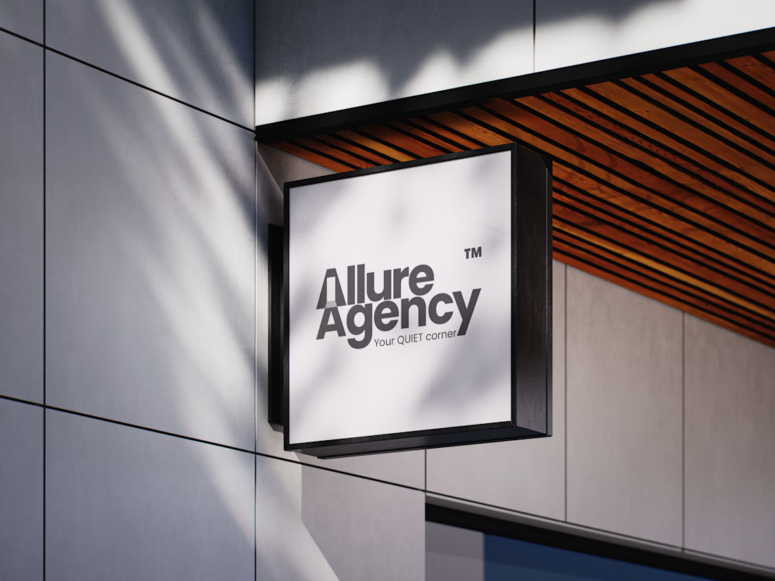
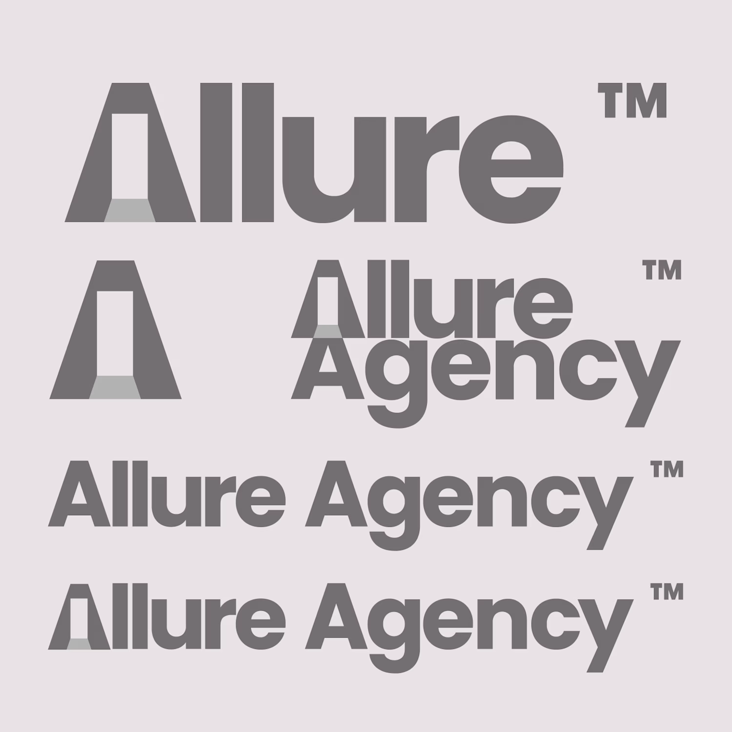
Nothing says mystery quite like a glowing door. So I reshaped the “A” in “Allure” to include one.
From there, I built a colour palette to suit the brand and applied it to the logo. That became the primary logo.
The secondary logo
For the secondary mark, I wanted to bring both A’s together again. That’s where it clicked: the “A” in “Agency” could be a shadow projected from the door. One shape, two letters, and the whole story in a single mark.
What’s next
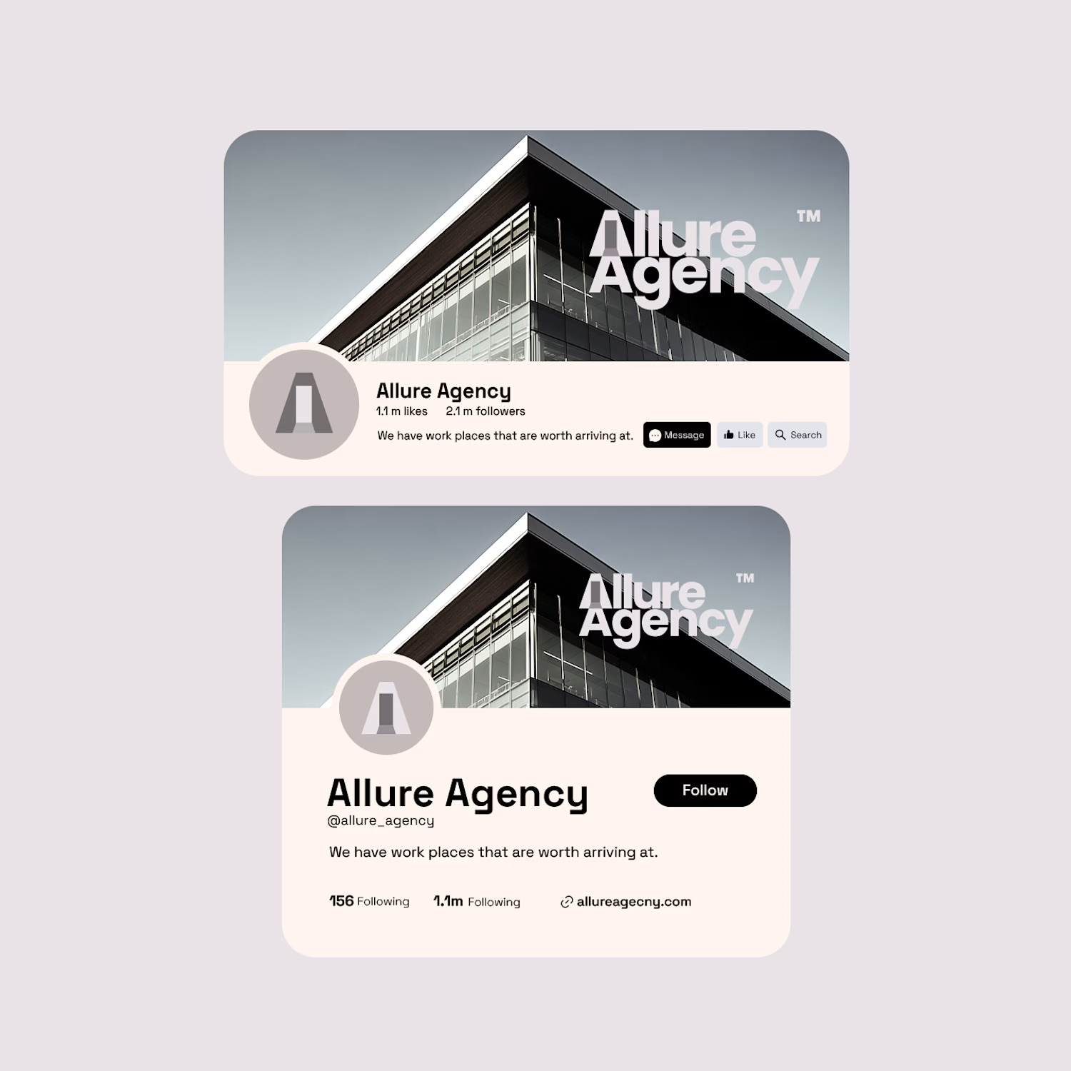
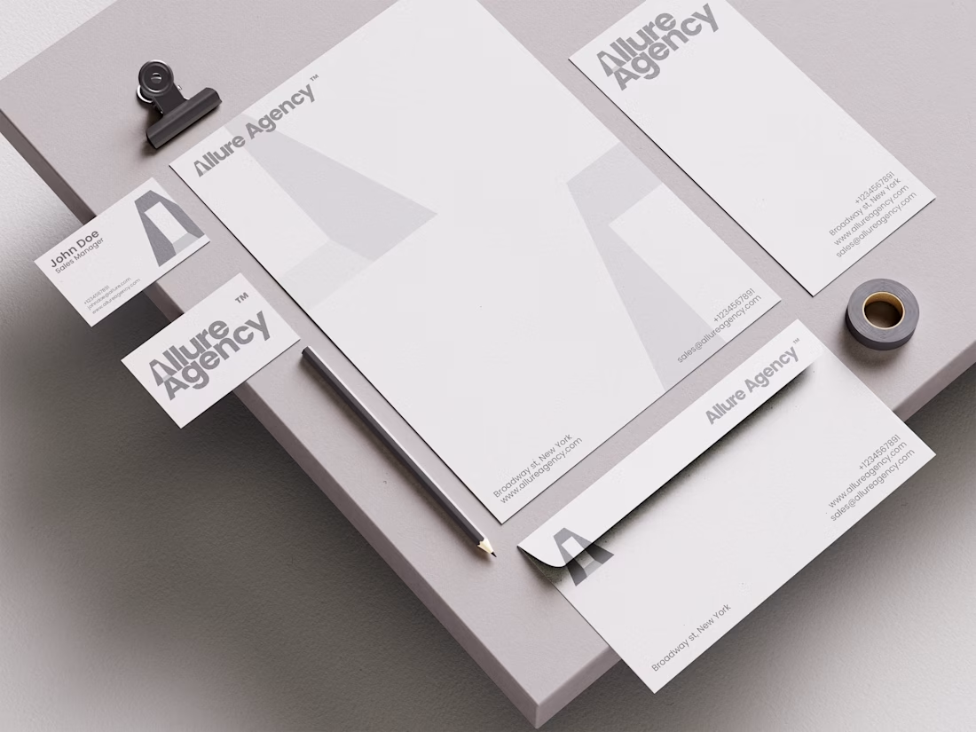
The logo is nearly done, so I’m moving on to bringing the brand to life. I’ll build mockups in the brand colours and develop marketing concepts that capture Allure’s tone of voice and how the brand would want to be seen.


The network for creativity
Join 1.25M professional creatives like you
Connect with clients, get discovered, and run your business 100% commission-free
Creatives on Contra have earned over $150M and we are just getting started



Related posts


🎉 It’s live! I’ve finally updated my design portfolio:
👉
This space has been a long time coming, a reflection of the stories, systems, and identities I’ve been lucky to shape across wellness, healthcare, community & events!
It’s still evolving (aren’t we all?), and I’ll be adding more projects soon, but I’m excited to finally share a fresh look at my work and creative direction!

Congratulations on the new portfolio, Kajal! The grid of bold reds, magenta and cobalt mockups, with that confident serif G repeating throughout, makes the whole identity feel energetic yet cohesive. What guided the way you sequenced your wellness and healthcare projects?

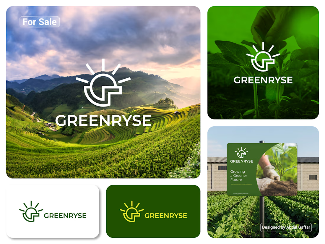
GREENRYSE – G Lettermark, Sun Logo Design, Sustainable Agriculture.
Introducing GREENRYSE, a modern logo concept inspired by nature, agriculture, and the power of growth. The symbol combines a geometric letter G with a rising sun, representing new beginnings, natural energy, and a brighter future for agriculture.
The presentation explores how the logo works across different backgrounds and applications, including agricultural landscapes, product imagery, and outdoor signage. Its clean geometric structure and fresh green color direction create a natural yet professional look.
Designed for agricultural companies, organic farming businesses, crop production, sustainable agriculture, and modern agritech ventures.

Stunning!

Does a brand system need more rules or fewer?
Norr & Co. taught me fewer, but unbreakable ones. Two things never change. Everything else is allowed to get weird.
How fast can you tell a brand idea is weak?
Mine went flat the moment I tried it on a bakery and a late-night bar at the same time. Test your idea on your two most different cases first.