The network for creativity
Join 1.25M professional creatives like you
Connect with clients, get discovered, and run your business 100% commission-free
Creatives on Contra have earned over $150M and we are just getting started
Back to feedPost

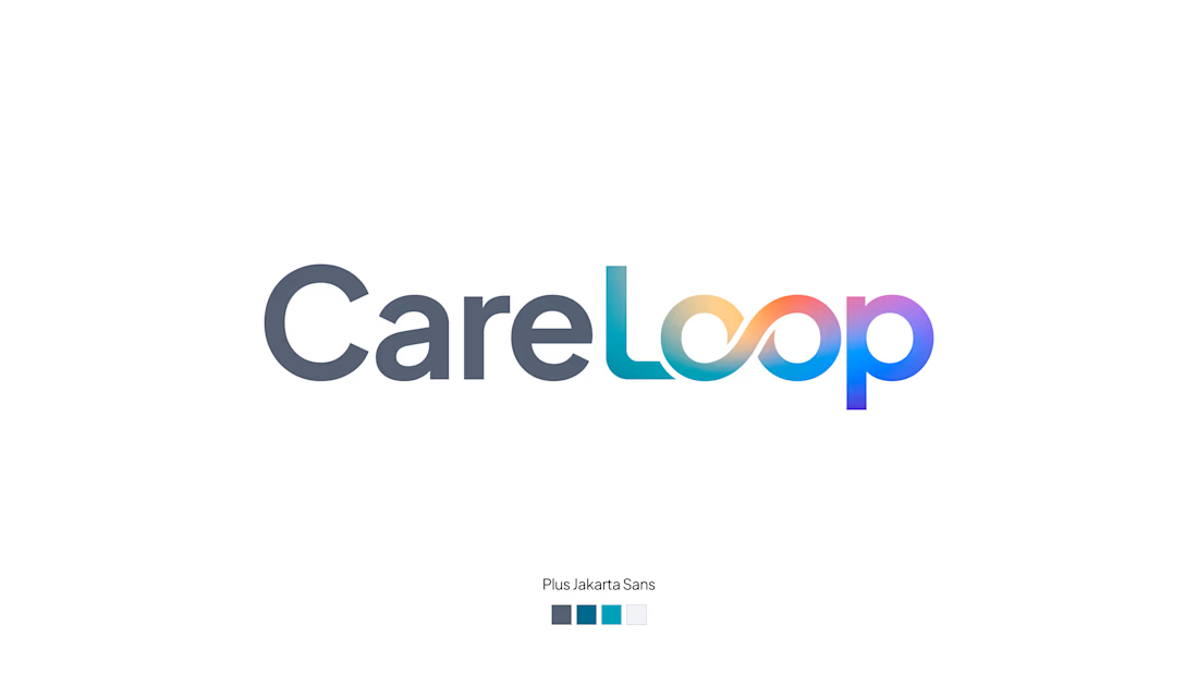
I'm building CareLoop, a health app that connects uninsured and under-insured people to vital resources like clinics, grants, and transit. As a fun side project to inspire I put together a quick logo concept.
Typeface: Plus Jakarta Sans (Modern, clean, friendly)
"Care": Cool gray (Stable, secure)
"Loop": Rainbow mesh gradient (Connecting diverse resources into a unified spectrum)
Does the logo feel trustworthy and welcoming for a healthcare app?
Does the gradient successfully communicate connection and inclusivity?How does it scale down to a small mobile app icon?
Would love your thoughts! 😊

The network for creativity
Join 1.25M professional creatives like you
Connect with clients, get discovered, and run your business 100% commission-free
Creatives on Contra have earned over $150M and we are just getting started
Trending
retrofuturism
Share your favorite designs from the past exploring the distant future. Or your own take on the aesthetic 🚀
halftone
Dots. Texture. Grain. Let's see your designs using the halftone technique.

Midjourney
Creatives are showing off what they're making with Midjourney.
colorgrade
Video editors sound off: How do you enhance the mood of your video in color grading?





Related posts

Who doesn’t love a brand mascot?
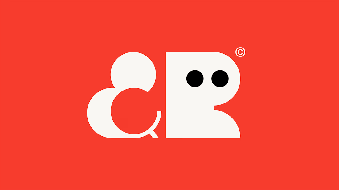
For BD&R, the mascot came from the abbreviated letterforms we designed, but the idea and name itself came from the story of how the founders first met through business.
That’s why I never start a project thinking about what the logo should look like.
I ask questions. How did you meet? Why did you start? What makes you different? What stories have shaped the business?
Because without that context, you’re designing on assumptions. And assumptions usually lead to work that blends in.
My discovery process is personal to every founder we work with. The process might be similar, but what we uncover never is.
Sometimes the best ideas are already sitting inside the business. You just have to discover them.

Great work


Wow! It's amazing

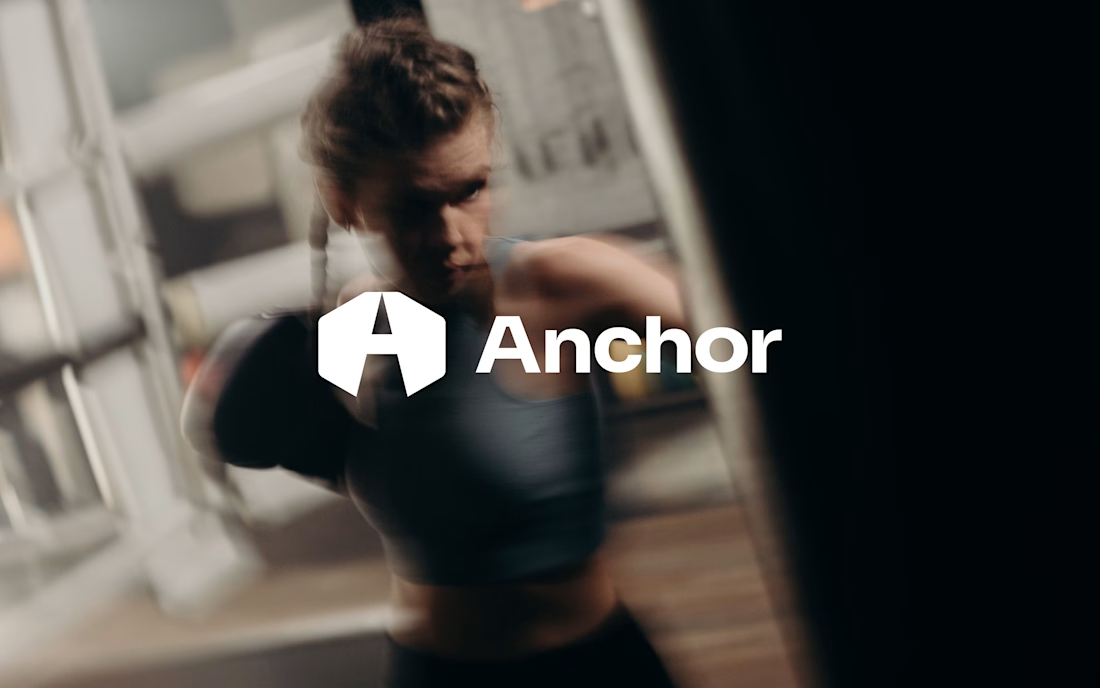
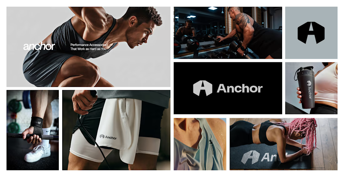
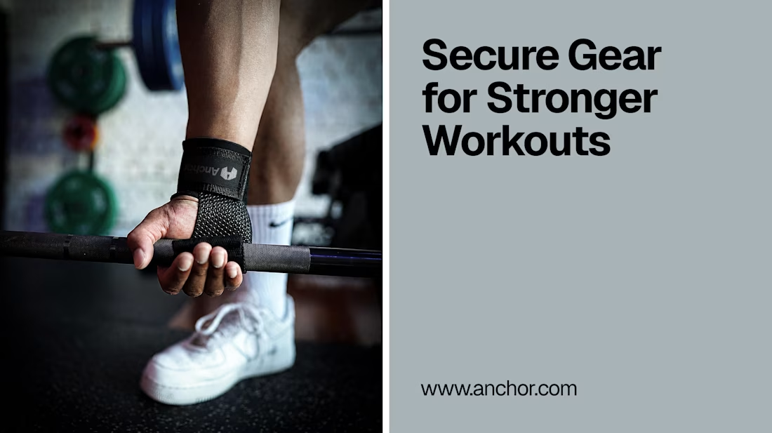
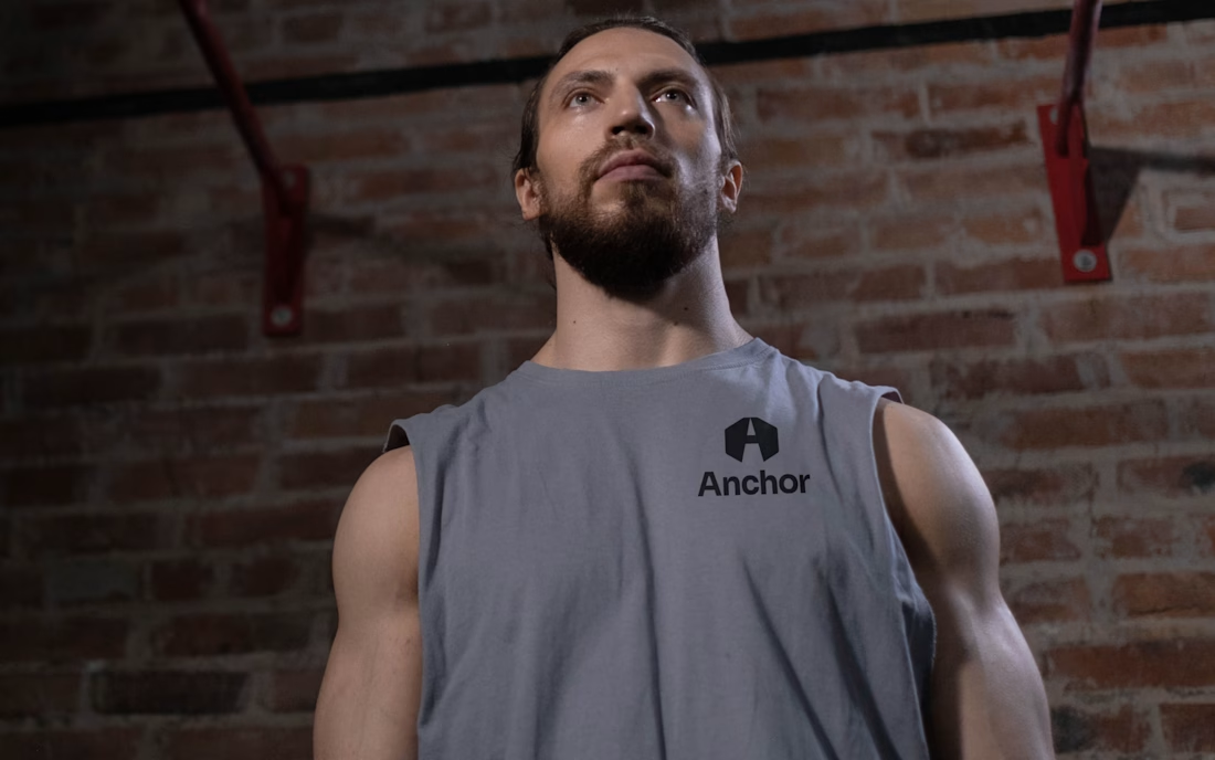
Introducing Anchor - a bold fitness brand identity built for people who train with purpose. From performance apparel and lifting accessories to powerful campaign visuals, every detail is designed to move with strength, focus, and confidence.
A complete branding concept for a modern fitness lifestyle brand.
#BrandIdentity #FitnessBranding #SportswearDesign #LogoDesign #BrandDesign #CreativeDirection #GraphicDesign