The network for creativity
Join 1.25M professional creatives like you
Connect with clients, get discovered, and run your business 100% commission-free
Creatives on Contra have earned over $150M and we are just getting started
Back to feedPost

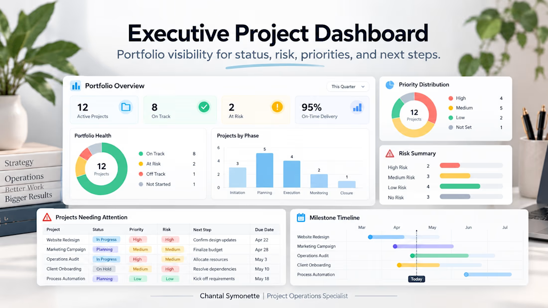
A leadership-focused dashboard built to provide a clear view of portfolio health. It highlights project status, risk, priorities, milestones, and projects needing attention so decision-makers can quickly identify where action is required.
Business Workflow AutomationOperations ManagementProgram ManagementGoogle SheetsMicrosoft ExcelSmartsheet


The network for creativity
Join 1.25M professional creatives like you
Connect with clients, get discovered, and run your business 100% commission-free
Creatives on Contra have earned over $150M and we are just getting started






Related posts

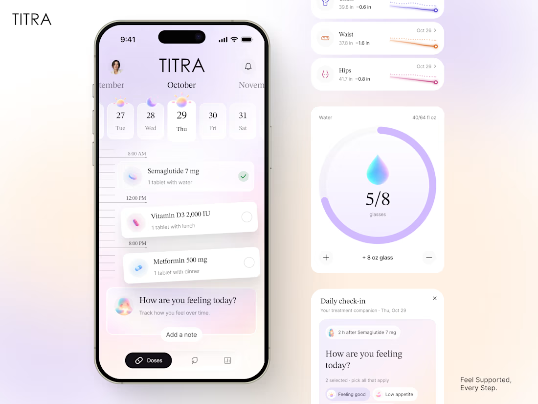
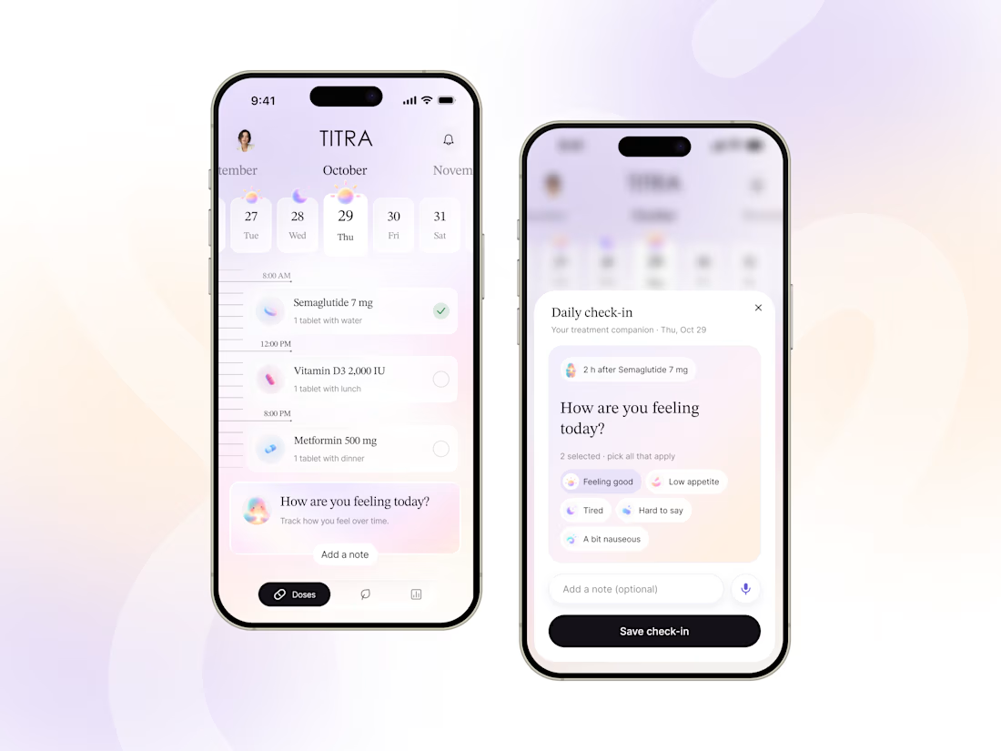
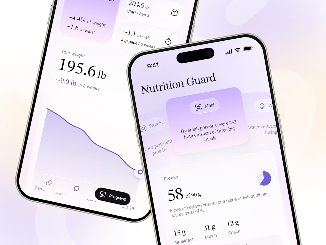
Treatment plans are clear when they’re explained by a doctor. The harder part can be following the routine day after day: remembering doses, keeping track of how you feel, and noticing progress that may not show up quickly on the scale.
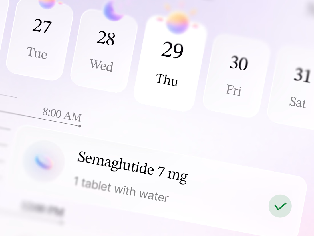
TITRA is a self-initiated treatment companion app concept for people following a plan prescribed by their doctor. It brings doses into one timeline, offers a simple way to log how you feel, and helps track nutrition and longer-term progress.
The design aims to make health tracking feel calm and human, rather than clinical or childish. Soft light, serif headlines, and generous spacing support a thoughtful experience across the app.
TITRA doesn’t change treatment or provide medical advice. All data shown is fictional. The concept draws on our experience designing real telehealth products.


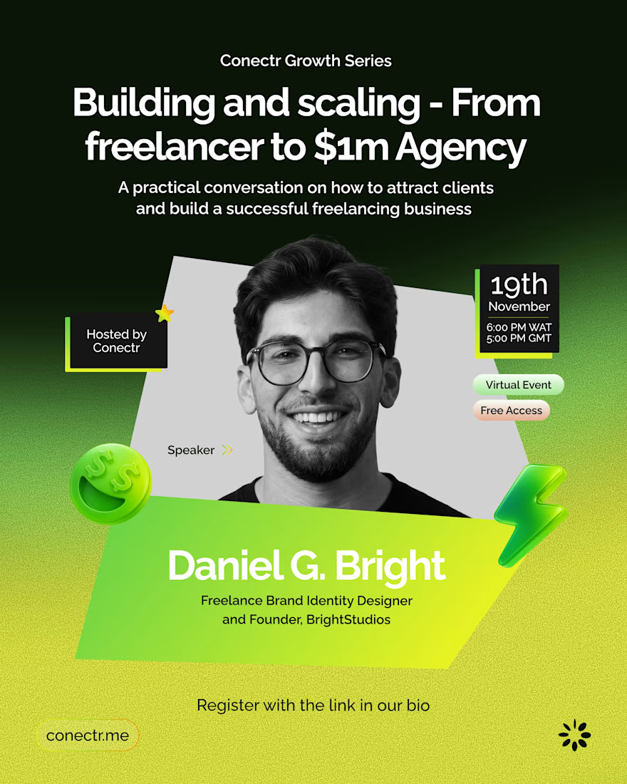
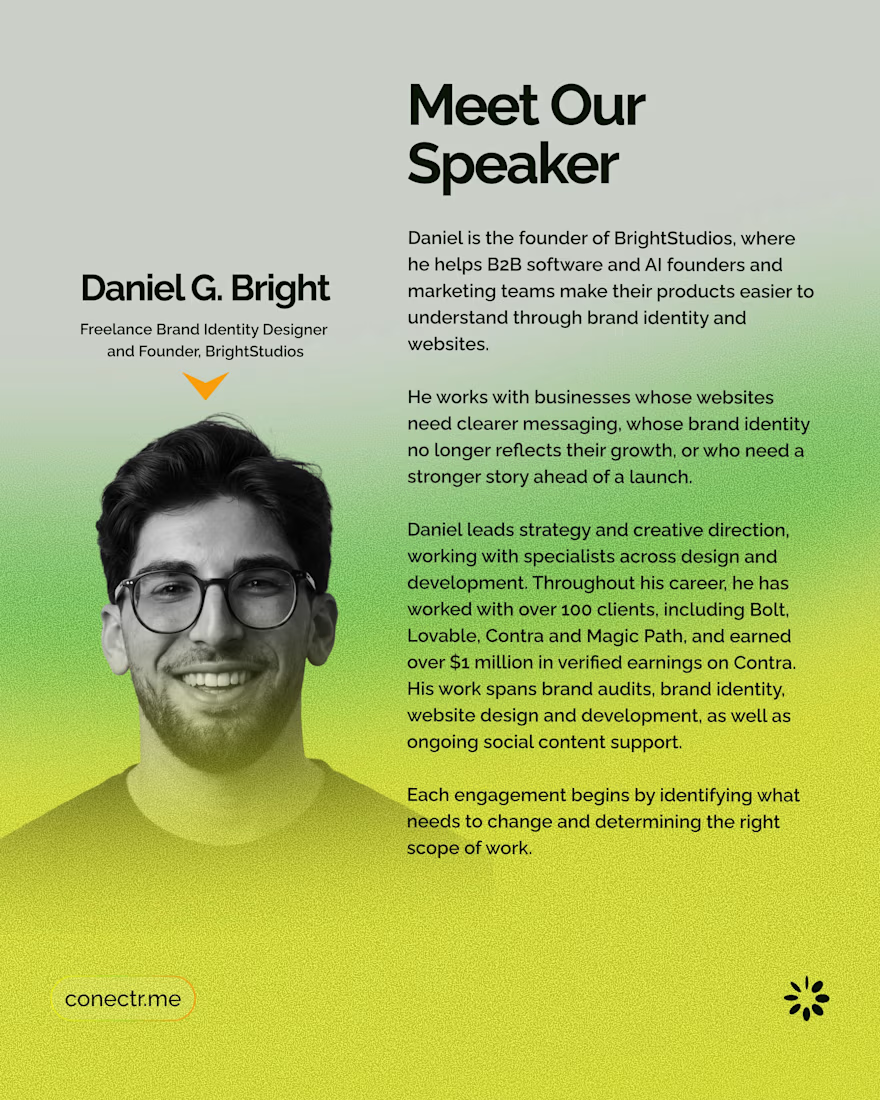
I'm doing an online webinar tomorrow with Conectr.
It's about getting clients and turning freelancing into an actual business. 100+ career clients and $1M+ earned on Contra later, I've got plenty of stuff that worked and plenty that didn't 😅
If you're a designer or freelancer trying to grow, come hang out.
Thursday, 12 PM ET
https://conectr.me/e/building-and-scaling-from-freelancer-to-1m-agency-rn0

Well done.

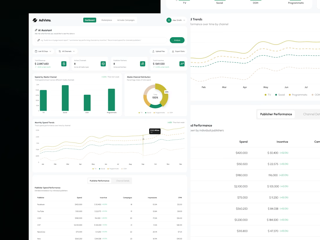
Your dashboard shouldn't need a dashboard to explain it. 👀
Meet AdVisa, an affiliate analytics concept built around clarity, clean charts, and smarter data exploration.
Here's the design breakdown. 🧵
#DashboardDesign #SaaSDesign #UIUX #DataVisualization
(1/5)
Less noise. More insights. 📊
I organized revenue, spending trends, and campaign metrics into a clean dashboard that makes important numbers easier to scan.
Because the best analytics experience helps you find answers, not just data.
(2/5)