The network for creativity
Join 1.25M professional creatives like you
Connect with clients, get discovered, and run your business 100% commission-free
Creatives on Contra have earned over $150M and we are just getting started

The network for creativity
Join 1.25M professional creatives like you
Connect with clients, get discovered, and run your business 100% commission-free
Creatives on Contra have earned over $150M and we are just getting started
Trending
retrofuturism
Share your favorite designs from the past exploring the distant future. Or your own take on the aesthetic 🚀
halftone
Dots. Texture. Grain. Let's see your designs using the halftone technique.

Midjourney
Creatives are showing off what they're making with Midjourney.
colorgrade
Video editors sound off: How do you enhance the mood of your video in color grading?
Related posts


I've Never Seen Such a Mr. Perfectionist.
Your Designs Always Out of The Box 🔥

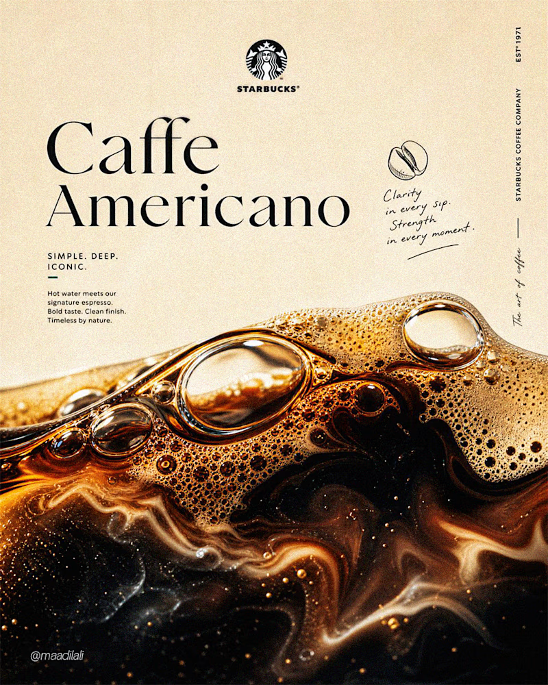
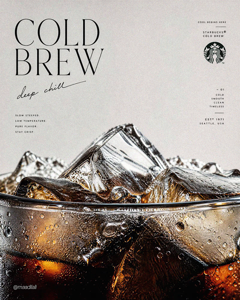
1971 - VIntage Starbucks Corporation Inc.
What do you think! Which one do you like more? 🔥
8 votes
Ends in 16h

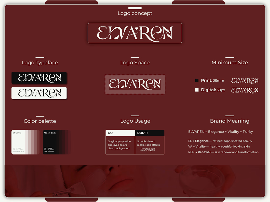
Title: Redefining Beauty Through Purposeful Identity, "ELVAREN" Skincare ✨
Most skincare brands try to look good. Great skincare brands stand for something deeper.
When creating the visual identity for ELVAREN, the goal wasn't just aesthetics, it was about translating pure clinical care and elegance into a timeless brand system. 🌿
The Strategic Foundation Behind the Design:
EL (Elegance): Refined, high-end typography crafted for visual calm.
VA (Vitality): Clean structural spacing reflecting fresh, youthful skin.
REN (Renewal): Minimalist aesthetics aligned with pure transformation.
From modern packaging hierarchy to cohesive typography, every detail was carefully engineered to build instant consumer trust and luxury shelf presence. 🧴✨
💡 Designers & Founders: What’s the first thing you notice when choosing a premium skincare product? The bottle design or the clarity of the label? Let’s chat in the comments! 👇
📩 Need a strategic, trust-building visual identity for your brand?
Let’s collaborate and bring your vision to life. DMs are open! 💬
Portfolio: https://dribbble.com/artoryxrifat
#BrandDesign #VisualIdentity #SkincareBranding #LogoDesigner #PackagingDesign #BrandingStrategy #MinimalistDesign #LuxuryBranding #BrandIdentity #GraphicDesign #PortfolioShowcase #BrandDesigner #ElvarenBeauty