The network for creativity
Join 1.25M professional creatives like you
Connect with clients, get discovered, and run your business 100% commission-free
Creatives on Contra have earned over $150M and we are just getting started
Back to feedPost
Taste Test

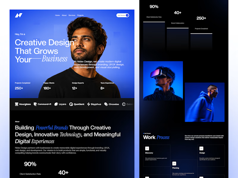
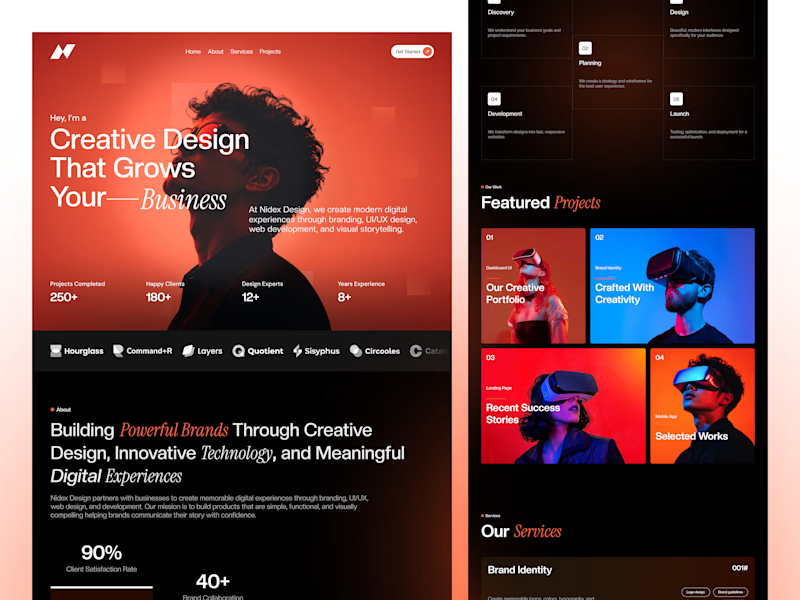
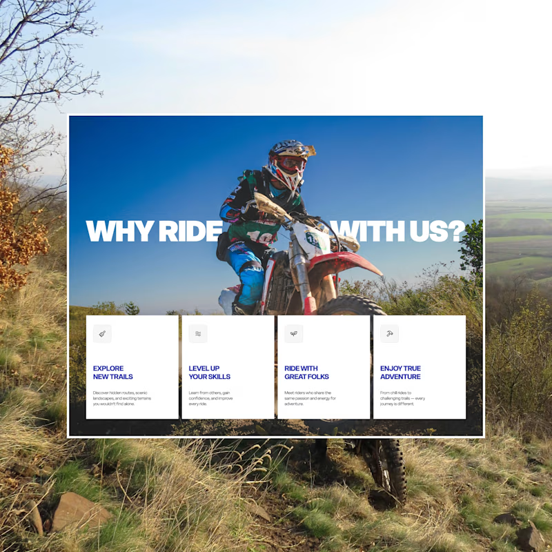
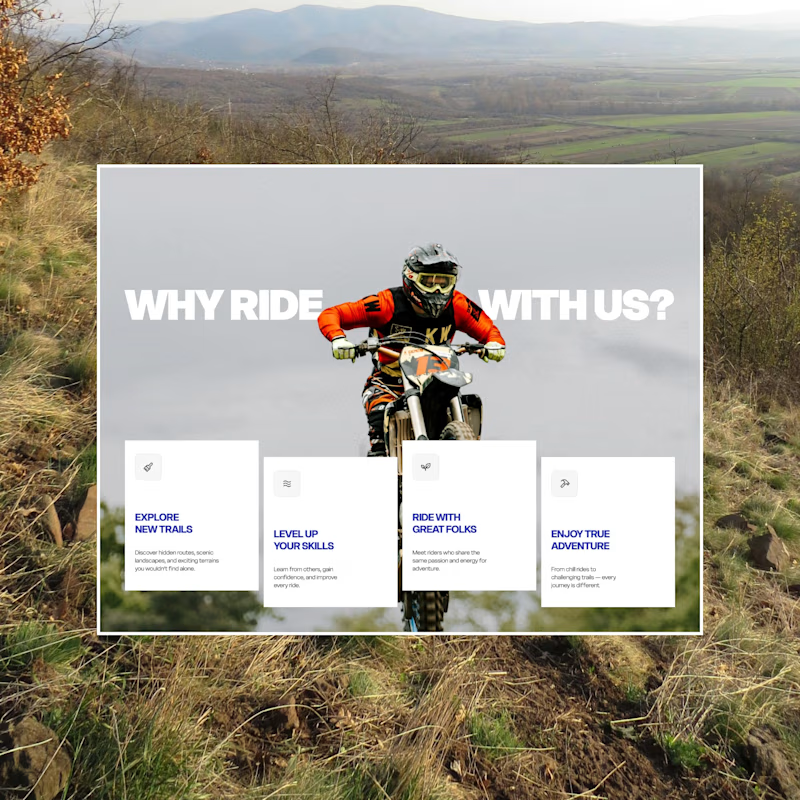
I explored two color directions for this creative agency landing page.
🔵 Blue – Clean, modern, and professional.
🔴 Red – Bold, energetic, and eye-catching.
Which one would you choose for a creative agency website?
💙 Blue
❤️ Red
Vote below and let me know why! 👇
4 voted
50%
4 voted
50%
8 votes
Closed

All the right decisions made here.
The network for creativity
Join 1.25M professional creatives like you
Connect with clients, get discovered, and run your business 100% commission-free
Creatives on Contra have earned over $150M and we are just getting started
Trending
retrofuturism
Share your favorite designs from the past exploring the distant future. Or your own take on the aesthetic 🚀
halftone
Dots. Texture. Grain. Let's see your designs using the halftone technique.

Midjourney
Creatives are showing off what they're making with Midjourney.
colorgrade
Video editors sound off: How do you enhance the mood of your video in color grading?


Related posts

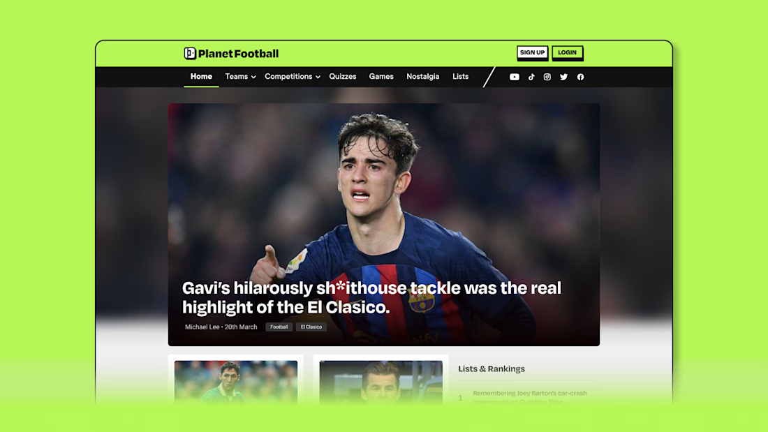
Planet Football Rebrand ⚽️
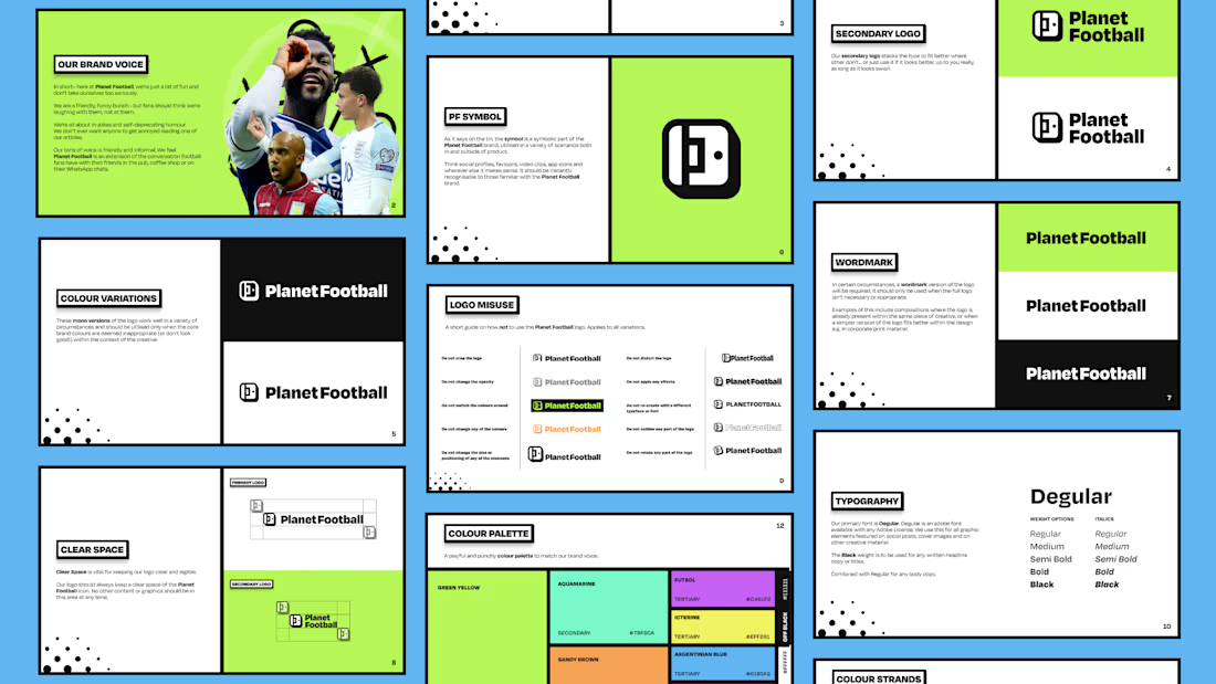
Planet Football is a celebration of everything the game has to offer beyond the scoreline. While traditional football media focuses on match reports and opinion-led coverage, Planet Football highlights the humour, nostalgia and culture of the sport, capturing the moments that make us love our beautiful game.
I led the rebrand and creative direction to help reposition Planet Football for a younger, more social-first audience. The goal was to rediscover the brand’s playful identity and evolve it into a more engaging and distinctive presence across digital platforms.
The identity needed to feel energetic, expressive and unmistakably football, while standing apart from more conventional news outlets. It had to support fast-moving social content while maintaining a clear and recognisable brand system across all touchpoints.
The final identity introduces a refreshed visual system, animation style and content direction designed for social-first storytelling. Supported by a new TikTok and Reels strategy and a redesigned website, the rebrand transforms Planet Football into a more dynamic and engaging brand built for modern football audiences.



The colors are so good!

The hero sets the tone for the whole page.
Exploring a couple of ways to get it right.
38 voted
68%
18 voted
32%
56 votes
Closed

I can go with A

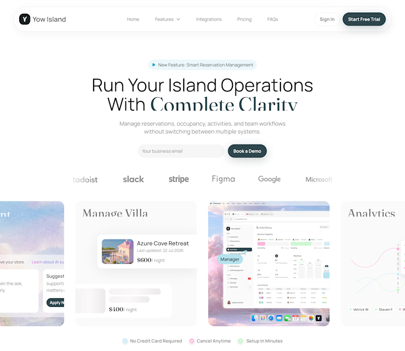
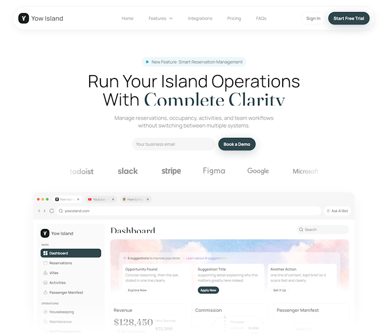
I've been exploring two hero directions for Yow Island, an island operations management platform.
- Version A uses multiple floating product previews to highlight the platform’s range of features and create a more dynamic first impression.
- Version B focuses on one large dashboard preview for a cleaner, more product-focused experience.
Same message, different visual approach - testing which direction communicates the product more clearly.
Which one would you choose: A or B?
4 voted
80%
1 voted
20%
5 votes
Closed

Cool work !