The network for creativity
Join 1.25M professional creatives like you
Connect with clients, get discovered, and run your business 100% commission-free
Creatives on Contra have earned over $150M and we are just getting started
Back to feedPost
✨ HopeBridge Foundation | Compassionate Nonprofit UI
🧡 Impact-Driven Social Aesthetic: A welcoming and professional digital experience crafted to connect communities and amplify humanitarian missions through authentic, human-centric visual storytelling.
⚓ Trust-Building Contrast Palette: A thoughtful color system blending deep navy, vibrant coral, and clean warm white to balance emotional resonance with corporate accountability.
🎯 Donation-Optimized Architecture: A conversion-focused layout featuring persistent, high-visibility "Make A Donate" CTAs and streamlined user journeys engineered to maximize contributions and support.
🤝 Grassroots Program Showcases: Dedicated, modular content sections designed to highlight key community pillars—including healthcare lifelines, nutritional security, and education funds.
📸 Real-Field Narrative Grid: A clean visual hierarchy optimized for sharing real survival stories, grassroots data metrics, and live video documentation as displayed in HopeBridge Foundation 01.jpg.
📱 Accessibility-First Layout: A highly organized and scalable responsive framework built to ensure a flawless browsing experience for donors, volunteers, and global advocates across all devices.
🛠 Figma | UI/UX Design | Non-Profit Web UI | Social Impact Branding | Donation Flow
📂 View full project: https://www.behance.net/abdullahuiuxdesigner
UI Design | UX Design | Figma


The network for creativity
Join 1.25M professional creatives like you
Connect with clients, get discovered, and run your business 100% commission-free
Creatives on Contra have earned over $150M and we are just getting started



Related posts

If your members pay premium. Your website should look like it.
Animation really changes the way you look at a website.
The premium is in the details. 🤌
Hero section with animation for a Tennis Sports Club Membership Platform.
Full landing page WIP; gonna share it very soon.


The animation adds a lot to the premium feel for a tennis club membership platform. Looking forward to seeing the full landing page.

Bold Illustrations make an instant impact
See full case study here for the branding evolution and website redesign for a B2B SaaS startup!


I loved these colours. Looking Stunning 😍

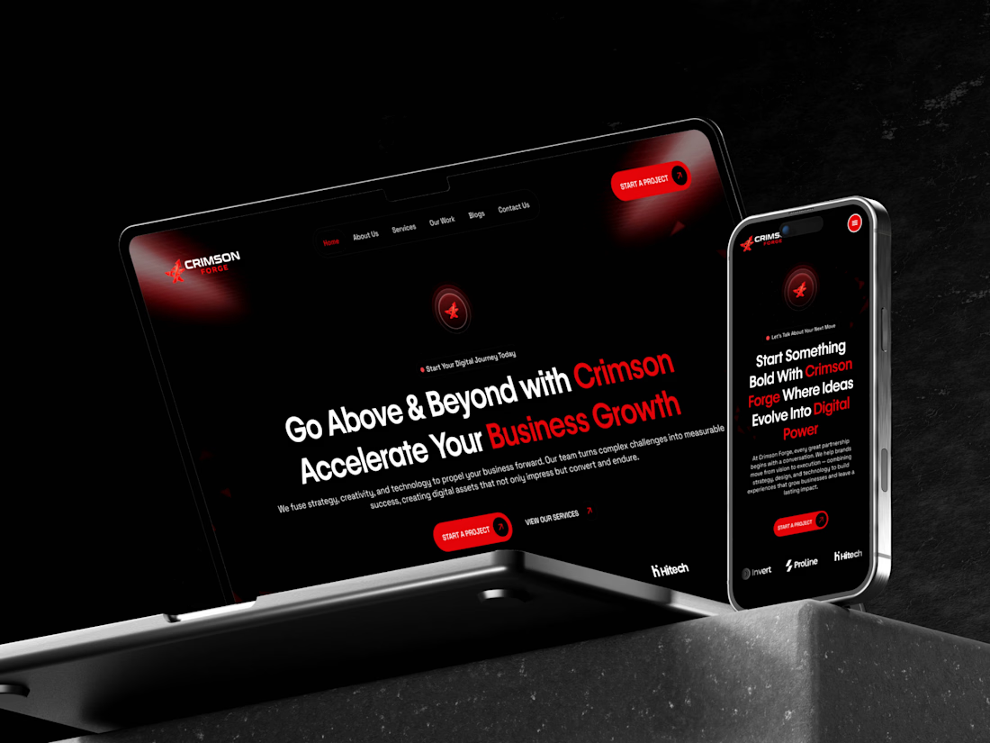
🎬 Crimson Forge | Website Design Walkthrough
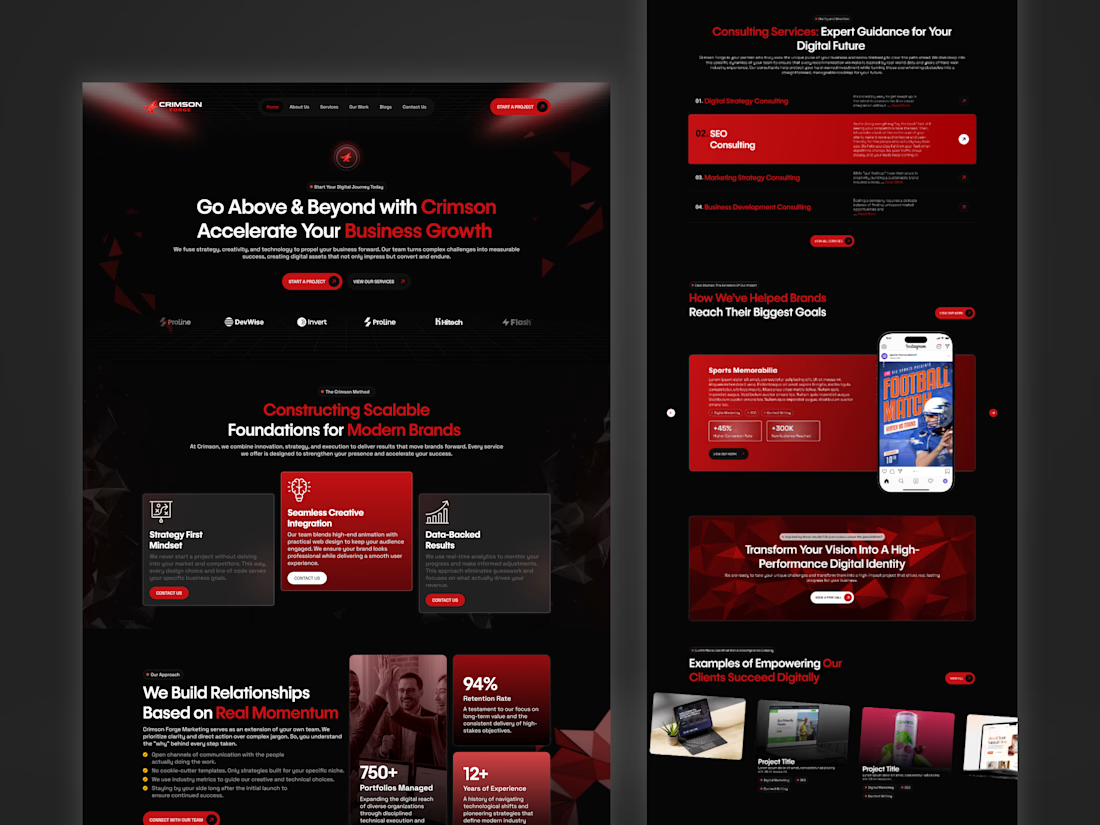
A closer look at Crimson Forge, a digital agency website concept designed to bring bold branding and strategic web design together.
From the striking crimson-and-black visual identity to the service sections, project showcases, testimonials, and contact experience, every section is designed to create a cohesive digital journey.
The walkthrough highlights the overall layout, visual consistency, and flow of the website from top to bottom.
🛠 Figma | Website UI | Visual Design | Web Experience
📂 Explore more of my work: https://www.behance.net/abdullahuiuxdesigner
#WebDesign #UIDesign #WebsiteShowcase