The network for creativity
Join 1.25M professional creatives like you
Connect with clients, get discovered, and run your business 100% commission-free
Creatives on Contra have earned over $150M and we are just getting started
Back to feedPost
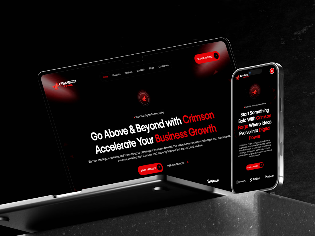
🎬 Crimson Forge | Website Design Walkthrough
A closer look at Crimson Forge, a digital agency website concept designed to bring bold branding and strategic web design together.
From the striking crimson-and-black visual identity to the service sections, project showcases, testimonials, and contact experience, every section is designed to create a cohesive digital journey.
The walkthrough highlights the overall layout, visual consistency, and flow of the website from top to bottom.
🛠 Figma | Website UI | Visual Design | Web Experience
📂 Explore more of my work: https://www.behance.net/abdullahuiuxdesigner
#WebDesign #UIDesign #WebsiteShowcase


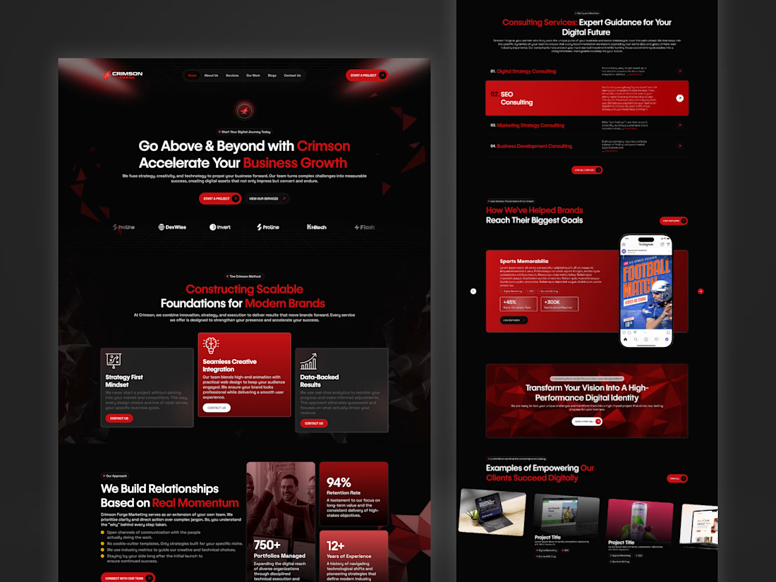


Thanks for the feedback! That makes sense. Some of the red cards are actually showing the active or hover states, but I agree that keeping the brightest red for the main CTA buttons could help them stand out more.
The network for creativity
Join 1.25M professional creatives like you
Connect with clients, get discovered, and run your business 100% commission-free
Creatives on Contra have earned over $150M and we are just getting started



Related posts

i built a semi-3D interactive website with @Base44 for a Creative Production Studio, called STORM STUDIO,. that drafts 3D Digital unique experience for Brands.
STROM STUDIO specializes indesign, motion, 3D and Technology, working together to turn ambitious ideas into immersive digital experiences.
At STORM STUDIO, We create 3D visual storytelling and interactive web experiences that help brands stand out.
STORM STUDIO - https://stormstudio.base44.app
also, check it out on mobile, to get the full mobile experience
my walkthrough process will be below in my comment section

my walkthrough process
PS; if you opened the STORM STUDIO website on a Mobile phone, Shaking the phone rattles the rubik cubes like a shaken jar.
and,
on PC/DESKTOP, moving the cursor rattles the rubik cubes, also slowly scroll through the home page to have a full experience of the scroll animate effects, etc.
try it out 😊


I finally updated my personal website, and you can actually "dye" your own canvas on it! 🎨
I've been experimenting with how to bring something physical into a digital space. The idea came from my growing interest in natural dyes and traditional textile-making, which I've been exploring a lot lately.
I designed and built the whole experience in one day using Figma, Claude and Netlify. It's been pretty exciting to see how AI makes ideas that once felt technically out of reach something I can now experiment with and build on my own.
I'm also open to fractional creative director roles, so if you know a team building something meaningful, I'd love to connect!
Come play with it, and please let me know if you find any bugs 🐛
mya-nguyen.com


dyeing your own canvas on a personal site is such a nice idea. most portfolios just sit there, this one lets you play

MOTIF — From Words to Pixels to Code
What if you could see your dream website before writing a single line of code, then turn that vision into something real?
That's why I built Motif, an AI-powered visual design and website creation studio, built on Base44.
We turn words into pixels. Then we turn those pixels into real HTML and CSS.
Most AI website builders take a prompt and immediately generate a website. You get what the AI decides, and often spend ages prompting, regenerating and fighting to get something that resembles what you originally imagined.
I wanted to change that.
Motif puts visual creativity before code.
You start by describing your idea in plain English. Motif explores different visual directions, generating concepts that let you actually see what's possible before committing to a design.
Once you find something you love, Motif transforms that approved visual into a real, responsive website built with HTML and CSS. Not a flattened image pretending to be a website, but actual editable elements.
And that's where Motif becomes more than an AI generator.
Inside the visual studio, you can select elements, change typography, colours, spacing, imagery and layouts, preview desktop and mobile versions, and refine the design without starting over.
One of my favourite features is Shuffle, which can dramatically reimagine a design's composition and styling, allowing you to explore new creative possibilities without writing another lengthy prompt.
I also wanted people to understand what Motif could do before signing up or waiting for AI generation. So I built a product-focused homepage featuring real application footage, an explainer video and editable sample projects visitors can explore.
Why I built it
I've spent years working across software development, 3D design and interactive experiences, and I've always been fascinated by the gap between having a creative vision and actually bringing it to life.
AI has made building software more accessible, but great design still requires exploration, experimentation and creative control.
I believe AI should expand your imagination, not replace your creativity.
Motif is my attempt to bring those worlds together: the freedom of visual design, the intelligence of AI and the flexibility of real web development.
It's designed for entrepreneurs, developers, designers and anyone who's ever had a great idea but struggled to make it look the way they imagined.
Built with Base44, Motif demonstrates how far a creative application can go beyond traditional no-code tools.
Motif isn't about generating another template. It's about making something unmistakably yours.
Imagine it. Shape it. Make it real.
#Base44Challenge

Great idea, great output Mellis - goated