The network for creativity
Join 1.25M professional creatives like you
Connect with clients, get discovered, and run your business 100% commission-free
Creatives on Contra have earned over $150M and we are just getting started
Back to feedPost
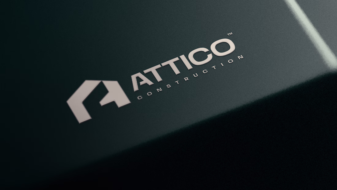
Attico Construction is a UK based renovations company who approached me to redesign their brand into completely something new which would have both of their initials A & C but at the same time should have a strong geometric shape encapsulating an element from their industry.
The real move is in the negative space: the gap between the pillars carries A&C, the brand's own initials, hiding in plain sight. It's the kind of detail clients don't notice until they do, and then they can't stop showing people.
The network for creativity
Join 1.25M professional creatives like you
Connect with clients, get discovered, and run your business 100% commission-free
Creatives on Contra have earned over $150M and we are just getting started
Related posts
In these two visual styles for brand identities, which direction would be your style?
1 voted
33%

2 voted
67%
3 votes
Closed
Lifestyle is fire 🔥
He's cute, smart and addicted to his phone :( here's the mascotte we designed for Brainrot, which we will announce soon!
How did the engagement start for this project? I remember. seeing the founder share on socials about the app. Did you reach out or was it through Contra?
Why overcomplicating your layout kills readability.
Most content-heavy sites fail because they try to show everything at once. Sidebars, badges, related articles, and tiny fonts create cognitive overload. The user gets tired after two paragraphs and leaves.
Good design is about aggressive editing. You need to manage where the eye goes first.
In this layout, the hierarchy does all the work:
• A massive headline sets the mood and context instantly
• Generous white space prevents visual fatigue
• The clean grid ensures the reader actually focuses on the text
We don't need complex decorations to make a web page look expensive. We just need perfect typography and discipline.
Are you building a product or content platform that feels too cluttered? Drop a link below, and I’ll tell you where your users are getting stuck.
Love the color theme!
Trending
Claude
Claude has entered the design space. How are you using Claude Design?
Contra University
Learn from expert creatives how to earn more using next-gen AI tools.
MagicPath
The canvas is infinite, and exploration is becoming the workflow. How are you using MagicPath?
creativeaiflow
Creative AI workflows are evolving. What tools do you use, and what are their strengths and weaknesses?
freelancerlife
Freelancer life is wins, pivots, and everything in between. What’s yours right now?