The network for creativity
Join 1.25M professional creatives like you
Connect with clients, get discovered, and run your business 100% commission-free
Creatives on Contra have earned over $150M and we are just getting started
Back to feedPost

Patagonia FY2025 Sustainability Report Concept
A premium sustainability report presentation inspired by Patagonia's commitment to environmental responsibility and transparent business communication.
This concept explores how ESG reporting, climate initiatives, and corporate storytelling can be transformed into a visually engaging presentation through editorial layouts, strong typography, and clear information hierarchy.
Highlights
Sustainability reporting
ESG storytelling
Data visualization
Editorial presentation design
Corporate communications
Tools
PowerPoint, Photoshop, AI-assisted creative workflow
Independent concept project. Not affiliated with Patagonia.


The network for creativity
Join 1.25M professional creatives like you
Connect with clients, get discovered, and run your business 100% commission-free
Creatives on Contra have earned over $150M and we are just getting started



Related posts

Exploring two different hero directions for a new project.
Same message, two completely different visual approaches.
Which one makes a stronger first impression?
A or B? Curious to hear your thoughts!

36 voted
90%
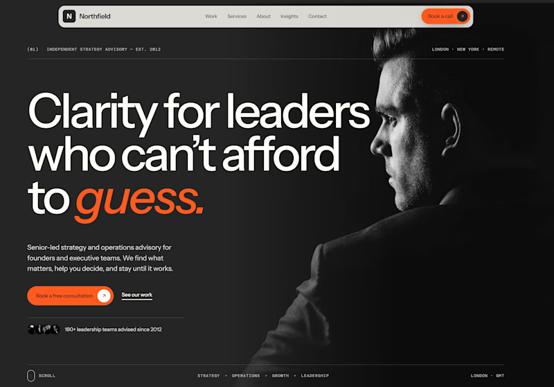
4 voted
10%
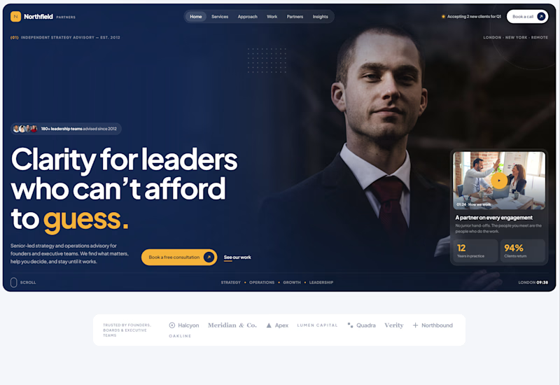
40 votes
Closed

Both are strong. I lean towards the dark version, because the orange accent on the italic "guess." pops and the profile portrait gives it a more editorial, confident feel. The navy one reads a bit more corporate, which could suit a more conservative audience. Nice exploration!

Two directions. One NFT marketplace.
Which visual direction would you choose?
🖤 A — Dark & Futuristic
🤍 B — Bright & Minimal
Both explore the future of Web3, but with completely different visual identities.
Drop your vote in the comments: A or B?
#UIUXDesign #WebDesign #NFT #Web3 #ProductDesign

10 voted
29%
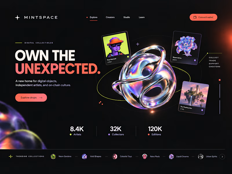
25 voted
71%
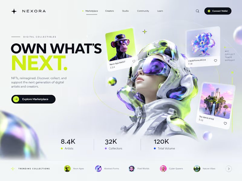
35 votes
Closed

Strong design, well done


VELORA — Skincare E-commerce Website Design
An e-commerce website design for a skincare brand, focused on visual identity, product presentation, and customer experience.
The design brings together bold typography, warm color tones, and product-focused imagery to create a distinctive digital storefront.
Services: UI/UX Design, E-commerce Website Design, Visual Design, Motion Design
Ideal for: Skincare brands, beauty businesses, cosmetics startups, and online retailers.


Nice work!