The network for creativity
Join 1.25M professional creatives like you
Connect with clients, get discovered, and run your business 100% commission-free
Creatives on Contra have earned over $150M and we are just getting started
Back to feedPost

Welcome email concept designed for a beverage brand to introduce new subscribers to the brand, communicate its value proposition, and encourage first-time purchases through strategic email design and clear calls to action.


The network for creativity
Join 1.25M professional creatives like you
Connect with clients, get discovered, and run your business 100% commission-free
Creatives on Contra have earned over $150M and we are just getting started




Related posts

Upcoming card design for a Picnic App 🥞🧺🍎
Do we like the idea of images or predefined avatars more?:)
20 voted
83%
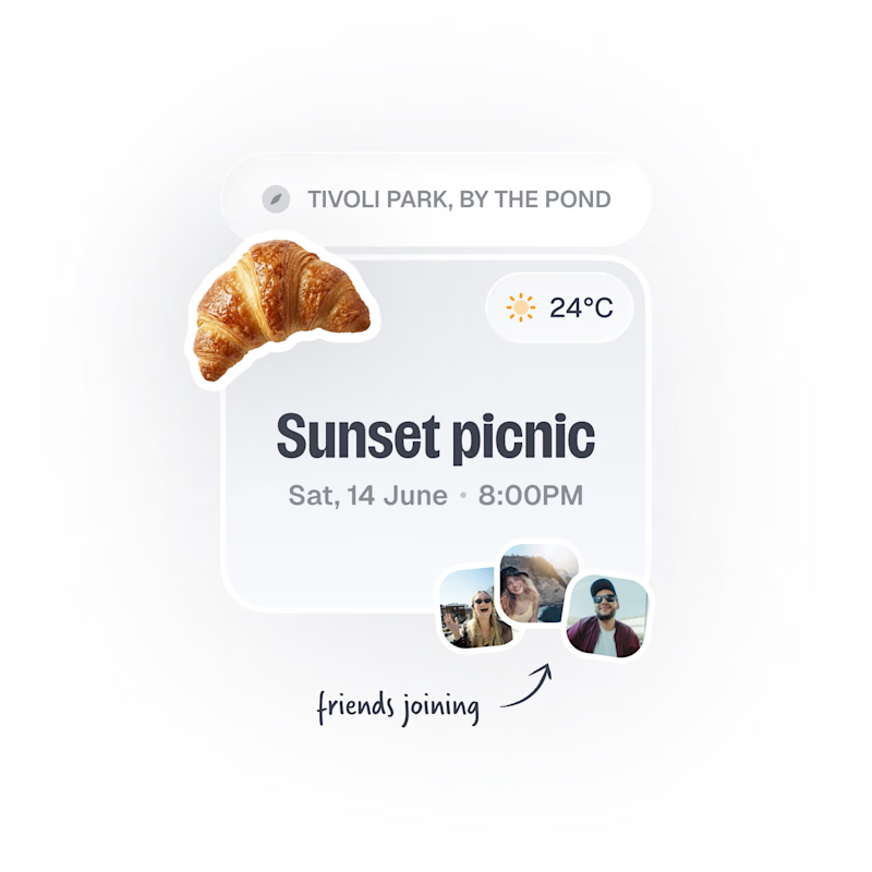
4 voted
17%
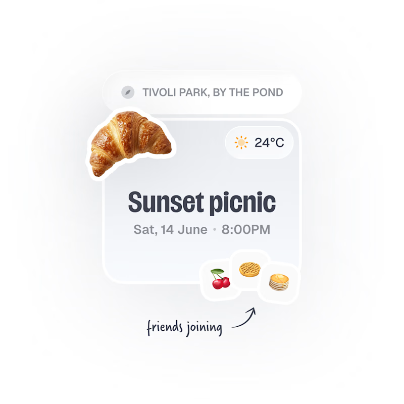
24 votes
Closed

Images, with the fruit avatars as the fallback for anyone without a photo. Faces are how you spot your friends at a glance, and the croissant already gives the card plenty of personality.

Need a second pair of eyes 👀
I'm designing the online store for FizzPop, a craft soda brand: all-natural sodas, sparkling waters and botanical tonics.
Flower Fizz(A): eggshell, tiger orange and deep ultramarine, with flower shapes and stacked colour swatches for the flavours
Corner Shop(B): lime, soft blues and navy, editorial layout with a giant wordmark and menu-style flavour tiles
38 voted
44%
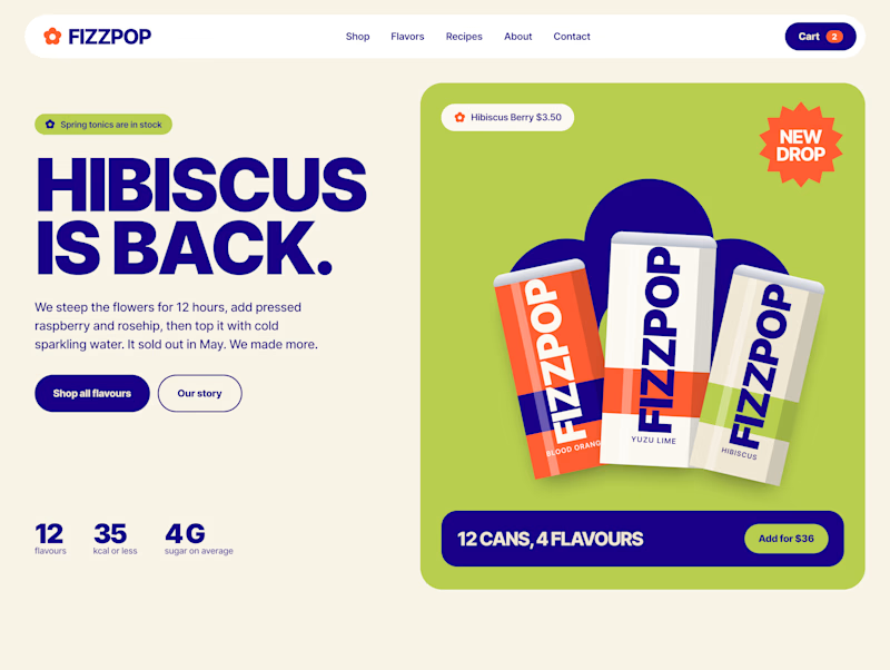
48 voted
56%
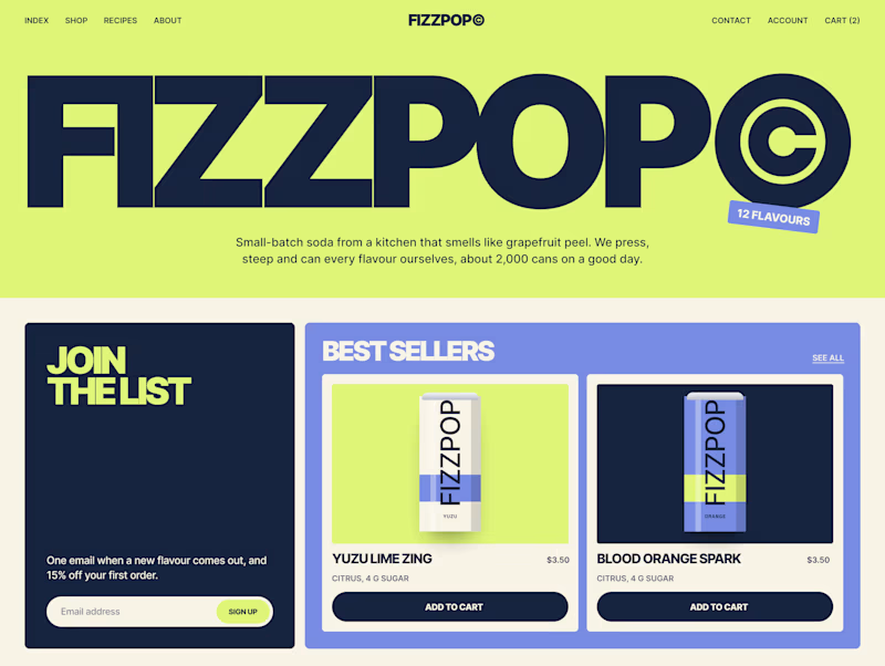
86 votes
Closed


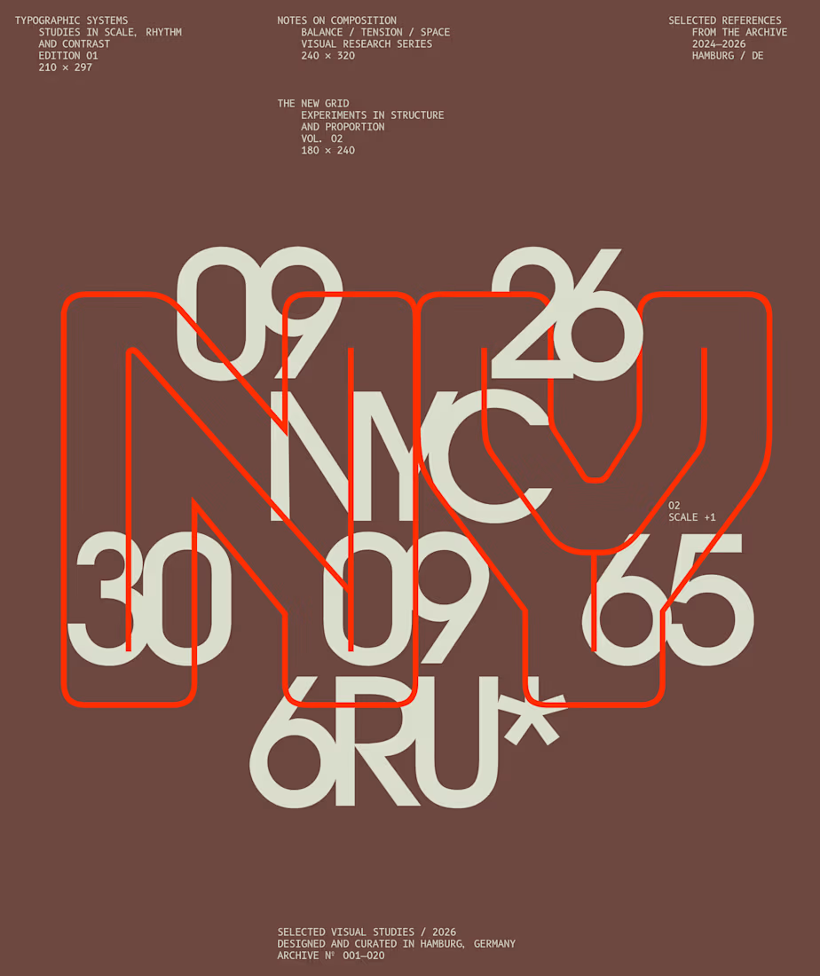
I designed these typographic layouts as part of my ongoing visual series on scale, grid and rhythm
↳ Master typography & layout - The foundation of timeless web design. Join 350+ designers inside my 13-hour online course https://typomonday.com/course



Beautiful wo