The network for creativity
Join 1.25M professional creatives like you
Connect with clients, get discovered, and run your business 100% commission-free
Creatives on Contra have earned over $150M and we are just getting started
Back to feedPost

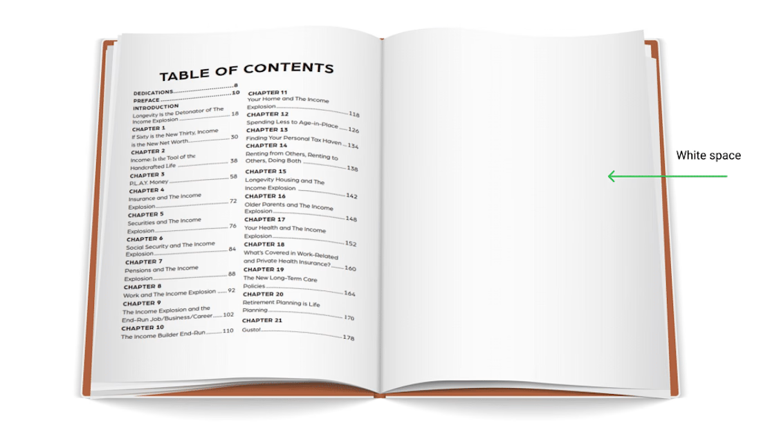
Book Interior Formatting - Table of Contents Design


The network for creativity
Join 1.25M professional creatives like you
Connect with clients, get discovered, and run your business 100% commission-free
Creatives on Contra have earned over $150M and we are just getting started







Related posts

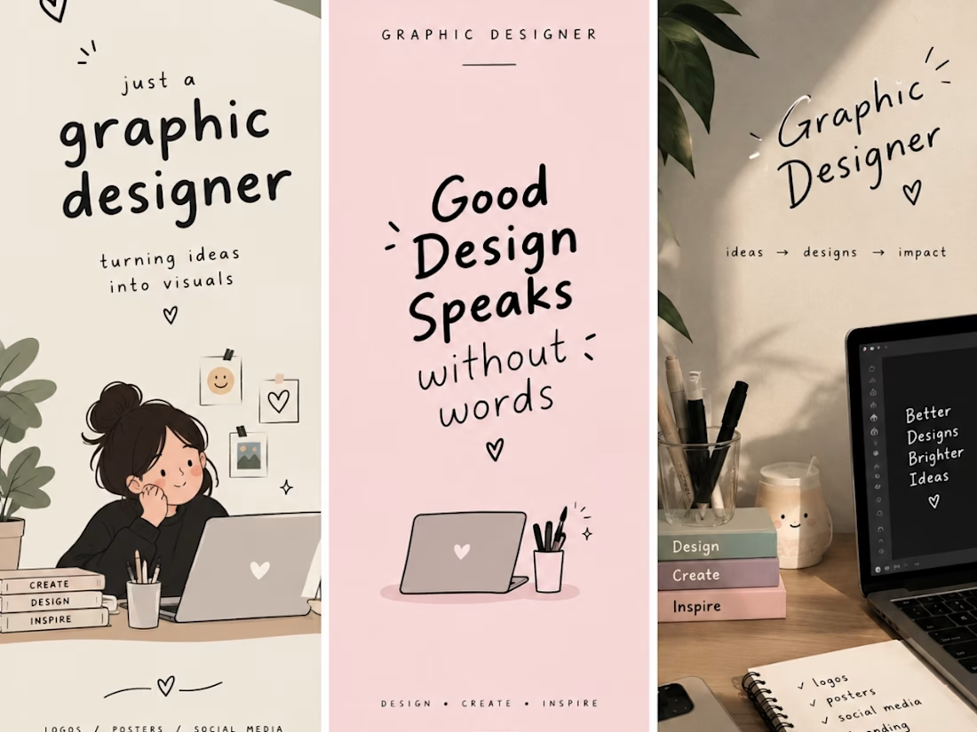
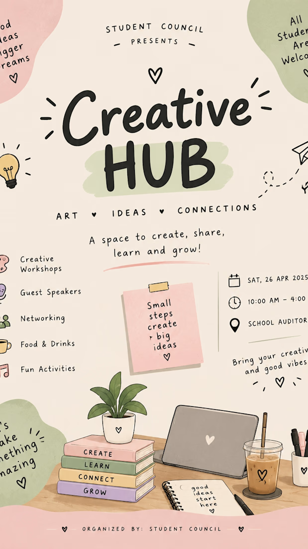
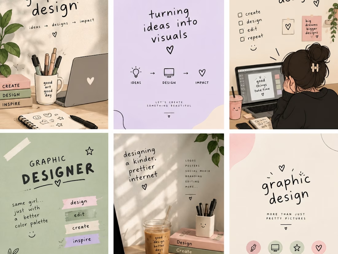
I am a creative graphic designer passionate about turning ideas into eye-catching designs. I create unique and professional designs, including logos, social media posts, business cards, posters, banners, and branding materials. My goal is to bring your vision to life through creativity, quality, and attention to detail. I believe every design tells a story, and I am here to make your brand stand out with beautiful and meaningful visuals. ✨🎨


Proud to share my latest completed design package, curated specifically for Contemporary Romance, New Adult, or Literary Fiction authors.
When designing this, my goal was to blend evocative, painterly textures with highly clean modern typography to capture themes of nostalgia, emotional depth, and memories. To give self-published authors the ultimate launch toolkit, I expanded this full-print wrap into a cohesive branding bundle.
Share your thoughts!
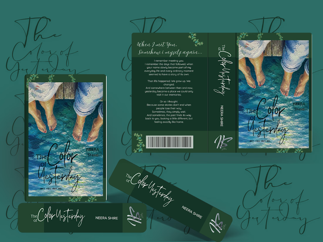

Blending painterly textures with clean typography is a smart move for New Adult covers. It helps balance the emotional weight of the story with the modern aesthetic that performs well in digital storefronts.

Some more experimental futuristic typography story design for Bar LOQA.


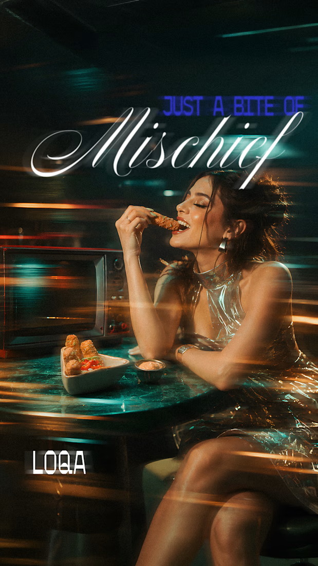
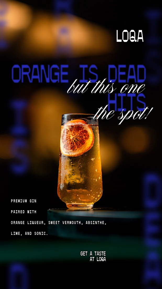
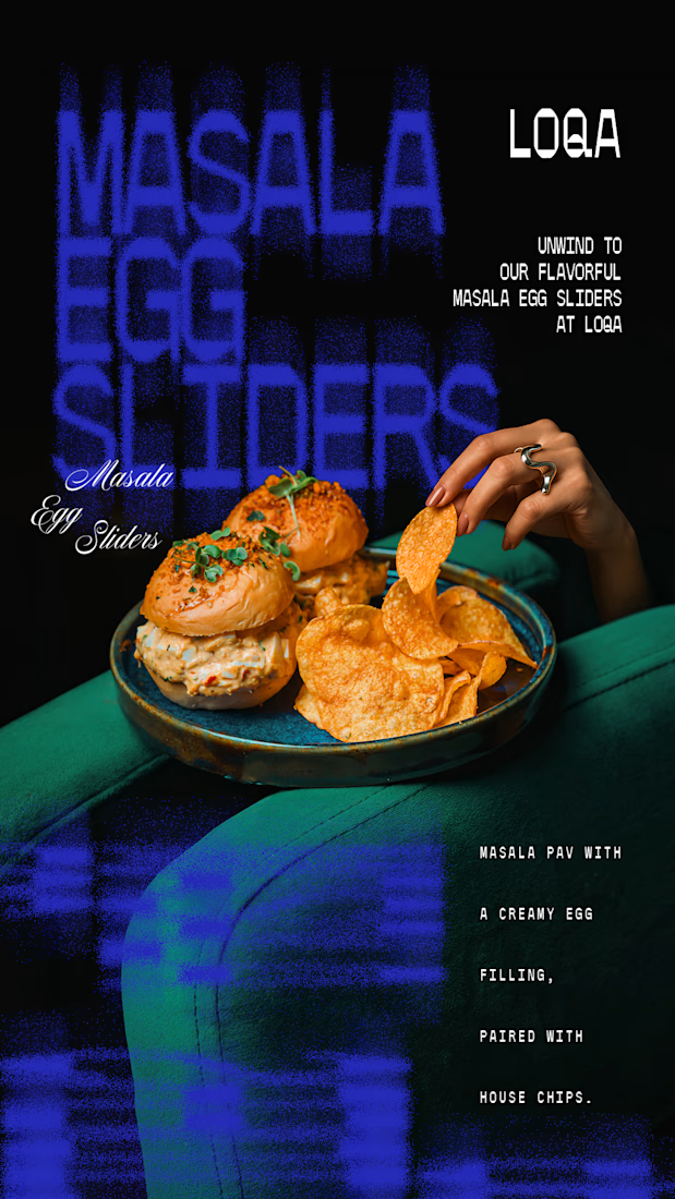
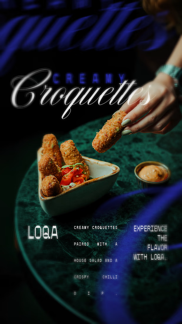

The script lettering over the cocktail sits in the glow without fighting the photo, while the sliders frame gets a much lighter touch. Do you place the type first and crop the image around it, or the other way round?