The network for creativity
Join 1.25M professional creatives like you
Connect with clients, get discovered, and run your business 100% commission-free
Creatives on Contra have earned over $150M and we are just getting started
Back to feedPost

3D Creator Portfolio Website
A modern 3D portfolio website designed for a creative 3D artist who wants their work to stand out.
The website uses a dark visual style with large typography, 3D artwork, smooth animations, interactive elements, and scroll based transitions to create an immersive experience.
The homepage introduces the creator with a bold hero section, followed by a moving project showcase, an About section, services, and detailed project cards.
What I focused on
• Strong visual first impression
• Large and expressive typography
• Smooth scroll animations
• Interactive magnetic elements
• Responsive design for mobile, tablet, and desktop
• Project focused portfolio layout
• Clean navigation and clear calls to action
• Fast and modern frontend implementation
Built with
React
TypeScript
Tailwind CSS
Framer Motion
Vite
This design is ideal for 3D artists, designers, creative developers, studios, and anyone who wants a portfolio that feels more like an interactive experience than a traditional website.
If you need a creative portfolio website that makes your work the main focus, I can build something similar for you.
#3DDesign #3DArtist #PortfolioDesign #WebDesign #WebDevelopment #CreativeDeveloper #FramerMotion #ReactJS #TypeScript #FrontendDevelopment #CreativePortfolio #InteractiveDesign #MotionDesign #UIUX #DigitalDesign


The network for creativity
Join 1.25M professional creatives like you
Connect with clients, get discovered, and run your business 100% commission-free
Creatives on Contra have earned over $150M and we are just getting started



Related posts

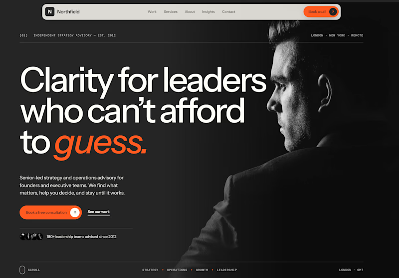
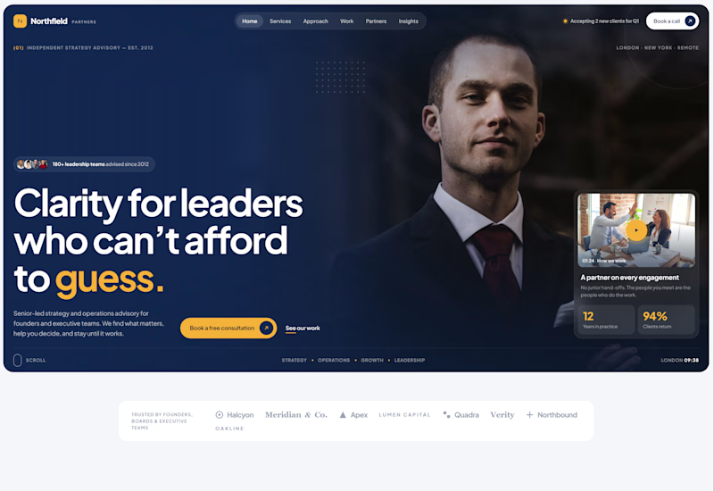
Exploring two different hero directions for a new project.
Same message, two completely different visual approaches.
Which one makes a stronger first impression?
A or B? Curious to hear your thoughts!
36 voted
90%
4 voted
10%
40 votes
Closed

Both are strong. I lean towards the dark version, because the orange accent on the italic "guess." pops and the profile portrait gives it a more editorial, confident feel. The navy one reads a bit more corporate, which could suit a more conservative audience. Nice exploration!

Same projects. Different perspectives.
With INKY, switching between grid and list views changes more than the layout.
The grid gives projects a visual presence. The list offers a more direct way to browse and compare.
Neither is necessarily better.
They're simply two ways of experiencing the same work.
One portfolio. Two perspectives.

Cool 3D assets

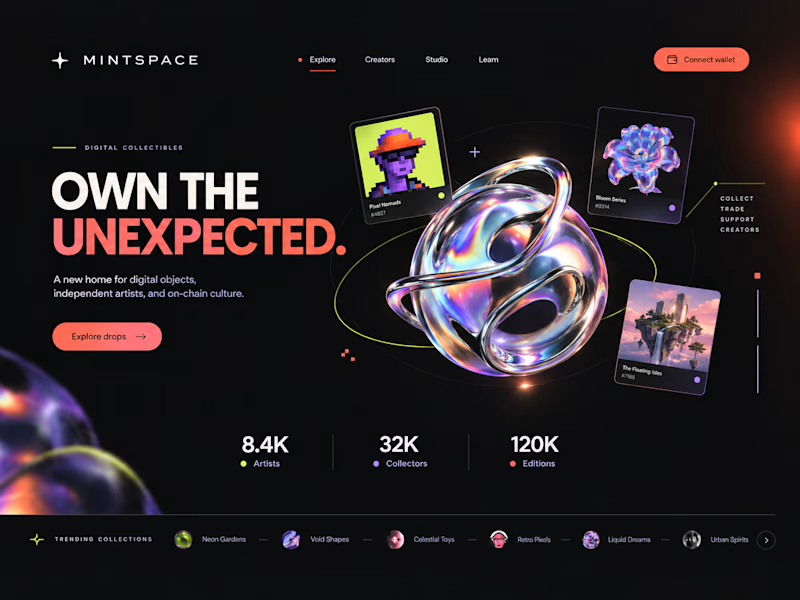
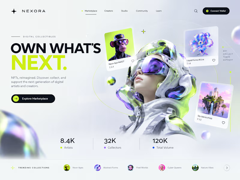
Two directions. One NFT marketplace.
Which visual direction would you choose?
🖤 A — Dark & Futuristic
🤍 B — Bright & Minimal
Both explore the future of Web3, but with completely different visual identities.
Drop your vote in the comments: A or B?
#UIUXDesign #WebDesign #NFT #Web3 #ProductDesign

10 voted
29%
25 voted
71%
35 votes
Closed

Strong design, well done