The network for creativity
Join 1.25M professional creatives like you
Connect with clients, get discovered, and run your business 100% commission-free
Creatives on Contra have earned over $150M and we are just getting started
Back to feedPost


In the age of TikTok and short videos, your website has less than 5-seconds to grab & keep customers engaged before they leave.
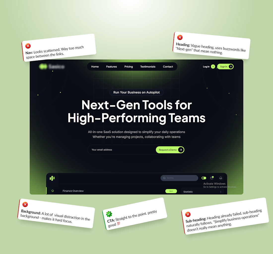
Sadly, a lot of saas companies ruin their chances by making these easy to avoid mistakes:
Using clever grammer instead of simple English.
Using buzzwords like “Next-gen” that mean absolutely nothing to the average customer.
Noise backgrounds & motion that distract customers from reading the text.
Writing subheadings that's vague instead of explaining exactly how the product works.
You can easily avoid these traps by focusing on building a website that your customers understand, not one meant to impress viewers. Your site can still look beautiful, but never at the expense of clear communication.
If people don't get it in seconds, they click away. Clear always beats clever.
What do you think? Let me know below! 👇
The network for creativity
Join 1.25M professional creatives like you
Connect with clients, get discovered, and run your business 100% commission-free
Creatives on Contra have earned over $150M and we are just getting started



Related posts

Clarity like this makes your website feel effortless. ✨
Less confusion.
More confidence.
More conversions.
That's what great design should do.


🔄 A Website Redesign Should Fix Problems, Not Just Change Colours.
A website can look outdated, but appearance isn't always the biggest problem.
Sometimes visitors struggle to find information. Sometimes the navigation is confusing. Sometimes the website doesn't communicate what the business actually offers.
Before redesigning a website, I look at:
→ User experience: Is the website easy to navigate?
→ Structure: Is information organized logically?
→ Messaging: Is the business value clear?
→ Mobile experience: Does everything work smoothly on smaller screens?
→ Conversion flow: Can visitors easily take the next step?
→ Performance: Does the website feel fast and reliable?
A successful redesign isn't about making everything look different.
It's about understanding what's not working and creating a better experience.
Don't redesign just to look modern. Redesign to work better.
What is the first thing you would improve on an outdated website?
#WebsiteRedesign #WordPress #WebDesign #UXDesign #WebsiteDevelopment #Contra



Hello everyone!
I am a Web Designer and Developer from Afghanistan.
I create modern, responsive websites for restaurants, hotels, online shops, and businesses.
My skills include WordPress, HTML, CSS, JavaScript, PHP, and Elementor.
Here are some examples of my work:
Restaurant Website: https://ranginalam22-coder.github.io/My-Restaurant-Website/
Hotel Website: https://ranginalam22-coder.github.io/Grand-Palace-Hotal/
I am available for new website projects. Feel free to contact me!