The network for creativity
Join 1.25M professional creatives like you
Connect with clients, get discovered, and run your business 100% commission-free
Creatives on Contra have earned over $150M and we are just getting started
Back to feedPost

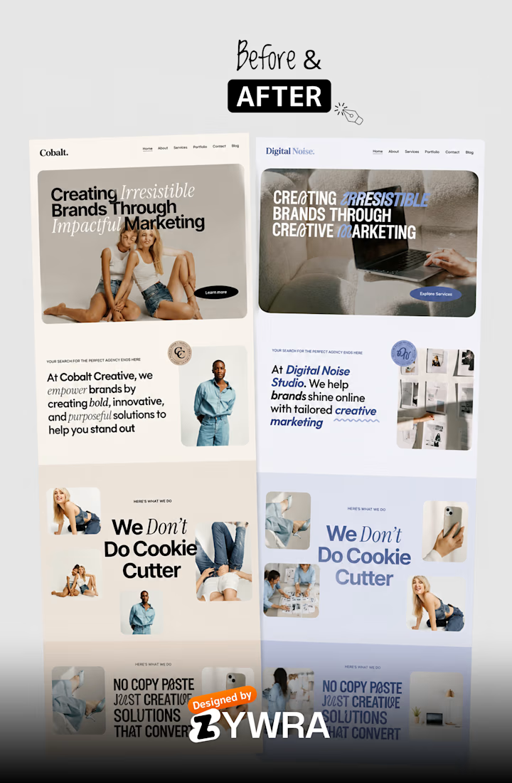
Website Redesign Before & After Case Study | Modern UI Transformation by Zywra Studio
A modern website redesign concept created by Zywra Studio, showcasing the transformation from a generic and outdated website into a bold, modern, and visually engaging digital experience.
This before-and-after redesign highlights how strategic UI/UX improvements, typography systems, color refinement, and layout restructuring can completely elevate a brand’s online presence.
The redesigned version focuses on stronger visual storytelling, improved readability, modern branding aesthetics, and conversion-focused website structure.


The network for creativity
Join 1.25M professional creatives like you
Connect with clients, get discovered, and run your business 100% commission-free
Creatives on Contra have earned over $150M and we are just getting started
Related posts

AI Freight landing page design completed for 5U AI.
They raised $3.2M recently.
I'm open for the new projects. 🤝

this is amazing website. smooth animation love the visual


We’re choosing the motion for an AI analytics product demo, and I can’t decide.
Both clips show the same flow. Someone asks a question in plain English. The agent checks permissions, plans the query, runs it past guardrails and builds the dashboard.
1. A walks you through each step as it happens.
2. B skips the steps and drops you straight onto the result.
A shows the work. B shows the speed. For a landing page I keep going back and forth.
Which one would make you trust the product more? Comment A or B, and tell me why.
3 voted
100%
0 voted
0%
3 votes
Closed

I think according to your query the output should consist on a list of clients with late invoices rather then showing charts etc,

New case on the profile: 3 Pokemon cards rebuilt as interactive Rive Animation
The brief we gave ourselves was simple. Catch that feeling of tilting a holo card, just on a screen.
So the eyes follow your cursor, every card has three moves, and the background switches between idle and action. There’s a pack to open and a randomizer that deals you a card.
Have a look at how it all came together 👇


Damn good work! How long did it take to make?