The network for creativity
Join 1.25M professional creatives like you
Connect with clients, get discovered, and run your business 100% commission-free
Creatives on Contra have earned over $150M and we are just getting started
Back to feedPost

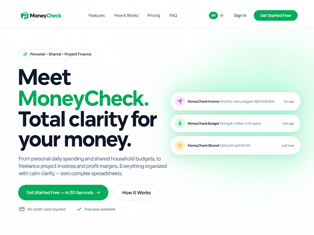
Your money is probably more chaotic than you think. 😭
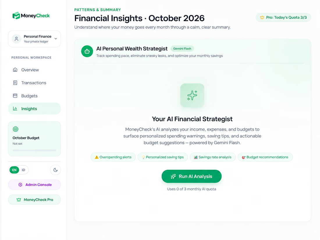
So I built MoneyCheck.
Track your personal, project, or shared finances without the spreadsheet headache — then let AI help you understand what’s actually happening with your money.
Open. Track. Know.
Try it → moneycheck.my.id


The network for creativity
Join 1.25M professional creatives like you
Connect with clients, get discovered, and run your business 100% commission-free
Creatives on Contra have earned over $150M and we are just getting started



Related posts

What if sending money felt a little more like giving a gift?
For Nova, I explored a banking app that brings payments, cards, and a bit of personality together. You can check your balance, browse recent transactions, send or request money, top up, and pay bills.
My favorite part is the digital postcard feature. Before sending a transfer, you can add a little illustrated card—a heart, a birthday greeting, or a playful character. A simple way to make birthday money or a thank-you feel more personal.
I carried that same 3D character into onboarding, pairing it with bold red gradients and large, clear payment details. There’s room for play, while the recipient and amount stay easy to check.
Would you add a postcard to a transfer? I’d love to know what occasion you’d use it for.






2nd variation of a landing page for a B2B search analytics platform
For this variation, I went with a lighter background where the CTA is visually focused instantly.
You might have 3~5 seconds to get the user's attention, so it's very important how the design looks and feels.
Full landing page coming tomorrow.


CHRONOS: Dark, Cinematic Landing Page for a Luxury Watch Brand
The brief: A hero section for a luxury watch brand that feels expensive and quiet, and still gives the visitor a clear next step.
What I focused on
Colour: Deep green and black as the base, red used only for the light beam, the first headline word and the button. Limited colour keeps it premium.
Typography: A high-contrast serif for the headline, which gives it a watchmaking feel, and a clean sans-serif for supporting text so it stays easy to read.
Hierarchy: Watch first, headline second, button third. The eye moves in that order, and the animation follows it.
Motion: Slow, controlled movement only: a soft fade-in, a rising headline and a gentle light pulse. No bounce or flashy effects.
Trust: Three short proof points under the button, so the page isn’t only atmosphere.

Love the lighting.