The network for creativity
Join 1.25M professional creatives like you
Connect with clients, get discovered, and run your business 100% commission-free
Creatives on Contra have earned over $150M and we are just getting started
Back to feedPost

Exploring new frontiers mixing Gaussian Splats and traditional mesh in ThreeJS.
Live Demo: Castelblends.com


The network for creativity
Join 1.25M professional creatives like you
Connect with clients, get discovered, and run your business 100% commission-free
Creatives on Contra have earned over $150M and we are just getting started

Challenges
View all


Related posts

FARO OSTERIA just got featured on Contra! ✨
Really happy to see this one selected by the Contra team. I loved building the world around it, from the red pasta boxes and blue caps to the menu and street campaign.
Thank you, Contra, and everyone who has taken a look and supported the work.
Explore the project:
https://contra.com/community/eVKgBdEl-faro-osteria-italian-comfort-street
Independent concept. Creative direction, branding, packaging and AI assisted imagery by Mauricio Pontual / MP House Studio.
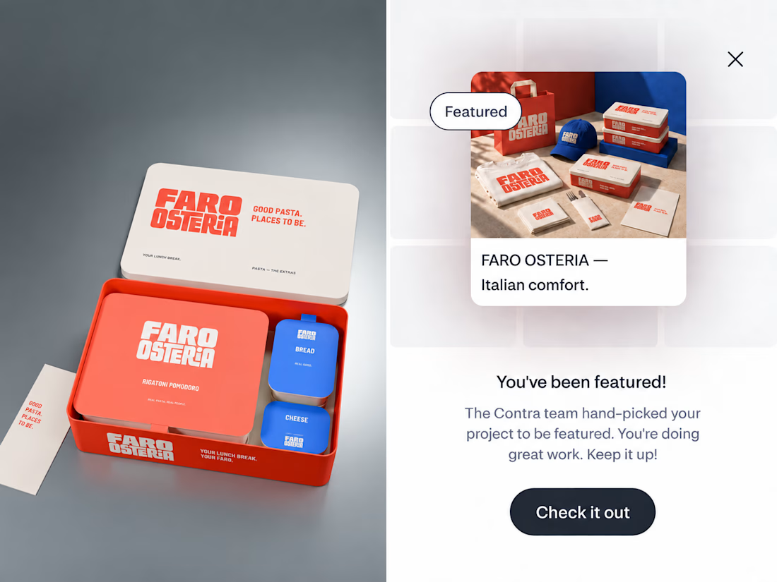

The red-and-blue packaging system feels wonderfully confident, and the tiny “featured” moment makes the presentation feel like part of the brand world. Great balance of restaurant warmth and editorial polish.

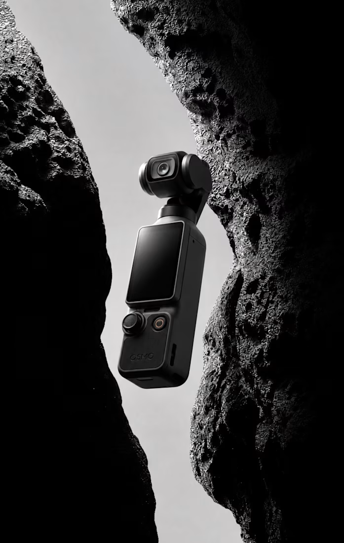
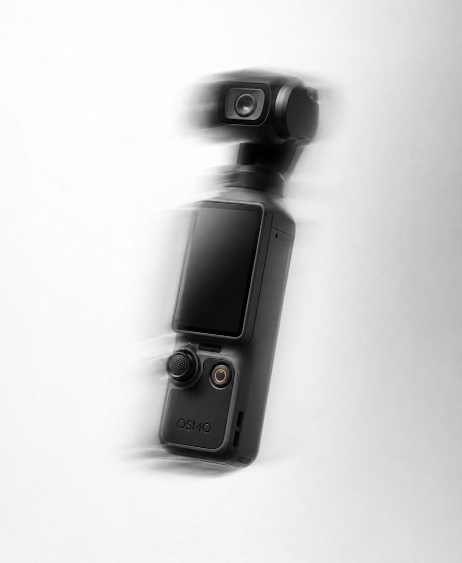

Exploring geometry beyond familiar dimensions.
Procedural motion, transformation and structure.


Wireframe only and it still reads as motion, that says the structure itself is the story here. Procedural geometry that breathes like this is way harder than it looks.