The network for creativity
Join 1.25M professional creatives like you
Connect with clients, get discovered, and run your business 100% commission-free
Creatives on Contra have earned over $150M and we are just getting started
Back to feedPost
Taste Test

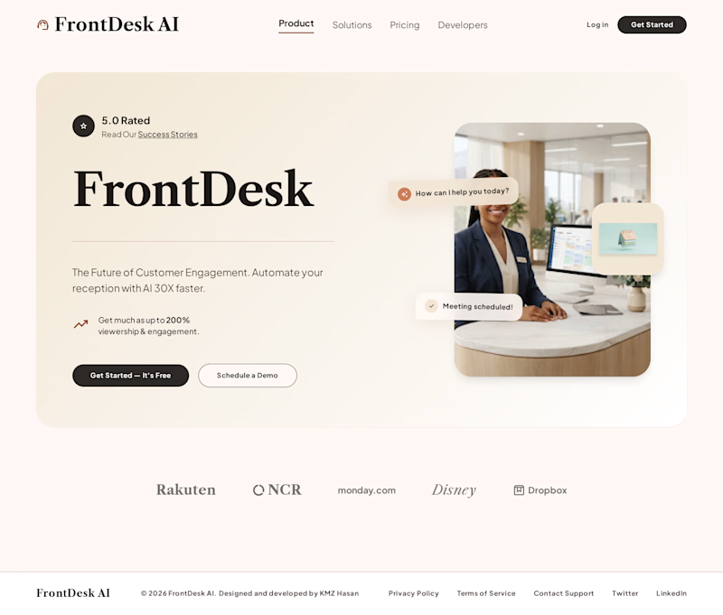
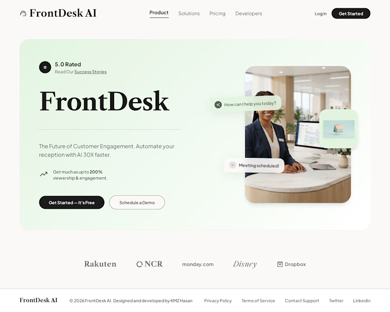
Designing a version for FrontDesk AI receptionist for a client . Which design looks good ?

3 voted
75%
1 voted
25%
4 votes
Closed

Went with B, the green gives the dark CTA button more contrast so it actually pulls your eye first. On A the two buttons read as equal weight and I had to look twice to find the primary action.

Option A for me. The warmer tone feels more welcoming and better suited to a front-desk experience. I think the overall spacing could use a little more refinement as well, but the direction is strong. 😊
The network for creativity
Join 1.25M professional creatives like you
Connect with clients, get discovered, and run your business 100% commission-free
Creatives on Contra have earned over $150M and we are just getting started











Related posts


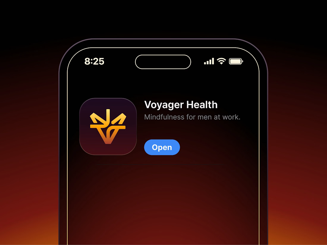

Aryna, that golden symbol pops so nicely against the plum background ✨

WIP - Brand Identity
Which one?
9 voted
47%
10 voted
53%
19 votes
Closed

B is more suitable for these textures ❤️❤️
Great job Gaber🎉🎉🔥🔥

Same design. Which palette? 👀
You picked your favorite preview last time. This time, I’m putting the colors to the vote.
One body-care packaging concept, with the same typography and composition:
A · Rose Cream, Strawberry Sorbet + Plum Jelly
B · Lime Mousse, Coconut Cream + Plum Jelly
Which would you choose and what does it make you feel about the brand?
Both palettes use colors and matching ingredient textures from DCS 654, my library of 654 dessert-inspired colors.
Take a closer look: dcs.mariya.design

7 voted
44%
9 voted
56%
16 votes
Closed
B is absolutely stunning 🎉🎉🎉🎉
Great job Mariya❤️