The network for creativity
Join 1.25M professional creatives like you
Connect with clients, get discovered, and run your business 100% commission-free
Creatives on Contra have earned over $150M and we are just getting started
Back to feedPost

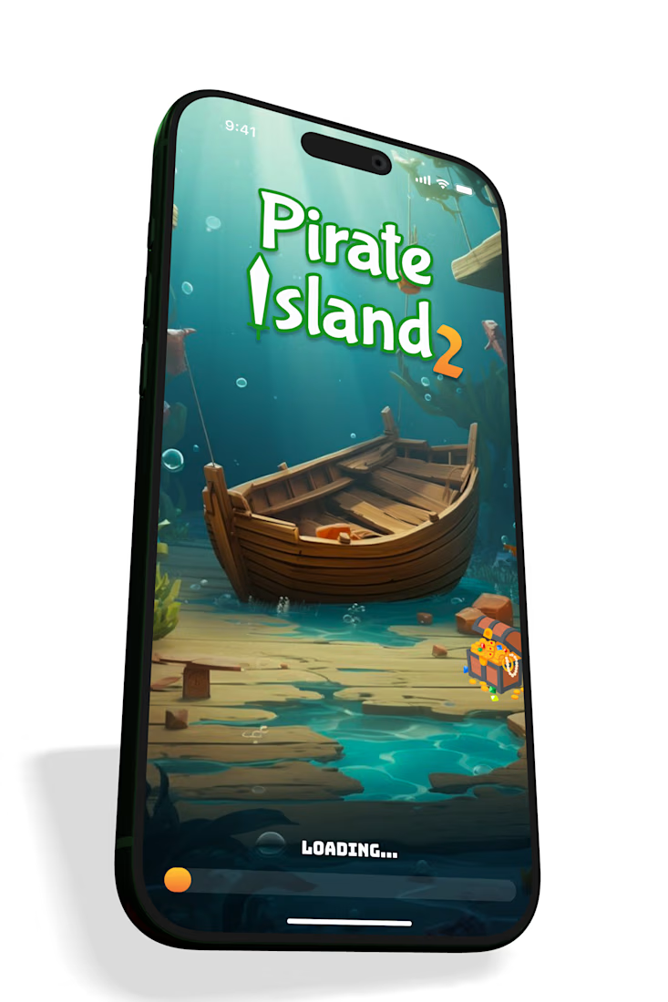
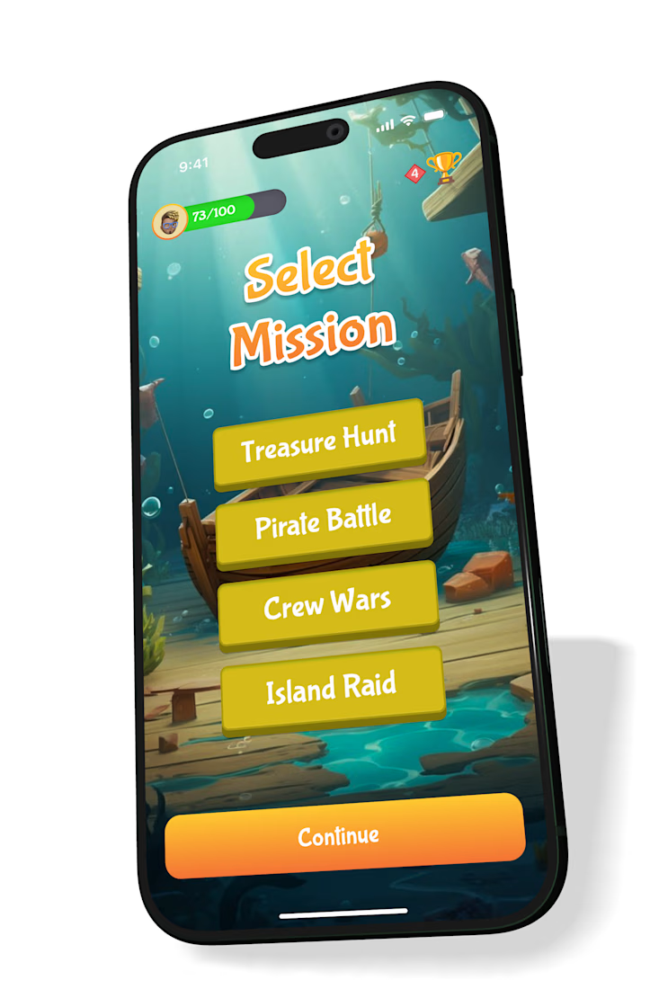
Why did I add a “Continue” button when the user had already selected a mission?
While designing this game UI interaction, I considered automatically taking the player into the selected mission. It would be faster, but it would also assume that every tap is intentional. A player might accidentally select a mission, want to reconsider their choice, or simply change their mind. Keeping the Continue CTA creates a simple flow: Select → Review → Confirm → Continue.
As product designers, we often talk about reducing friction and making experiences more efficient. But efficiency shouldn't come at the expense of user control. Sometimes, an extra tap isn't unnecessary friction; it's a moment that gives users the opportunity to confirm their intent. A product is ultimately built for its users, and good interaction design should give them control over how they move through the experience. 🎮
The network for creativity
Join 1.25M professional creatives like you
Connect with clients, get discovered, and run your business 100% commission-free
Creatives on Contra have earned over $150M and we are just getting started





Related posts

A cursor doesn't have to disappear into the interface.
In INKY, the custom cursor isn't just feedback. It becomes part of the visual language of the portfolio.
A small interaction can change how the entire interface feels — without adding more content or more UI.
Interaction can be part of the identity.

Love the direction


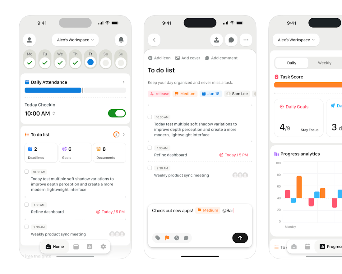
to-do list mobile UI

More from ARDA®, a look at the desktop experience.
A, editorial approach to presenting architecture, built around typography, grid and imagery.


