The network for creativity
Join 1.25M professional creatives like you
Connect with clients, get discovered, and run your business 100% commission-free
Creatives on Contra have earned over $150M and we are just getting started
Back to feedPost

We love productivity tools.
Notion.
Trello.
Asana.
ClickUp.
Google Calendar.
The list goes on.
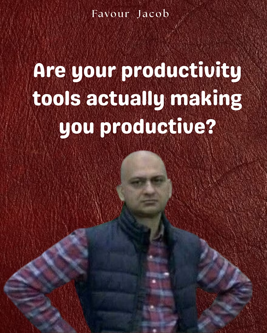
But do these tools actually make you productive?
And more importantly…
Why did you choose the tool you’re using?
Because you saw someone recommend it?
Because everyone seems to be using it?
Or because you actually understood the problem you were trying to solve?
A tool can organise your work beautifully and still not help you get the work done.
Sometimes the problem isn’t that you need a better tool.
You need a better way of working.
Before I introduce a new tool into a workflow, I want to understand what we’re trying to achieve, what’s currently getting in the way, and what the tool actually needs to help us do.
Then we choose the tool.
Not the other way around.
That’s how I think about systems: the tool should support the work, not become more work.
I’m Favour💕
I help businesses make sense of the work behind the scenes, build practical systems around it, and make sure the tools actually serve the way they work.
Maybe before downloading another productivity app this week, ask yourself: what problem am I actually trying to solve? 😌:
The network for creativity
Join 1.25M professional creatives like you
Connect with clients, get discovered, and run your business 100% commission-free
Creatives on Contra have earned over $150M and we are just getting started
Challenges
View all


Related posts

🚀 Streamlining Admin Workflows & Data Precision!
Managing manual data entry and unstructured documents can slow down business operations. Recently, I’ve been helping clients clean up complex datasets, convert scanned PDFs into structured Excel sheets, and automate repetitive entry tasks.
Key Services I Offer:
Data Cleaning & Advanced Formatting (Excel / Sheets)
PDF to Editable Formats (Word / Excel) with 100% Accuracy
Web Research & Data Scraping
Custom Browser & Administrative Workflow Automation
Need help freeing up hours of manual work? Send me a message or check out my profile! 📈
Tags: #dataentry #virtualassistant #adminworkflows #pdfconversion #datamanagement



Making productivity a little more colorful. 💜
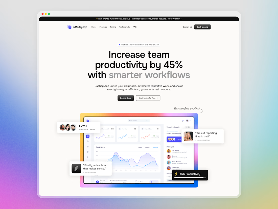
Hey Contra community! Today I want to share a closer look at SaaSsy App – a landing page concept for an all-in-one productivity platform.
The product has a lot going on, so the main challenge was presenting all those features without making the landing page feel overloaded. I kept the structure simple and used colorful gradients and bold typography to make the content easier to follow and a bit more memorable.


Creative work and UI Flow


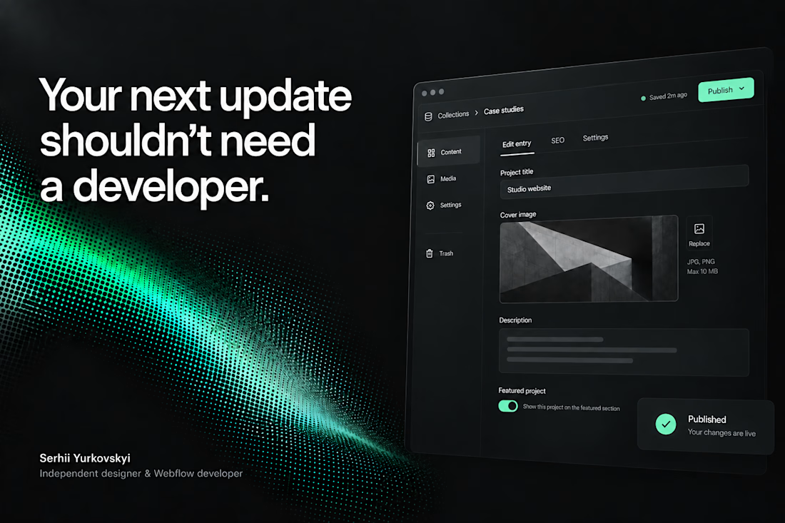
A client shouldn’t have to learn Webflow just to publish their next case study.
On a recent build, I spent a lot of time on the CMS: setting up reusable blocks and the logic that lets the team update content without rebuilding pages.
The tricky part is deciding how much control to give them. Too little, and every update becomes a request. Too much, and they’re suddenly responsible for the layout.
I want them to open the CMS, know what to do, and get on with their day. There’s a fair amount of work behind making that feel simple.



The CMS thinking here is spot on: the best handoff is the one that gives a client confidence without exposing all the complexity underneath.