The network for creativity
Join 1.25M professional creatives like you
Connect with clients, get discovered, and run your business 100% commission-free
Creatives on Contra have earned over $150M and we are just getting started
Back to feedPost


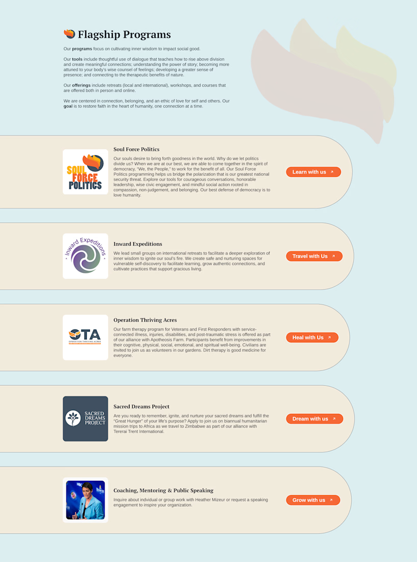
We’re used to service sections on websites looking “correct”: clean grids, standard cards, an icon on top, text underneath. It works – but it’s not always memorable.
Sometimes, even serious, professional websites stand out precisely because they present their services in a more unexpected way. Here, the services are designed almost like individual scenes: oversized rounded shapes, soft lines, plenty of negative space, asymmetrical composition, a calm color palette, and bright CTA buttons used as accents. Because of this, the section feels less like a list and more like a visual rhythm.
This kind of approach isn’t just about aesthetics. It helps communicate the personality of the project before the user even starts reading. And it’s a good reminder that service sections don’t have to be purely functional – they can feel atmospheric, expressive, and a little unexpected too.


The network for creativity
Join 1.25M professional creatives like you
Connect with clients, get discovered, and run your business 100% commission-free
Creatives on Contra have earned over $150M and we are just getting started
Related posts

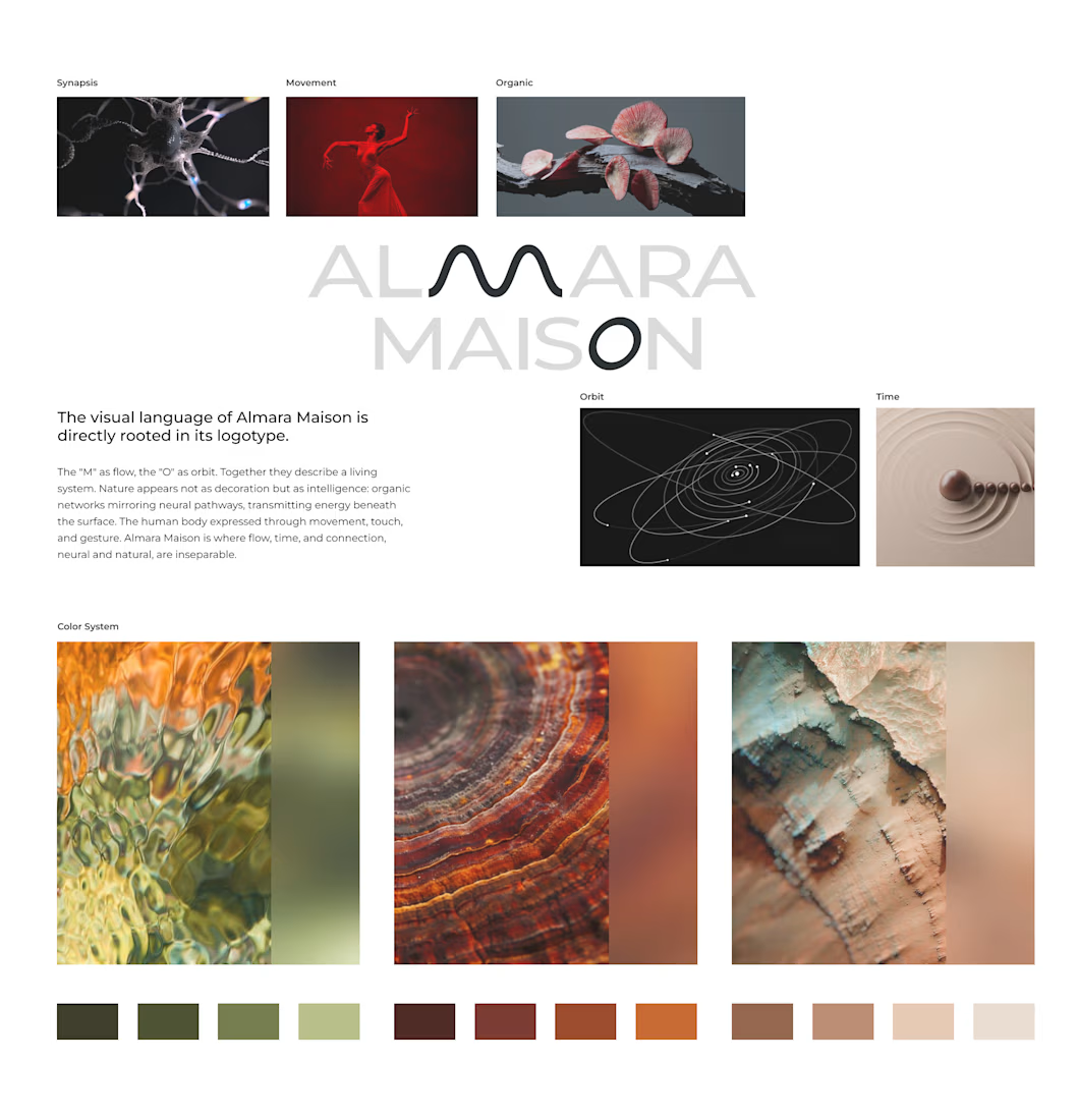
Almara Maison arrived with a name and a feeling: organic and futuristic, body and technology, ancient and now. Most wellness brands resolve that tension by choosing a side. We didn't.
The identity is built on the intelligence of living systems: fungal networks, synaptic connections, invisible structures that mirror human awareness. The wave-shaped "M" carries movement and rhythm. The "O" is time understood as cycles. Nothing decorative. Every form is a decision.
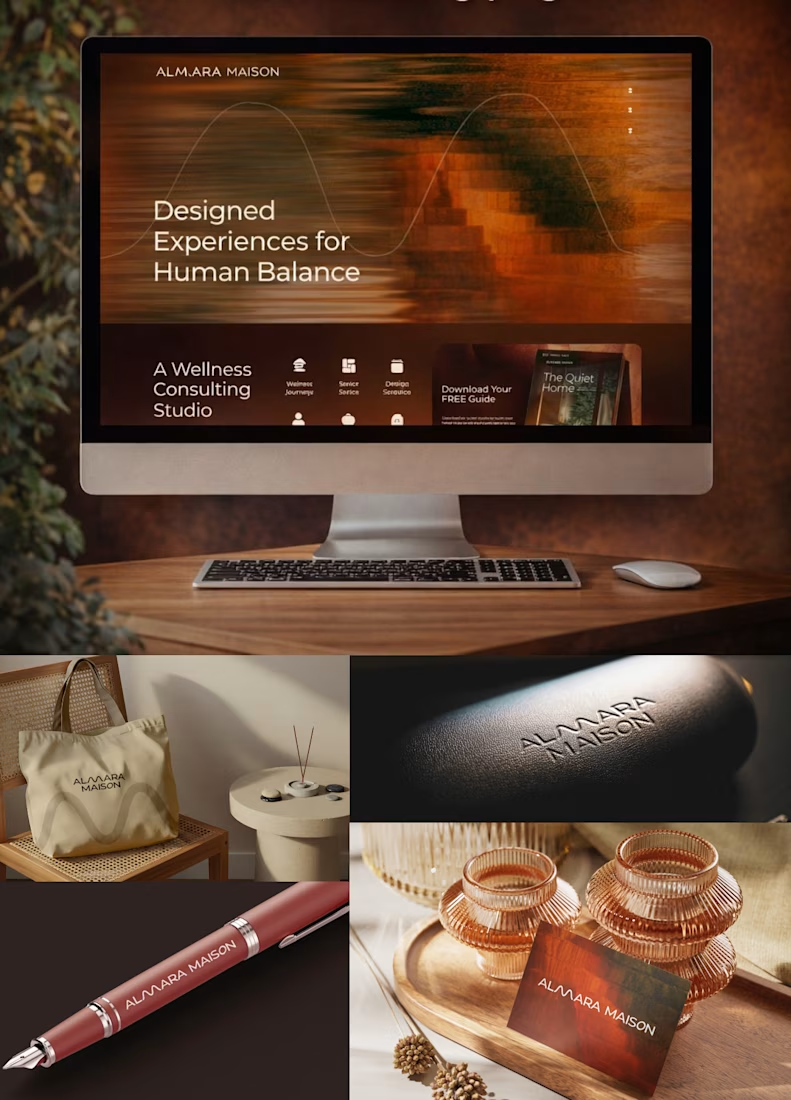
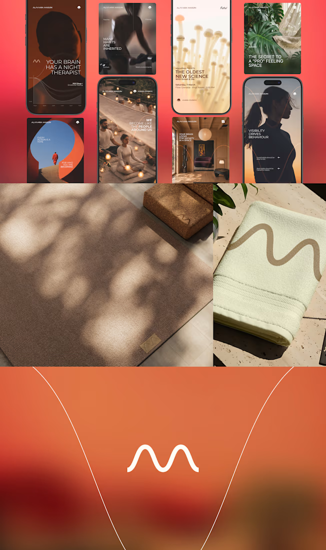
From there: full website in Antigravity with custom cursor and motion, AI-powered automations for content and communication, internal systems that let the studio scale without adding headcount.
Brand identity to live website. Two weeks.


Nice:)

Which Hero section is better Full width or Split?
2 voted
33%
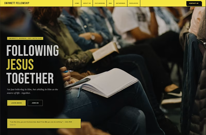
4 voted
67%
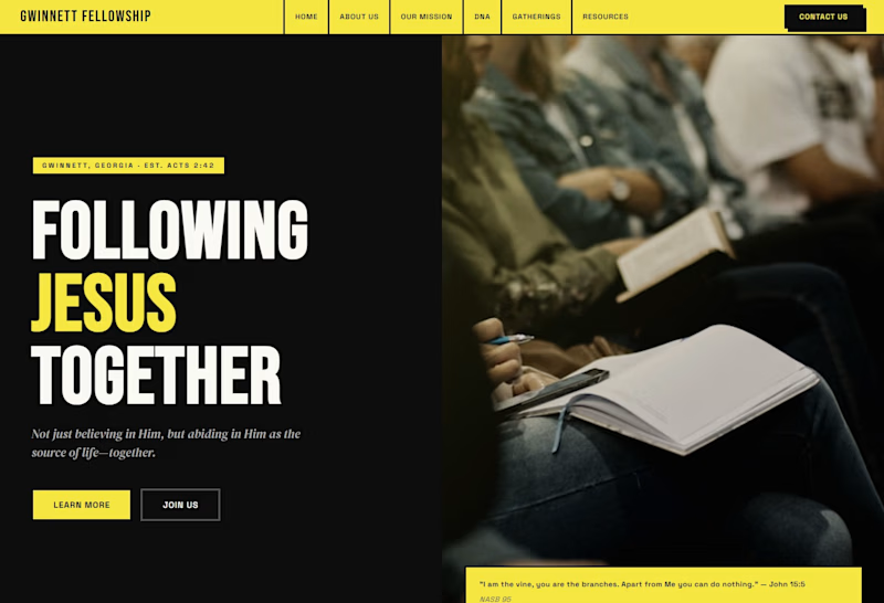
6 votes
Closed

Definitely full width

First sale on Glyph Co. and it wasn't just the template. It was the full Template + Expert Setup.
Built something real. Someone paid for it.
That's the validation 🖤

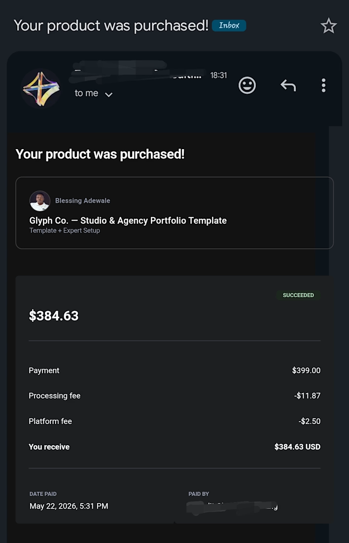

Let’s goo win is win








Trending

Claude
Claude has entered the design space. How are you using Claude Design?

Contra University
Learn from expert creatives how to earn more using next-gen AI tools.
creativeaiflow
Creative AI workflows are evolving. What tools do you use, and what are their strengths and weaknesses?
portfolioreview
The best portfolios tell a story, not just show a grid. Share yours for feedback.
freelancerlife
Freelancer life is wins, pivots, and everything in between. What’s yours right now?