The network for creativity
Join 1.25M professional creatives like you
Connect with clients, get discovered, and run your business 100% commission-free
Creatives on Contra have earned over $150M and we are just getting started
Back to feedPost
Taste Test

Which video does a better job at "storytelling'?
1 voted
100%
0 voted
0%
1 vote
Closed

wait, omg! i had no clue we could do a taste test with video formats too, this is so cool 🔥
The network for creativity
Join 1.25M professional creatives like you
Connect with clients, get discovered, and run your business 100% commission-free
Creatives on Contra have earned over $150M and we are just getting started

Challenges
View all


Related posts


Which shade would you shoot? One is cool and airy: coral pearl in a frosted twisted case, chrome collar and a steel arc, ice blue set with a soft lit circle behind it.
The other is warm and severe: deep plum on a faceted black case with gold banding, black marble disc, acid green walls and one hard shaft of light cutting across the floor.
One opens up. The other closes in. 👇 #brandconcept #beautybranding #artdirection
3 voted
60%
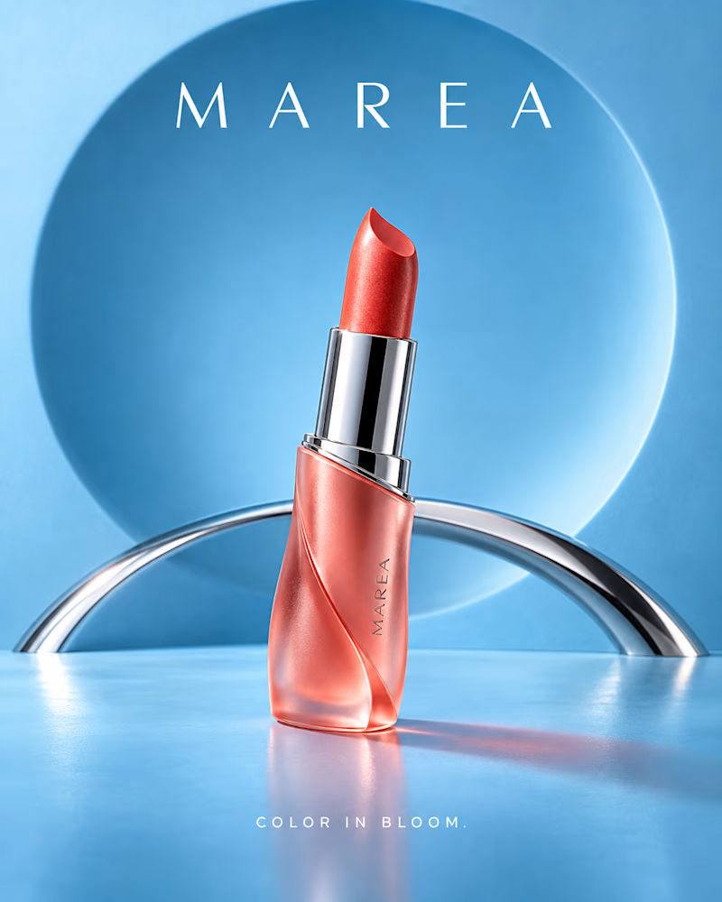
2 voted
40%
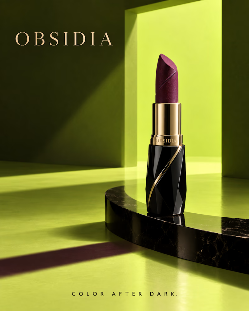
5 votes
Closed

Design/Background wins Obsidia and the product Marea Lipstic is more appealing!!
Which one would you brew? One is built in the studio: black box with copper foil botanicals, a dark cup steaming on a copper slab, terracotta walls and a teal circle burning behind it.
The other is shot on location: cream ceramic tin with a wooden lid on travertine, cold brew over ice in fluted glass, olive branches and the sea through a gold arch.
One is served with weight. The other is served with light. 👇 #brandconcept #coffeebranding #artdirection
1 voted
25%
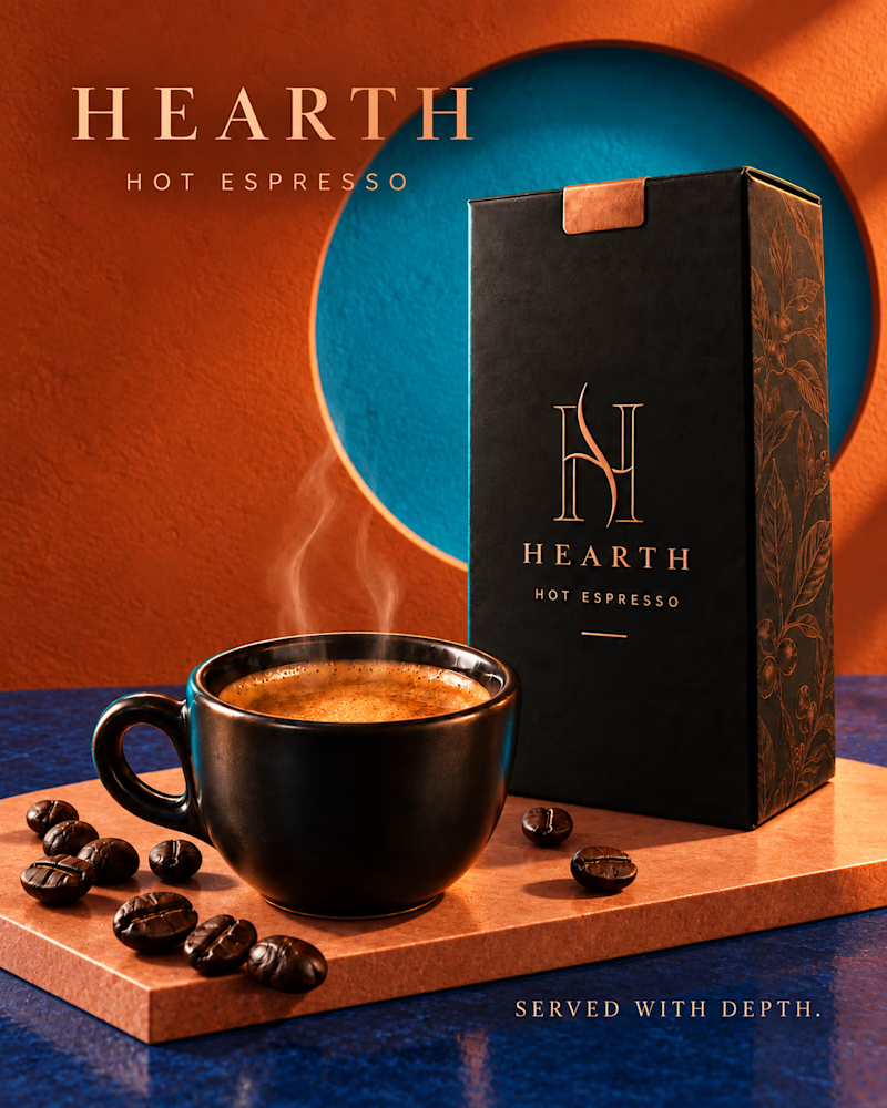
3 voted
75%
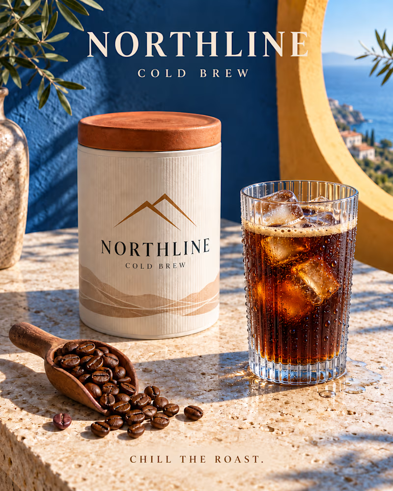
4 votes
Closed

The contrast between the copper-foil Hearth pack and the cooler Northline scene gives each roast its own personality. The restrained type and editorial framing make both directions feel genuinely shelf-ready.

I had the Shy Testimonials interaction working exactly how I wanted…
Then came the harder part: which visual treatment?
🖤 Matte Black — heavier, bolder, more editorial.
🫧 Colourless Glass — lighter, softer, almost disappears into the page.
Same component. Same interaction.
Just two completely different vibes.
And now I’m stuck. 👀
Which one makes you want to stop and read the testimonials?
🖤 Matte Black or 🫧 Glass?
Be honest — I’m actually using the winner. 👇
Also what kind of animation should i use ?

1 voted
20%
4 voted
80%
5 votes
Closed

thers just smth about glass...it give a soothing premium feel