The network for creativity
Join 1.25M professional creatives like you
Connect with clients, get discovered, and run your business 100% commission-free
Creatives on Contra have earned over $150M and we are just getting started
Back to feedPost

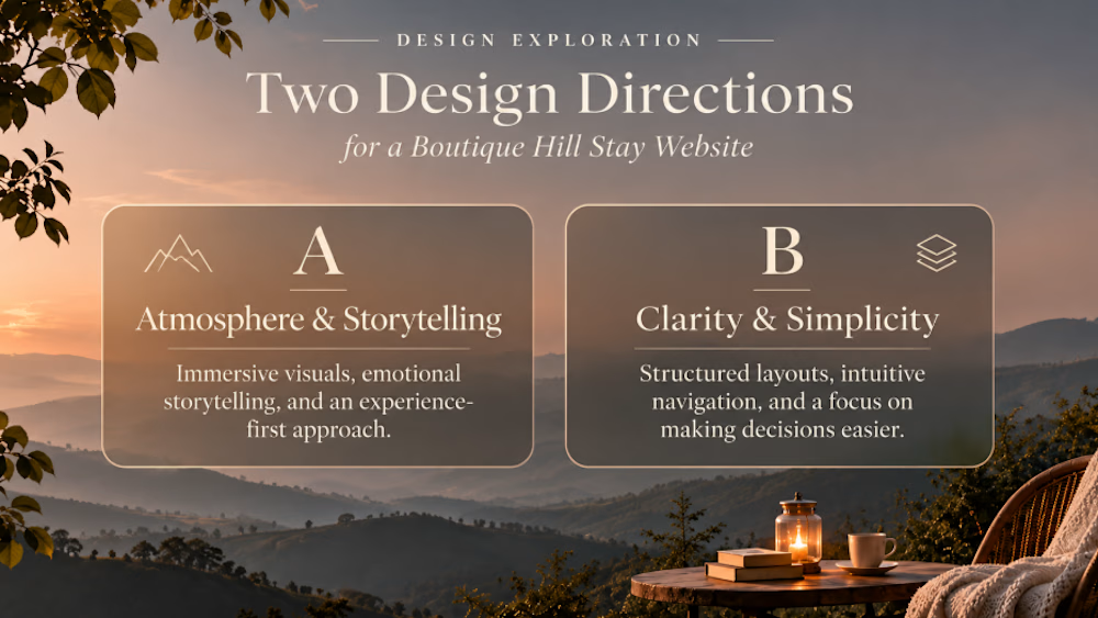
Same business. Same goal. Two completely different design directions.
It's interesting how much a website's personality can change through typography, layout, and visual hierarchy.
Imagine designing a website for a boutique hill stay.
Would you lean toward:
A — Atmosphere & Storytelling
Immersive visuals, emotional storytelling, and an experience-first approach.
B — Clarity & Simplicity
Structured layouts, intuitive navigation, and a focus on making decisions easier.
Both approaches serve the same purpose, but each shapes how visitors perceive the brand and interact with the experience.
I'm curious—which approach would you prioritize first, A or B?
And why?
The network for creativity
Join 1.25M professional creatives like you
Connect with clients, get discovered, and run your business 100% commission-free
Creatives on Contra have earned over $150M and we are just getting started





Related posts


Should a personal brand hero lead with the name or the promise?
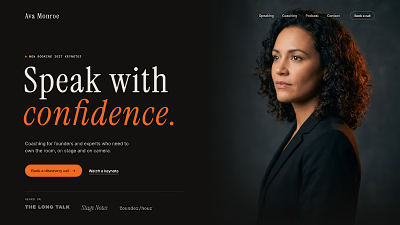
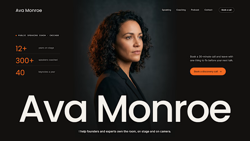
A client of ours is a speaking coach. People find her by name: podcasts, stages, word of mouth. Yet her first hero hid that name in the top-left corner.
We tested two directions:
The promise first. "Speak with confidence" in big type, the name small in the nav. Clear, but it could be any coach on the internet.
The name first. Her name at billboard scale, the promise in one line above it, her face right behind. Someone arriving from a podcast knows instantly they're in the right place.
When people search for you, your name is the headline.
Which one would you ship for a personal brand?
43 voted
51%
42 voted
49%
85 votes
Closed

Name first — podcast listeners arrive looking for her.

What happens when you stop trying to fit into one creative box?
I've been working on something that brings together a lot of what I've been exploring, questioning, breaking and building lately.
A new portfolio. New work, new directions, and a clearer picture of the kind of creative practice I want to build.
It's been a process of experimenting, changing my mind, and figuring things out along the way.
Not everything is finished, but it's getting close.
Révolté is officially launching soon.
A little chaos looks good on you.

Nice job man, work on new portfolio too haha


Very juicy. Didn't you feel like having some berries while working?