The network for creativity
Join 1.25M professional creatives like you
Connect with clients, get discovered, and run your business 100% commission-free
Creatives on Contra have earned over $150M and we are just getting started
Back to feedPost

Most people think a logo redesign is about making something look better.
I believe it's about making a brand work better.
Recently, I redesigned the identity for Dr. Meal—a healthy meal brand with a vision to make nutritious eating feel modern, trustworthy, and premium.
The challenge wasn't just creating a new logo. It was building a visual identity that balances healthcare credibility with the warmth and freshness people expect from a food brand.
The redesign focused on:
✓ A clean, memorable logo that reflects health and nourishment
✓ Modern typography for a premium, approachable feel
✓ A fresh color palette inspired by wellness and natural ingredients
✓ A scalable identity system that works across packaging, digital platforms, signage, uniforms, and marketing materials
Every design decision was intentional—removing unnecessary complexity while strengthening recognition and trust.
A successful brand identity doesn't just look beautiful; it communicates purpose, builds confidence, and creates a lasting impression.
This is what thoughtful branding can achieve.
Swipe through to see the transformation and let me know your favorite application.


The network for creativity
Join 1.25M professional creatives like you
Connect with clients, get discovered, and run your business 100% commission-free
Creatives on Contra have earned over $150M and we are just getting started


Trending

Claude
Claude has entered the design space. How are you using it?

Contra University
Learn from expert creatives how to earn more using next-gen AI tools.
Brand Design
The best brand designers are on Contra. Scroll to see what's trending in brand design. What are you building?
creativeaiflow
Creative AI workflows are evolving. What tools do you use, and what are their strengths and weaknesses?
freelancerlife
Freelancer life is wins, pivots, and everything in between. What’s yours right now?





Related posts


dope

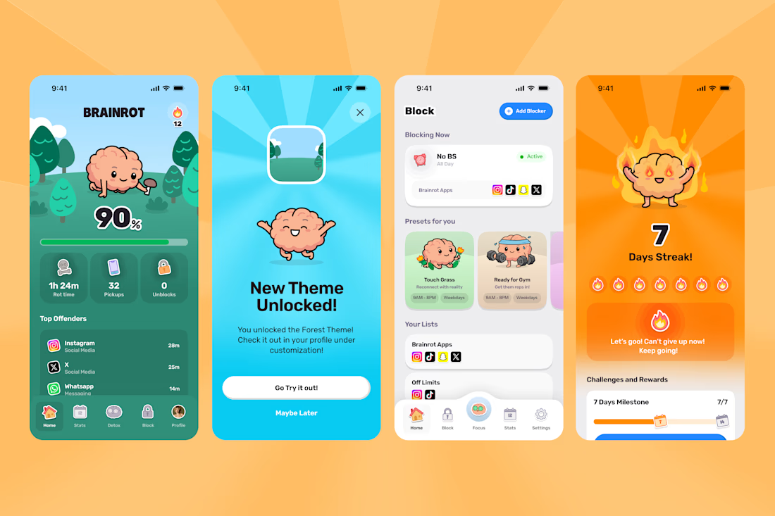
A few highlights from the Brainrot Project!
In 3 months we delivered:
100+ app screens
60 + Illustrations
70 + animations
+ Branding, Appstore Screens, Website and hundreds of Slack jokes.
Couldn't have done it without the legends Mary Delaney and Arsen Airyan!
If your brand or app needs a substantial facelift to stand out in the AI Slop age, let me know!


Congrats man!

My entry for the Envato × Contra Human by Design challenge.
AI has changed the game and made almost anything possible. But just because you can make anything doesn’t mean you always know what to make.
For this one, I took one simple piece of Envato’s identity, the logo, and pushed it as far as I could with one goal: make a pretty sick ad.
From there, it was a lot of experimenting, prompting, failing, refining, and eventually bringing all those ideas to life using Envato’s AI tools.
The result is my take on Human by Design. AI can give us endless possibilities, but someone still has to come up with the idea and decide where to take it.
100% created using Envato’s AI features.🚀


My entry for the Envato × Contra Human by Design challenge.
AI has changed the game and made almost anything possible. But just because you can make anything doesn’t mean you always know what to make.
For this one, I took one simple piece of Envato’s identity, the logo, and pushed...