The network for creativity
Join 1.25M professional creatives like you
Connect with clients, get discovered, and run your business 100% commission-free
Creatives on Contra have earned over $150M and we are just getting started
Back to feedPost

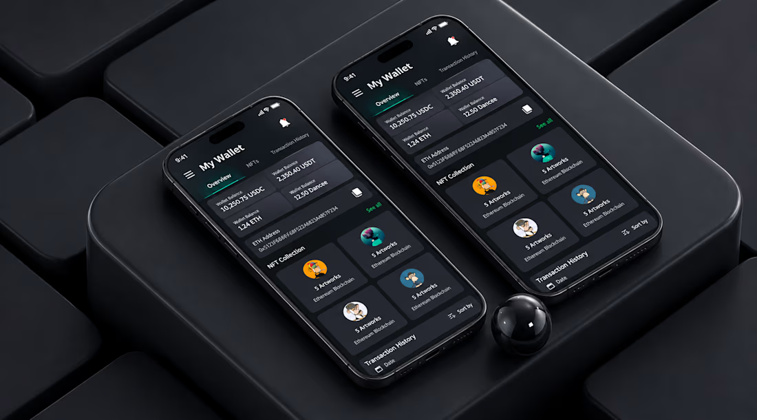
My Wallet" — Crypto Wallet App UI/UX Design (Dark Mode)
Designed a clean, modern crypto wallet interface focused on clarity and trust — because when users are managing their money, confusion costs clients.
Problem: Most crypto wallet apps overload users with numbers, charts, and jargon on the first screen — high bounce rate, low trust.
Solution: A dark-mode "Overview" dashboard that surfaces the 3 things users check first — balances (USDC/USDT/ETH/Dancee), NFT collection, and transaction history — without needing to tap around.
Key design decisions:
Dark theme with a subtle green accent (growth/finance psychology) for the active tab and CTAs
Balance cards grouped in a 2x2 grid for instant scannability
Wallet address shown but visually de-emphasized (secondary info, not distracting)
NFT collection previewed as cards with artwork + chain label, building toward a full gallery view
Bottom tab area reserved for Transaction History with sort/filter — built for scale, not just a mockup
Tools: Figma, dark-mode design system, mobile-first (iOS)
Available for wallet/dashboard/fintech UI projects — DM if you're building something similar.
The network for creativity
Join 1.25M professional creatives like you
Connect with clients, get discovered, and run your business 100% commission-free
Creatives on Contra have earned over $150M and we are just getting started







Related posts

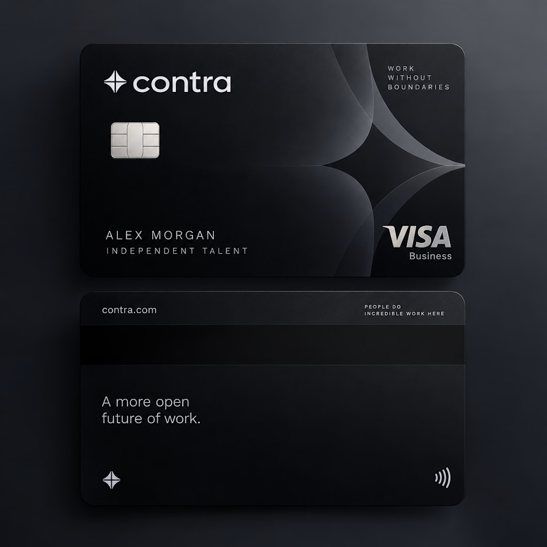
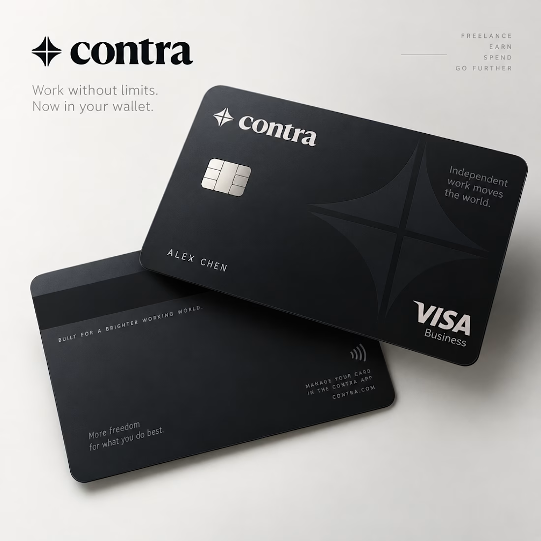
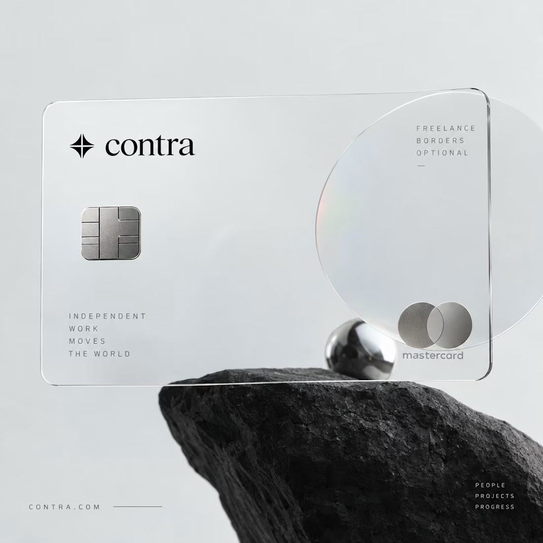


I’d definitely go with black. 🖤 It feels sharper, more premium, and timeless. The transparent concept is creative, but the black version has a stronger visual identity.

Hotel details screen for a booking app I’ve been designing.
Focused on clear information hierarchy, visual comfort, and helping users make quick booking decisions.
Excited to start sharing my work here 🚀

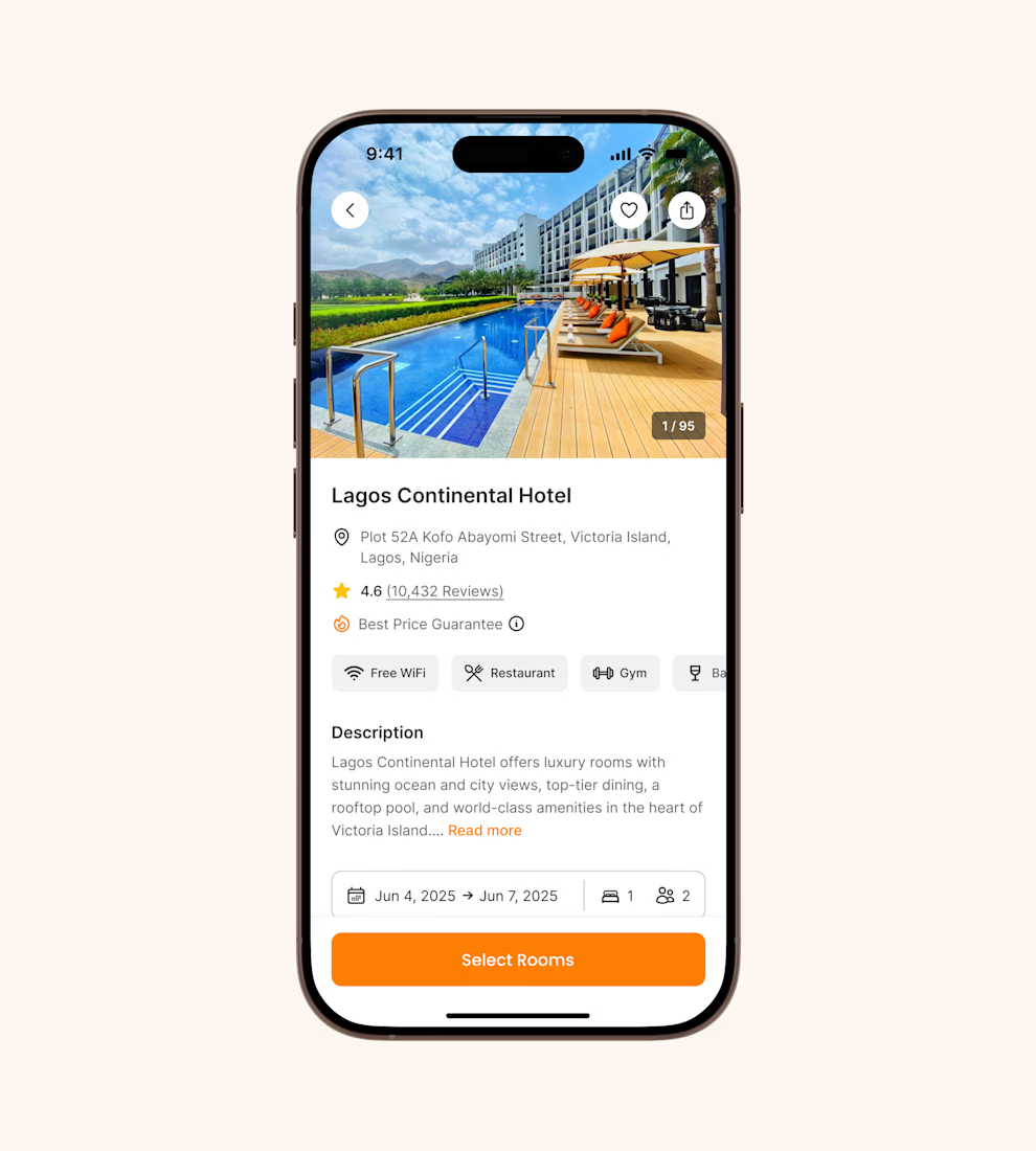

It's basic design but it's great❤️

A brand identity and card design project for Solayer’s Emerald Card, combining a geometric logo with a refined visual system inspired by the richness and brilliance of emeralds. The deep green palette, clean typography, and premium card layouts create a modern, sophisticated identity that bridges digital finance with everyday spending.



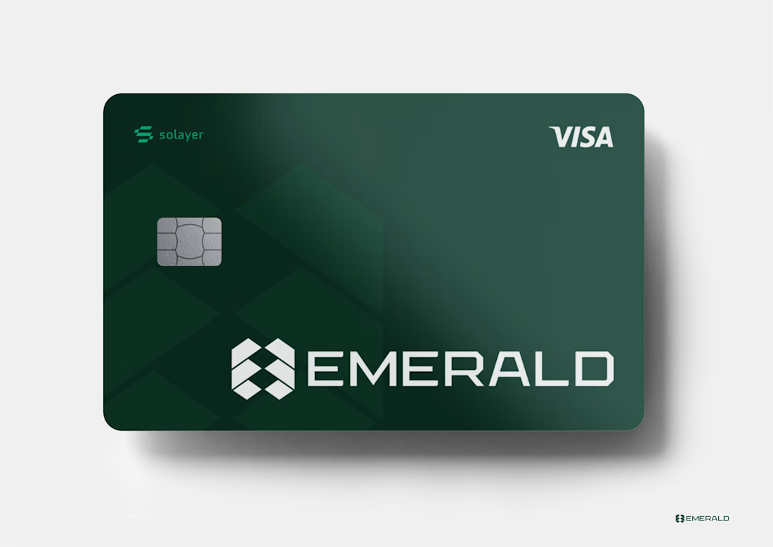
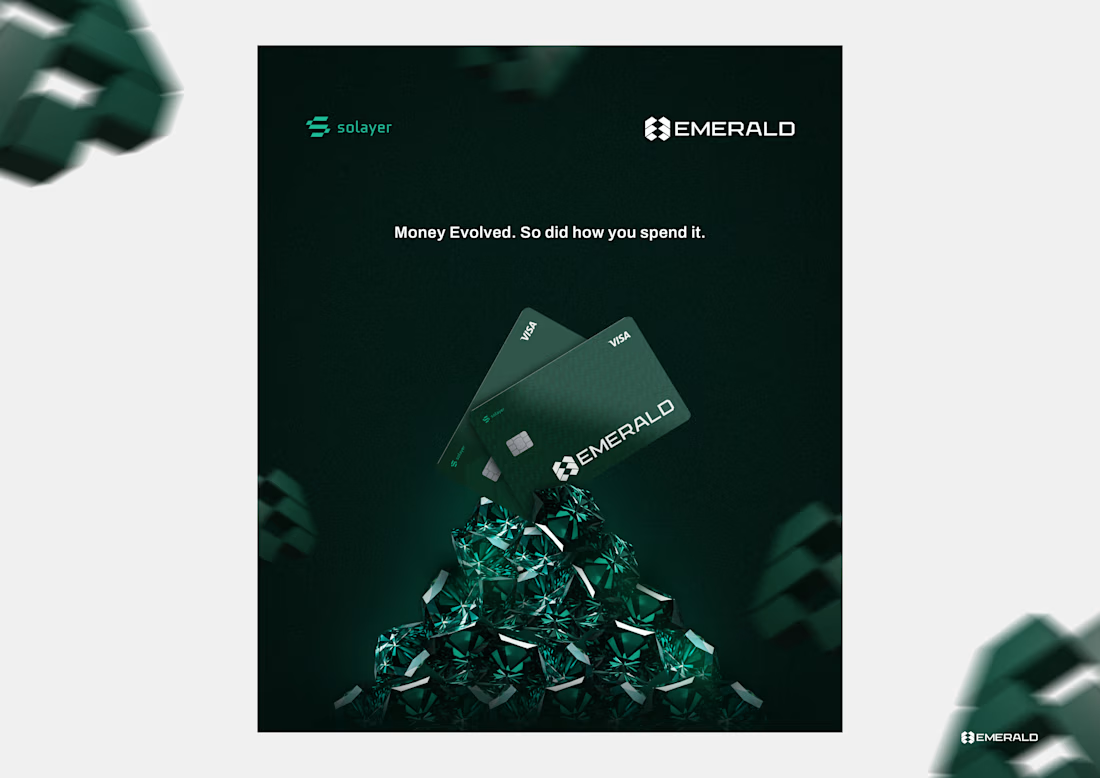
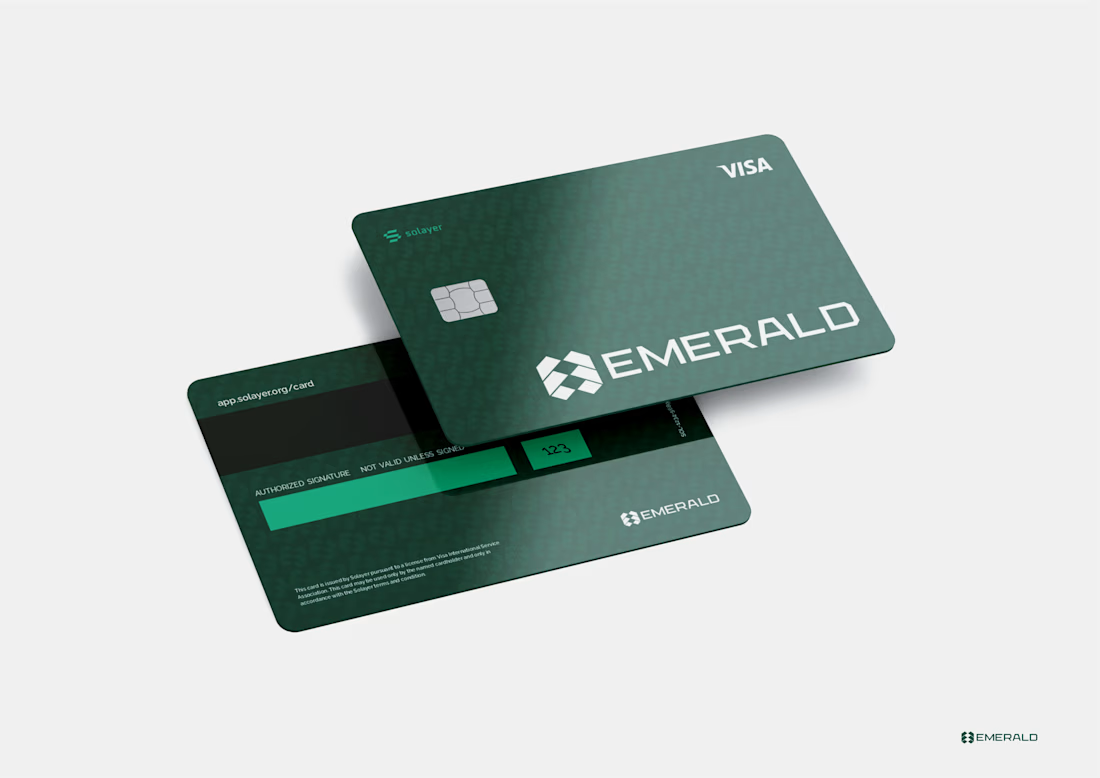


This is a really creative piece! I love how the visual elements come together to create something that feels distinctive rather than predictable. The composition, the overall visual direction, and the way the idea has been executed all contribute to making this stand out. It’s a...