The network for creativity
Join 1.25M professional creatives like you
Connect with clients, get discovered, and run your business 100% commission-free
Creatives on Contra have earned over $150M and we are just getting started
Back to feedPost

Built an interactive universe where business decisions tug each other in real time for #FigmaMakeathon
Not a dashboard, physics-driven, consequence-first
Drag a decision; watch risk, runway, velocity shift
Built with Figma Make🚀
#UX #ProductDesign #Figma

The network for creativity
Join 1.25M professional creatives like you
Connect with clients, get discovered, and run your business 100% commission-free
Creatives on Contra have earned over $150M and we are just getting started






Related posts

Built something that isn’t client work for a change.
Flowkidz. Short games that teach kids design, websites, AI, code and internet safety.



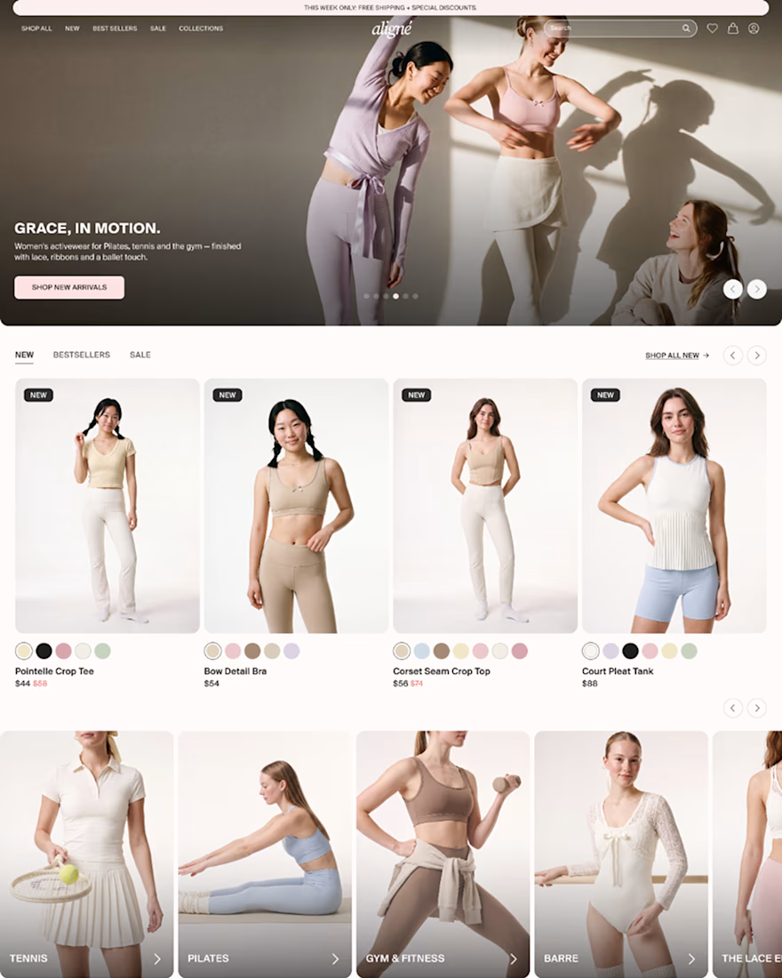
Hi everyone 👋 Sharing an early look at Aligné, a concept Pilates brand I’m designing for my portfolio. All visuals were generated with @Higgsfield AI and art-directed for a soft, sun-lit feel. The mockups and animations were made in @Figma with Figma Motion.
Full case study coming soon. Feedback is very welcome! ❤️
#Higgsfield #Figma #FigmaMotion #Ecommerce #ConceptDesign #FashionEcommerce



I love this

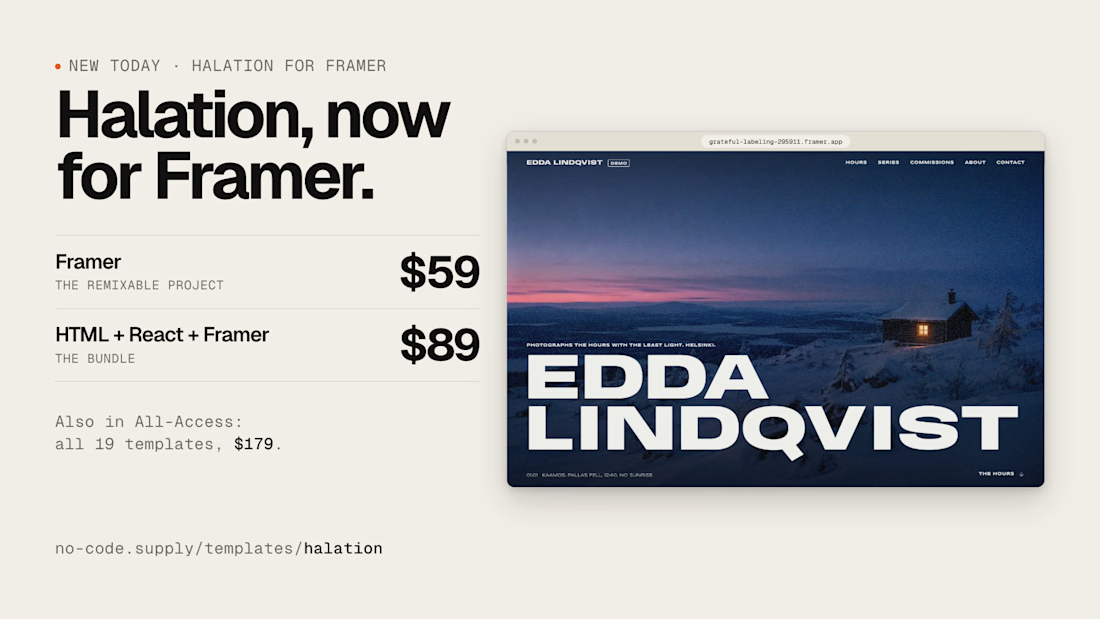
Photography template Halation is now on @Framer
https://www.framer.com/marketplace/templates/halation-photos/


Nice one