The network for creativity
Join 1.25M professional creatives like you
Connect with clients, get discovered, and run your business 100% commission-free
Creatives on Contra have earned over $150M and we are just getting started
Back to feedPost

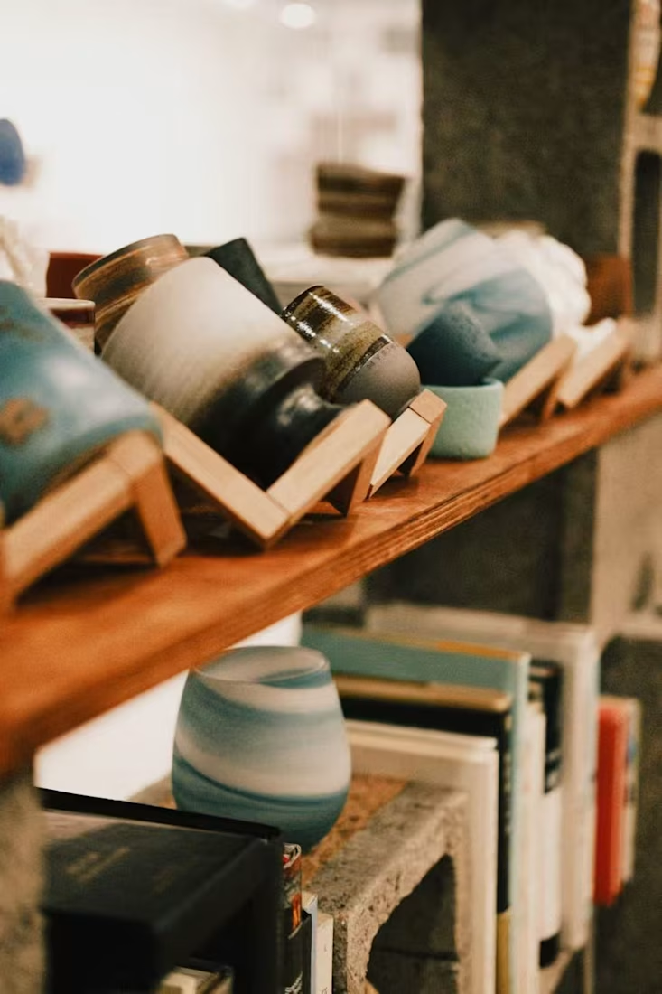
Three signs a beauty or fragrance brand feels generic
A brand often feels generic when:
The positioning could apply to any competitor
The packaging looks attractive but says nothing distinctive
The product story explains ingredients but creates no emotional reason to care
A strong brand direction should make the product easier to recognize, remember and choose.
The network for creativity
Join 1.25M professional creatives like you
Connect with clients, get discovered, and run your business 100% commission-free
Creatives on Contra have earned over $150M and we are just getting started




Related posts

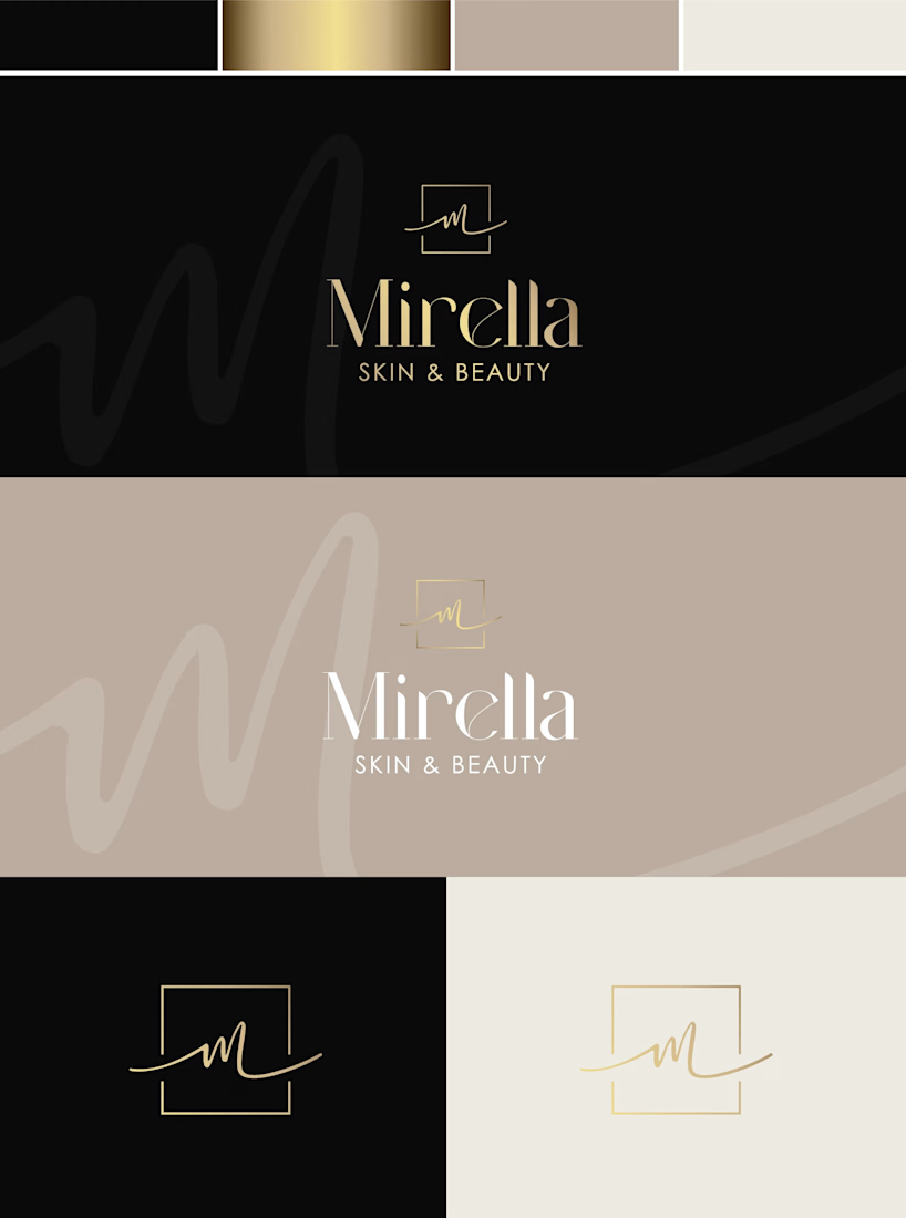
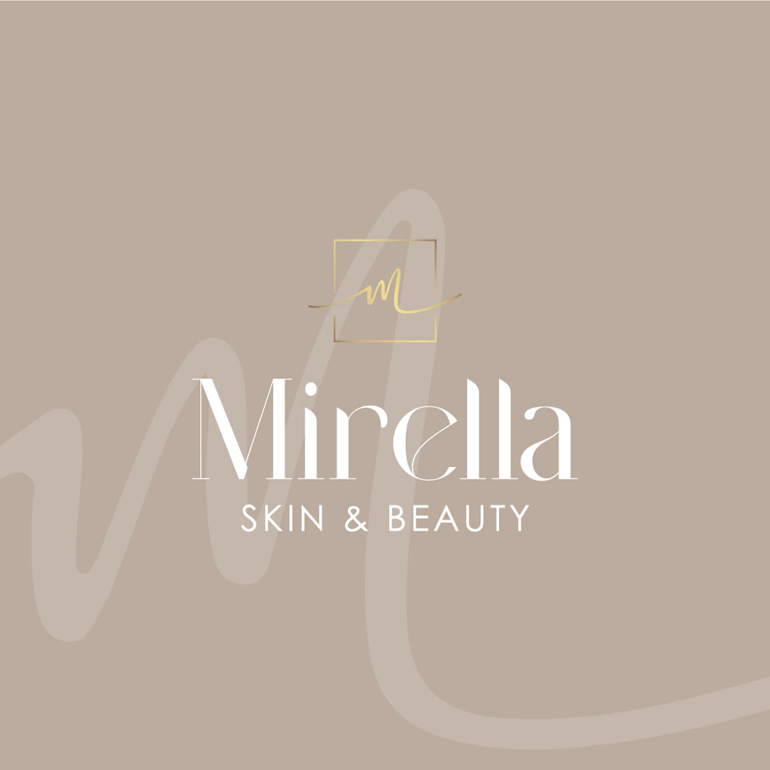
Mirella Skin & Beauty — A Refined Identity for a Modern Beauty Brand
A refined visual identity concept created for a modern beauty brand.
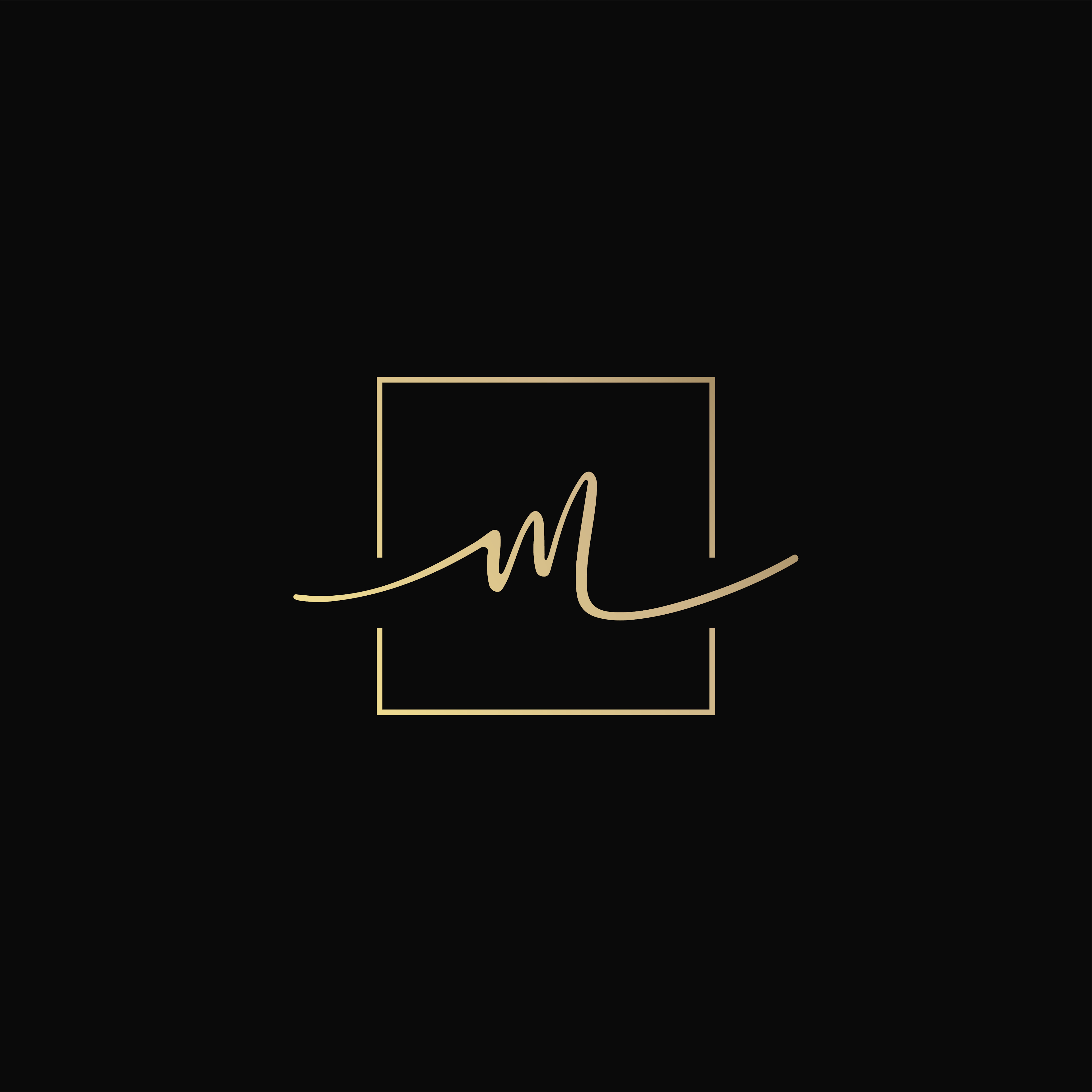
The direction combines soft neutrals, warm gold accents and elegant typography to create a sophisticated yet feminine look. The custom monogram adds a personal touch to the identity, while the subtle handwritten element brings softness and individuality to the brand.
The concept includes:
— Logo design
— Monogram / secondary mark
— Color palette
— Business card design
— Logo variations for different applications
The goal was to create a timeless identity that feels elegant, personal and effortlessly luxurious. ✨
#BrandIdentity #LogoDesign #BeautyBranding #VisualIdentity #BrandDesign #GraphicDesign #BeautyBrand #Branding


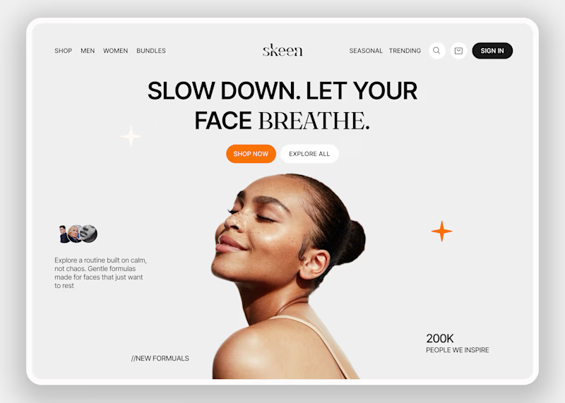
Skeen sells skincare online. People shopping for skin products are often unsure and overwhelmed by choices. The homepage has to make them relax first, and only then help them shop.
I kept the layout simple so the eye goes to one place and nothing fights for attention. Then I tested the mood with two backgrounds.
A is neutral grey, so nothing distracts from the product.
B is a warm peach that feels closer to skin and more caring.
Which one would make you trust a skincare brand more?


7 votes
Ends in 1d

On one will like normal bg in this context, B feels alive and actually grab focus ⭐

The logo took 6 rounds and 10 days to finalize.
(The final one looks nothing like the first.)
I'm building a full platform for a psychologist, and we started where every project should: branding.
Before any design, I wrote a brief on who the audience is and how they feel when they arrive. Two very different groups: stressed families looking for care, and professionals deciding whether to put their name on it. The brand had to feel trustworthy to both.
Round 1: six directions. The strongest was a shield with a checkmark. Verified, protected, done.
Round 2: the client pushed back. A checkmark says "passed." Her brand is about helping professionals grow toward a standard, not stamping them approved. The shield's layered stripes also felt military.
Rounds 3 to 5: we explored leaves, waves, even an infinity symbol. We tested other color families to see how the mark felt, then came back to green.
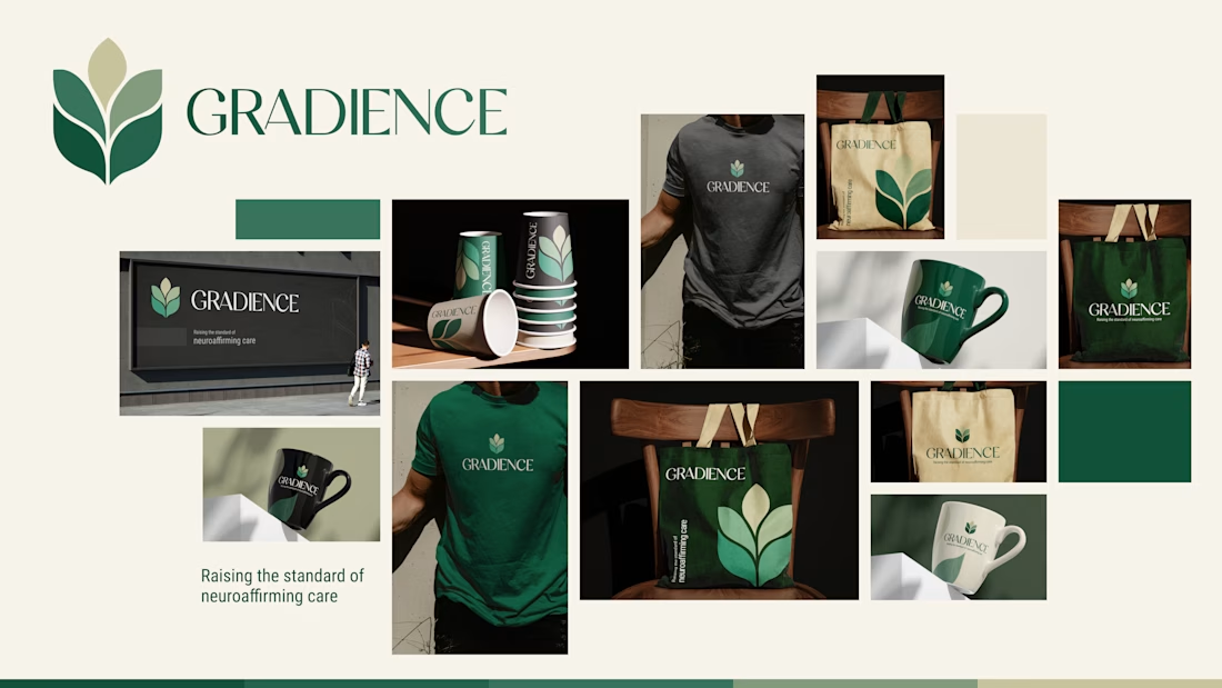
Round 6: stylized leaves growing upward, with a gradient that shows progression. The shield disappeared entirely.
The final logo has no checkmark, no shield, nothing military. Just growth.
What I took from it, the first idea is rarely the right one, and client feedback is usually about meaning, not aesthetics.
Now I'd like your take. When you look at the one pager mockup, what does it say to you? Does it feel trustworthy and warm? Honest feedback in the comments, please.

Weldone, Ali