The network for creativity
Join 1.25M professional creatives like you
Connect with clients, get discovered, and run your business 100% commission-free
Creatives on Contra have earned over $150M and we are just getting started
Back to feedPost

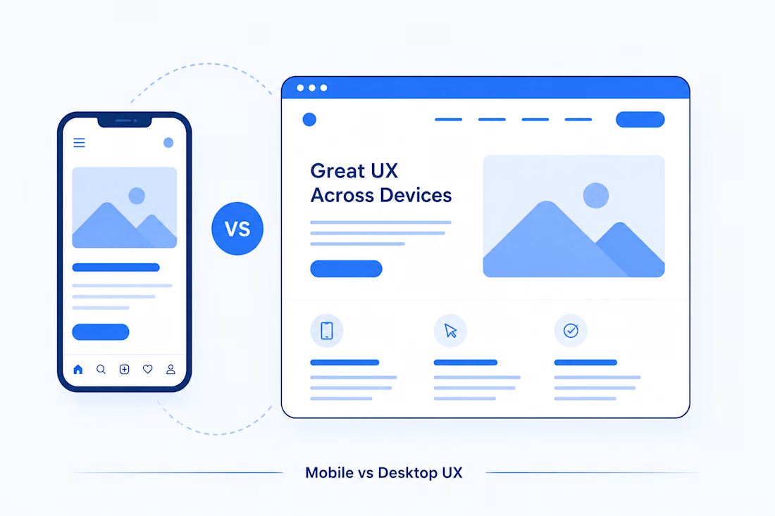
Mobile vs Desktop UX: Practical Guidance for Layouts, Navigation, and Touch Targets
Mobile UX isn't desktop UX on a smaller screen. It's a different design problem.
Designing for mobile and designing for desktop aren't the same skill wearing two different outfits.
They are shaped by different inputs, different environments, and different user behaviors.
On desktop, users typically interact with a precise cursor and have plenty of screen space. On mobile, users rely primarily on their fingers, often while moving, multitasking, or using a device with one hand.
Yet one of the most common mistakes I see in digital products is treating mobile as:
"Desktop, but stacked."
That's where usability problems start.
A good responsive experience isn't simply about making everything fit the screen. It's about making deliberate decisions for the way people actually use each device.
Here are the practical differences every designer should consider.
1. Input Method Changes Everything
The biggest difference between mobile and desktop UX isn't necessarily screen size.
It's how people interact with the interface.
Desktop
Mouse or trackpad
Precise pointer
Keyboard shortcuts
Hover states
Larger interaction area
Mobile
Fingers and thumbs
Less precise touch
No reliable hover state
One-handed interaction is common
More physical movement between controls
This difference affects almost every interaction decision.
For example, a desktop interface might reveal additional information when someone hovers over an element.
That same interaction doesn't translate naturally to mobile.
Practical takeaway
Never make a critical interaction dependent on hover.
If information or functionality is important, it should be visible or accessible through a clear tap interaction.
2. Touch Targets: The Visual Size Isn't the Interaction Size
A 20px icon might look perfectly fine in a design file.
But try tapping that icon accurately with your thumb while holding your phone in one hand.
That's a different story.
For mobile interfaces, commonly used platform guidance recommends touch targets around 44–48px depending on the platform and design system.
The important distinction is:
Visual size ≠ tappable area.
A 20px close icon can still have a much larger invisible hit area around it.
Common mistake
Designers sometimes create:
24px icon
4px padding
Another 24px icon right beside it
It looks clean in Figma.
It can be frustrating on an actual device.
Better approach
Design the interaction area separately from the visual element.
Give users enough space to tap comfortably without accidentally triggering a neighboring action.
3. Navigation Doesn't Simply Shrink
Desktop and mobile often require completely different navigation strategies.
Desktop
Horizontal navigation
Persistent sidebars
Mega menus
Breadcrumbs
Hover interactions
Multiple navigation options visible simultaneously
Mobile
Bottom navigation
Hamburger menus
Drill-down navigation
Accordions
Back buttons
Simplified information architecture
The goal isn't to squeeze the desktop navigation into a smaller space.
The goal is to determine:
What does the user actually need access to right now?
Why bottom navigation works
Primary navigation placed near the bottom of a mobile screen is generally easier to reach with a thumb than controls positioned at the top.
That's why many mobile products use bottom navigation for their most important destinations.
But what about hamburger menus?
Hamburger menus solve a space problem, but they also hide information.
Users have to tap before they can discover what's inside.
So I generally think of the hamburger menu as a useful solution for secondary navigation, rather than automatically using it for everything.
4. Layout: Don't Just Stack the Desktop
One of the biggest responsive design mistakes is this:
Desktop design → Stack columns → Call it mobile.
Responsive? Technically.
Good UX? Not necessarily.
Desktop gives you room for:
Sidebars
Two-column layouts
Large data tables
Supporting information
Multiple cards
Persistent navigation
Mobile forces you to prioritize.
Ask this question:
What is the most important thing the user needs to see or do on this screen?
That answer should influence the mobile hierarchy.
Instead of showing everything at once, consider:
Progressive disclosure
Expandable sections
Drill-down experiences
Simplified navigation
Scrollable content
Prioritized cards
Mobile design isn't about fitting everything.
It's about deciding what deserves attention first.
5. Content Density and Typography Matter More Than You Think
Desktop screens can display a lot of information without immediately feeling overwhelming.
Mobile screens don't have the same luxury.
A paragraph that feels perfectly reasonable on a 1440px screen can become a wall of text on a 375px viewport.
On mobile, consider:
Shorter copy
Remove unnecessary words and get to the point faster.
Readable typography
Body text should be comfortable to read without zooming.
More breathing room
Spacing becomes important because users are scanning vertically through a narrow viewport.
Stronger hierarchy
Headings, labels, buttons, and supporting information need clear visual differentiation.
A useful rule:
Don't simply reduce the size of your desktop design.
Sometimes mobile needs larger, clearer, and simpler elements — not smaller ones.
6. Forms Are a Silent Conversion Killer
Forms are one of the easiest places to expose poor mobile UX.
On desktop, you might comfortably place:
First Name | Last Name
on the same row.
On mobile, that same layout can create unnecessary friction.
Mobile forms should generally prioritize:
Single-column layouts
Larger input areas
Clear labels
Appropriate keyboard types
Autofill
Native date and time pickers
Minimal typing
Clear validation
Large primary actions
If someone needs to enter a phone number, don't make them fight with a generic keyboard.
If the device can provide a better input method, use it.
The principle
Every unnecessary keystroke is friction.
And on mobile, friction is especially expensive.
7. Mobile Introduces an Entire Layer of Gestures
Desktop interaction is largely built around:
Click → Hover → Scroll → Drag
Mobile adds:
Swipe
Pinch
Long press
Pull to refresh
Drag
Tap and hold
These interactions can make mobile experiences feel incredibly natural.
But there's a problem:
Gestures are often invisible.
A user may not know that an element can be swiped unless the interface provides a clue.
For example, showing a portion of the next card can communicate that additional content is available.
My rule for gestures
Don't hide critical functionality behind an invisible gesture.
If an action is important, provide a visible alternative.
Gestures should enhance the experience — not make the interface a guessing game.
8. Design for Context, Not Just Screen Size
This is one of the most overlooked differences between mobile and desktop.
Think about how people actually use each device.
A desktop user might be:
Sitting at a desk
Using a large monitor
Using a mouse and keyboard
Focused on the task
A mobile user might be:
Walking
Standing
Waiting in line
Holding a coffee
Using one hand
Interrupted by notifications
Switching between multiple tasks
That changes what "good UX" means.
Mobile experiences should often prioritize:
Speed
Get users to the outcome quickly.
Simplicity
Remove unnecessary decisions.
Resilience
Save progress when possible.
One-handed usability
Place important actions within comfortable reach.
Short task flows
Reduce unnecessary screens and interactions.
The best interface isn't necessarily the one with the most functionality.
It's the one that helps users accomplish what they came to do with the least unnecessary friction.
9. Responsive Design Isn't the Same as Mobile-First Design
These terms are often used interchangeably, but they represent different ideas.
Responsive design means the interface adapts to different screen sizes and environments.
Mobile-first design means starting with the most constrained environment and intentionally deciding what matters most before expanding the experience for larger screens.
Mobile-first thinking forces prioritization.
You have limited space, so you have to ask:
What is essential?
What can disappear?
What can be simplified?
What can move deeper into the experience?
What should the user see first?
Then, when you move to desktop, you can progressively introduce additional information and functionality.
This often results in a cleaner desktop experience too.
10. Mobile vs Desktop UX: Quick Reference
Element Desktop Mobile Input Mouse, trackpad, keyboard Touch Interaction precision High Lower Touch targets Pointer-oriented ~44–48px recommended range Navigation Top nav, sidebars, mega menus Bottom nav, simplified menus, drill-down Hover Available Not reliable Layout Multi-column, spatial Primarily linear Forms Multi-column can work Single-column is usually easier Typography More content density possible Prioritize readability and scanning Gestures Limited Swipe, pinch, long press, drag Context Often focused/seated Often mobile, interrupted, or one-handed Primary goal Efficient access to broader functionality Fast completion of priority tasks
The Biggest Mistake: Designing for the Device Instead of the User
It's easy to think about responsive design in terms of:
Desktop → Tablet → Mobile
But users don't experience breakpoints.
They experience:
Tasks.
They want to find something.
Buy something.
Submit something.
Compare something.
Read something.
Book something.
Solve something.
The device simply changes the environment in which they perform that task.
That's why good responsive UX isn't about making every element behave identically across screen sizes.
It's about maintaining the right experience across different contexts.
Final Thought
Good mobile UX isn't a compressed version of desktop UX.
It's a different design problem shaped by:
Thumbs instead of cursors.
Limited space instead of expansive layouts.
Interrupted attention instead of focused sessions.
Touch instead of precise pointer interactions.
The designers who create great responsive experiences aren't simply the ones who know how to make layouts responsive.
They're the ones who know what to change, what to remove, and what to prioritize.
So here's a simple test I use when thinking about mobile UX:
Could someone comfortably use this experience on their phone with one hand, without having to think too hard about what to do next?
If the answer is no, that's probably where the design needs another look.
What I would check first in a mobile UX audit
If you're reviewing an existing product, start with these five things:
Can users reach the primary actions comfortably?
Are interactive elements large enough to tap confidently?
Is the navigation optimized for mobile behavior?
Has the content hierarchy been intentionally redesigned?
Can users complete the main task with minimal friction?
Fix those before worrying about minor visual details.
Because great mobile UX isn't about making a smaller interface.
It's about making a better experience.
The network for creativity
Join 1.25M professional creatives like you
Connect with clients, get discovered, and run your business 100% commission-free
Creatives on Contra have earned over $150M and we are just getting started





Related posts

Credit card landing page design for a fintech startup — an interactive 3D claw machine that turns the offer into the hero instead of another floating card at 15 degrees.
Every card brand ships the same hero: a card hovering over a gradient. Clawd sells one card, not a marketplace, and the entire pitch is "stop comparing — we already did the comparing". So the landing page had to make a single-product offer read as a win rather than a shortage of options, and pull early-access sign-ups from people who are deliberate about money: the ones who actually track spending and read the APR line.
The metaphor does the positioning work. A claw machine that never misses, plus "we already picked the best one", means the visual is the argument and the headline doesn't have to explain itself.
I built the scene in Blender as an interactive element rather than a still render — the claw follows the cursor, the card tilts in the grip, and the pile underneath reacts, so a visitor plays with the product's core idea for a few seconds instead of scrolling past it.
Hero plus full page structure, desktop and mobile designed separately, the Blender scene with web-ready exports, interaction notes, and a developer-ready Figma file.


nice work

How to create a simple cursor tracking effect for your website 👀
Cursor interactions are a simple way to make a website feel more responsive and engaging without adding too much complexity.
In this tutorial, I break down how to create the effect and how you can use it to add more personality to your web projects.
Watch the video, follow the steps, and try it in your next build.

Great work


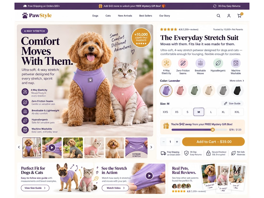
Your product page shouldn’t make customers work this hard to buy.
For pet apparel, one of the biggest conversion killers isn’t always the product.
It’s uncertainty about fit.
So I designed this Shopify product page concept around one goal: remove hesitation before the Add to Cart.
Instead of a basic product page, I built the buying experience around:
🐾 Dog + cat sizing support
📏 Easy-access interactive size guide
🧵 4-way stretch & product benefit callouts
🎥 Stretch demonstration video
⭐ Pet-specific reviews & UGC
🎁 Free gift progress tracker to increase AOV
🎨 Color + size selection above the fold
🛒 Clear, high-visibility Add to Cart
📱 Mobile-first sticky purchase experience
📩 Back-in-stock flow for unavailable sizes
The idea is simple:
Don’t just show the product. Answer the questions stopping someone from buying it.
“Will it fit my dog?”
“Will it stretch?”
“Which size should I choose?”
“Can I trust the quality?”
“What are other pet owners saying?”
Good eCommerce design should answer those questions before the customer has to ask them.
That’s how I approach Shopify design: UI/UX + CRO + buyer psychology, not just making pages look good.
What’s the #1 thing that makes you hesitate before buying clothing online—for yourself or your pet? 👇