The network for creativity
Join 1.25M professional creatives like you
Connect with clients, get discovered, and run your business 100% commission-free
Creatives on Contra have earned over $150M and we are just getting started
Back to feedPost

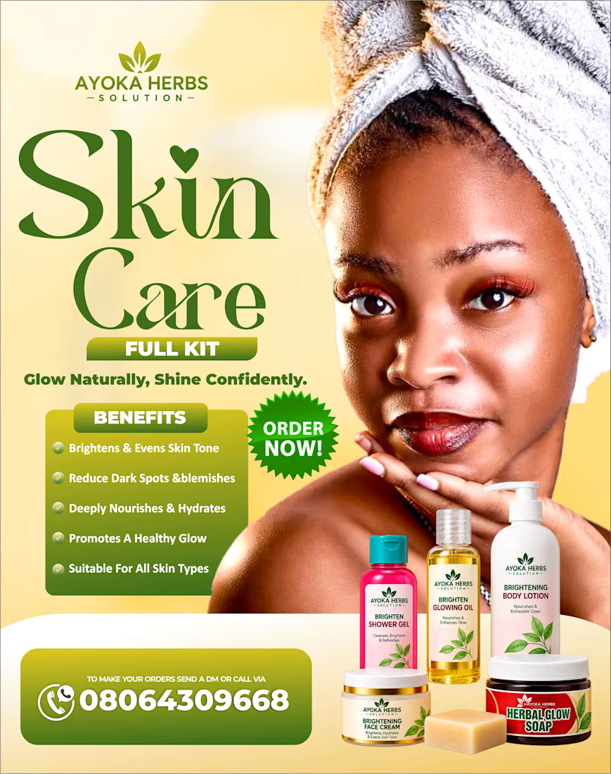
Designed a clean and eye-catching promotional flyer for Ayoka's herbs' skin care product line, focusing on clear information, product presentation, strong typography, and a natural color palette.🔥


The network for creativity
Join 1.25M professional creatives like you
Connect with clients, get discovered, and run your business 100% commission-free
Creatives on Contra have earned over $150M and we are just getting started







Related posts

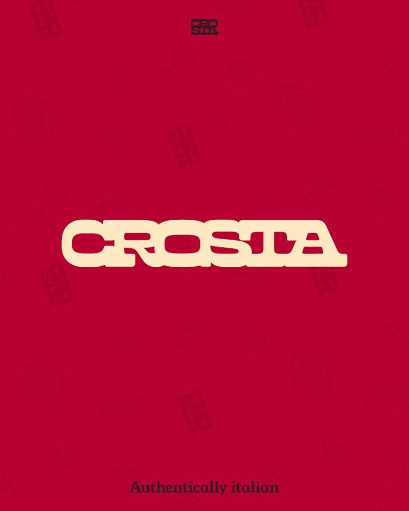
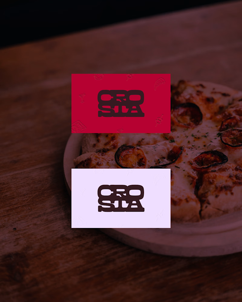
Do you prefer the main logo or the mark? Choose your pick.
The full project is coming soon, or check it out here on Instagram if you don't wanna wait.
11 voted
69%
5 voted
31%
16 votes
Closed

The mark, but for a reason that has nothing to do with which one looks better here: this brand lives on a pizza box, a napkin and a sticker on a takeaway bag, mostly around 20mm and often one ink on brown board. The full logo introduces the place once; the mark is what someone...

Hey contra fam!
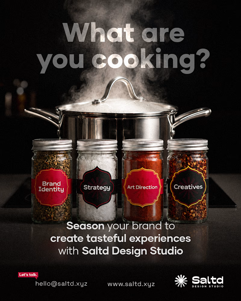
I made an ad flyer to promote my design studio…
Got caught up between these options.
Please help vote for the best one, and let me hear your thoughts on your choice design.
Thanks alot!
4 voted
50%
4 voted
50%

8 votes
Closed


My favourite direction from a recent series templates for Rayon Design.
Exploring luxury residential through typography and an editorial approach to layout.
Really happy with how this one came together!


Beautiful!