The network for creativity
Join 1.25M professional creatives like you
Connect with clients, get discovered, and run your business 100% commission-free
Creatives on Contra have earned over $150M and we are just getting started
Back to feedPost

Modern Website Design for Data Science Professionals
The website functions as a product presentation and landing page for a B2B business intelligence and AI-driven platform tailored for data analytics, workflow automation, and document generation, primarily serving sectors like insurance, marketing, and logistics.
Content Architecture
The hero section opens with a core value proposition centered on data optimization, workflow simplification, and transforming raw metrics into actionable data.
The core body contains a categorized feature grid mapping out individual pillars of the software:
Integrations / Data Visualization: Turning complex data points into charts and graphs.
Data Gathering: Advanced analytics and insight extraction.
Compliance / Data-Driven Decisions: Ensuring accuracy, risk mitigation, and strategic alignment.
User Interface (UI) Design Style
Thematic Aesthetic: The design adheres to a "Corporate Tech / B2B SaaS" design language. It utilizes a clean, data-centric framework common in modern enterprise software marketing.
Color Palette: The UI relies heavily on high-contrast, structured color blocking. It utilizes dark background wrappers contrasted against vibrant accents (typically variations of tech-oriented blues and neon greens) to establish context-specific indicators for different platform data types.
Typography: A structured typographic hierarchy is present. Clean, geometric sans-serif typefaces are deployed across large, bold section headers to command attention, while lighter font weights with ample line spacing are used for the body text to maintain optimal display density.
Data Visualization & Component Assets: The visuals employ a mix of abstract user interface components, conceptual charts, and structural cards to visually represent high-density enterprise data analytics without cluttering the viewport.
User Experience (UX) Design Characteristics
Information Scoping & Layout Consistency: The UX heavily relies on a grid-based framework. Content blocks are uniform, meaning that section layouts repeat structured parameters (such as identical subheaders and bullet points across different industry solutions) to reduce cognitive load during scrolling.
Frictionless Scannability: Important metrics, specialized features, and technical stats are deliberately isolated into high-visibility, snackable cards. This helps the user digest dense product capabilities dynamically as they move down the page.
Contextual Navigation Clues: Layout modules are divided into distinct visual segments (e.g., separating general utility features from highly specialized industry use cases), allowing different buyer personas (like a logistics manager vs. a financial analyst) to quickly find their relevant segment.
Conversion Mapping: Call-to-action touchpoints and instructional text are embedded systematically around product capability descriptions, explicitly linking features directly to workflow benefits or client validation quotes.
SEO WritingSEO Content Managment Content CreationWeb DesignWeb DevelopmentWebflowSearch Engine Optimization

The network for creativity
Join 1.25M professional creatives like you
Connect with clients, get discovered, and run your business 100% commission-free
Creatives on Contra have earned over $150M and we are just getting started
Trending
retrofuturism
Share your favorite designs from the past exploring the distant future. Or your own take on the aesthetic 🚀
halftone
Dots. Texture. Grain. Let's see your designs using the halftone technique.

Midjourney
Creatives are showing off what they're making with Midjourney.
colorgrade
Video editors sound off: How do you enhance the mood of your video in color grading?


Related posts


Another project completed! 🎉
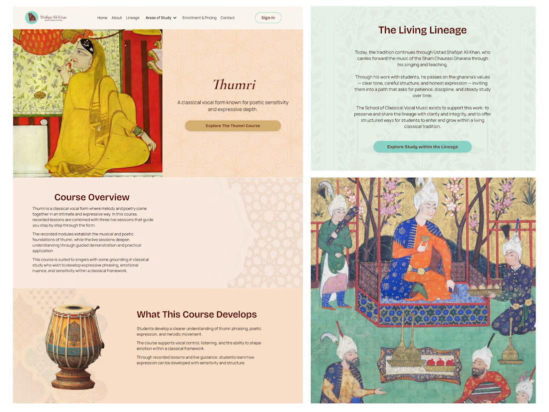
This one was a little different from the Kajabi projects we usually work on.
Instead of building a platform for coaches or business creators, we worked with Shafqat Ali Khan Music – an online school dedicated to teaching the centuries-old tradition of classical South Asian vocal music.
The biggest challenge wasn't adding more features or making the design feel trendy. It was creating a website that respected the heritage behind the music while still providing a clear and intuitive experience for today's online students. Sometimes the best design is the one that quietly supports the content rather than trying to stand out.
We're especially happy that the client loved the final result – and even better, they've already seen an increase in course sales after launching the new website.
Projects like this are always a reminder that every audience is different, and good design starts with understanding the people you're designing for.


I am from India, and I must say your work is so perfect...

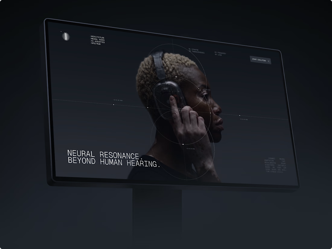
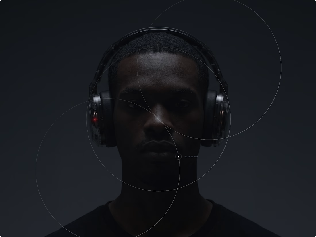
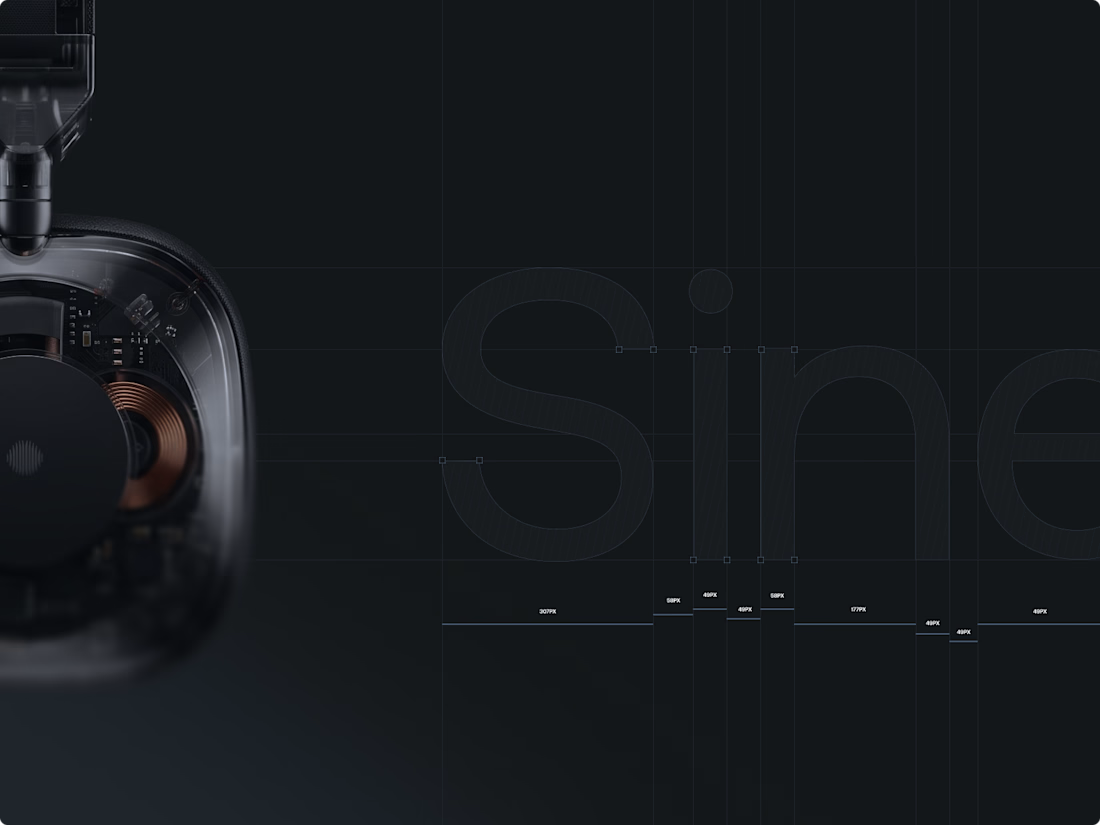
Exploring the intersection of neural AI processing and spatial acoustics with Sine audio technology. Full project : https://www.behance.net/Mitkow



This design makes everything look effortless!

A recent landing page exploration for a conceptual architecture studio designing for extreme environments.
The goal was to create an experience that feels editorial, immersive, and timeless—moving beyond the typical real estate aesthetic to highlight the relationship between architecture and nature.
Designed with a focus on typography, composition, and storytelling.
Always exploring ways to turn ideas into experiences.


Really clean work. The typography and composition do a great job of setting the mood.