The network for creativity
Join 1.25M professional creatives like you
Connect with clients, get discovered, and run your business 100% commission-free
Creatives on Contra have earned over $150M and we are just getting started
Back to feedPost

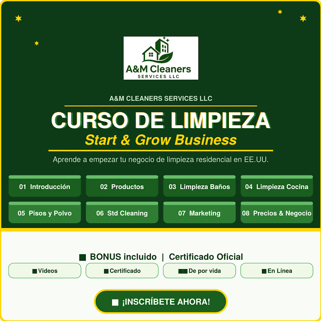
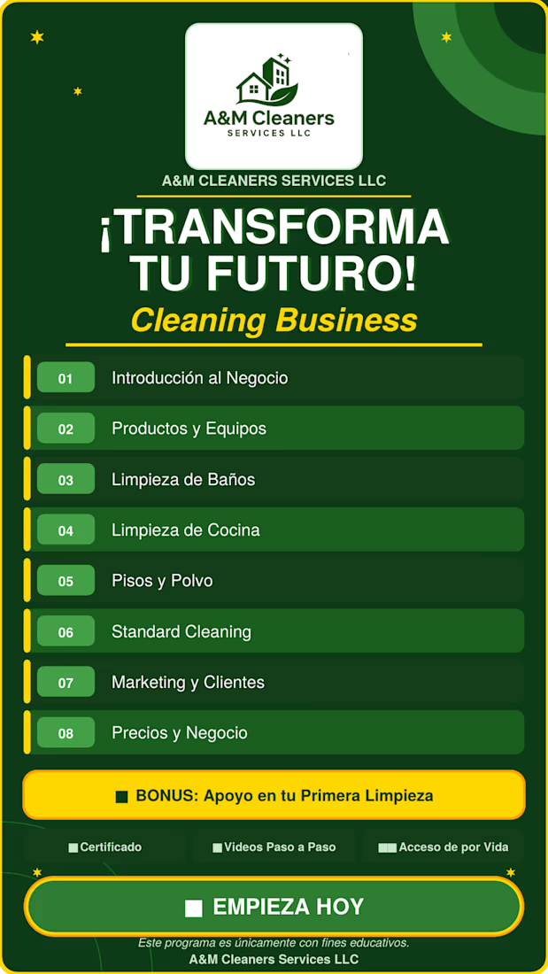
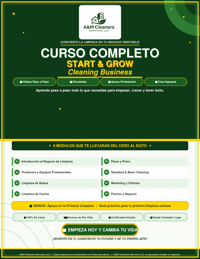
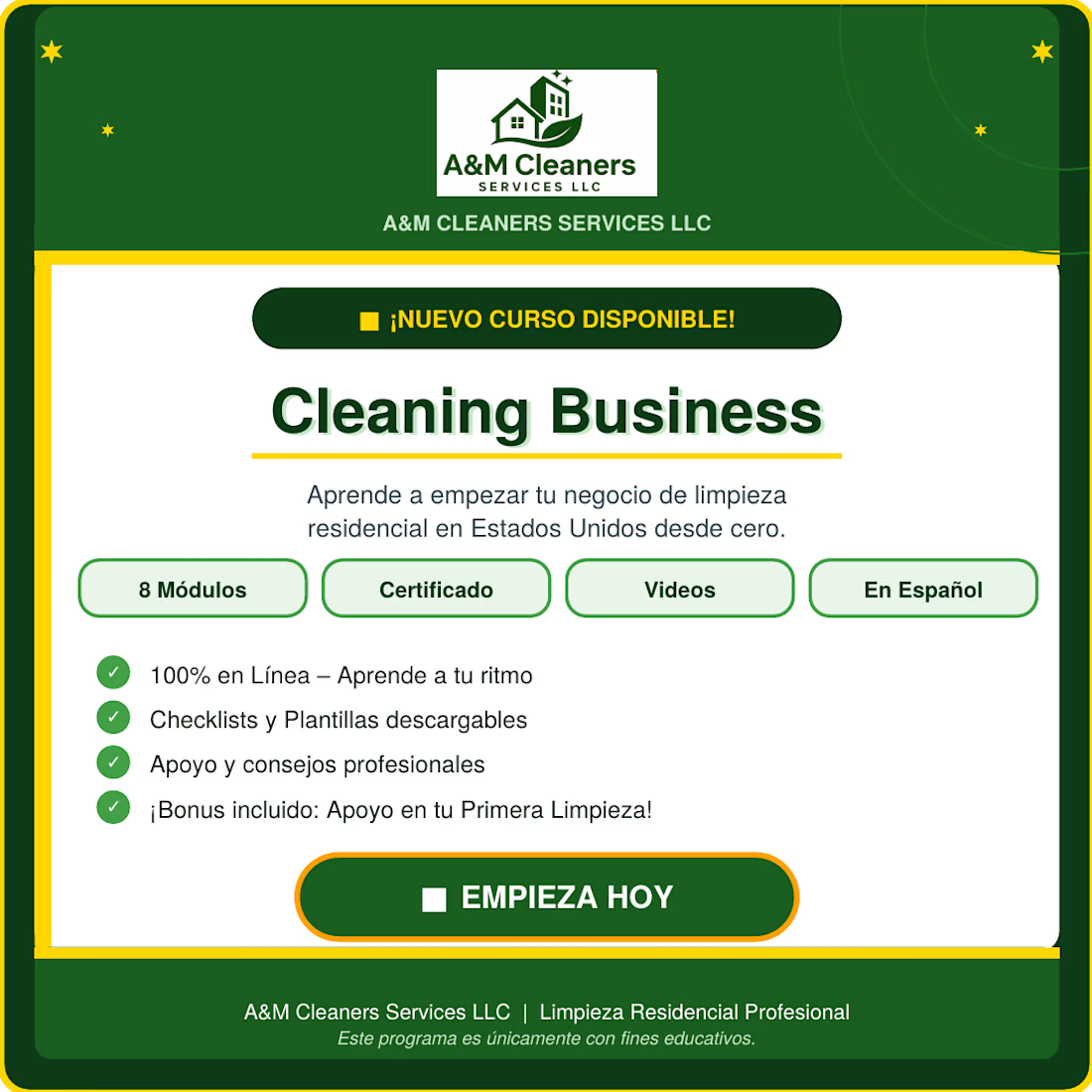
Worked on this promotional design project for A&M Cleaners Services LLC and it was a great experience.
The client shared the blueprint and I enhanced both the content writing and the overall design to create a clean, professional, and engaging marketing campaign for the Cleaning Business Course.
Really enjoyed bringing the idea to life through strong visuals, better content structure, and a modern promotional design.


The network for creativity
Join 1.25M professional creatives like you
Connect with clients, get discovered, and run your business 100% commission-free
Creatives on Contra have earned over $150M and we are just getting started











Related posts


Clean ending. That A feels solid, nice weight to it. Perfect for a showreel closer.

Overview

Halo App is a premium Framer template I designed and built for app founders. They need a launch page that converts and feels as polished as their product.
The challenge
Most app landing pages show a static screenshot and a list of features. Visitors scroll past without feeling the product.
My approach
I made the page itself feel like an app. The hero phone tilts in 3D as you move your mouse, and the balance, chart and transactions animate in. Every feature card shows a small live preview of the feature instead of only describing it.
Design decisions
• Liquid-glass system: frosted surfaces with background blur, light edges and soft colored light that drifts behind them
• Bento layout: cards sized by importance, so the most valuable features get the most space
• Motion with a purpose: each animation explains something (sorting, saving, reminders), and all of it respects reduced-motion settings
• Built to convert: store buttons with a QR code card for desktop visitors, social proof near every call to action, and pricing with an annual-savings badge
• Two themes: a full light and dark system built on design tokens
Built with: Framer, Framer Motion, CMS and responsive breakpoints
🔗 Template: https://framer.link/ZMXd0Ev
Live Preview: https://pretty-layout-205790.framer.app/#
Launching an app? I design and build high-converting landing pages and Framer websites for startups. Message me here on Contra or email asadhussainsyedi@gmail.com.




does the 3d phone tilt just sit still on mobile or swap to something else

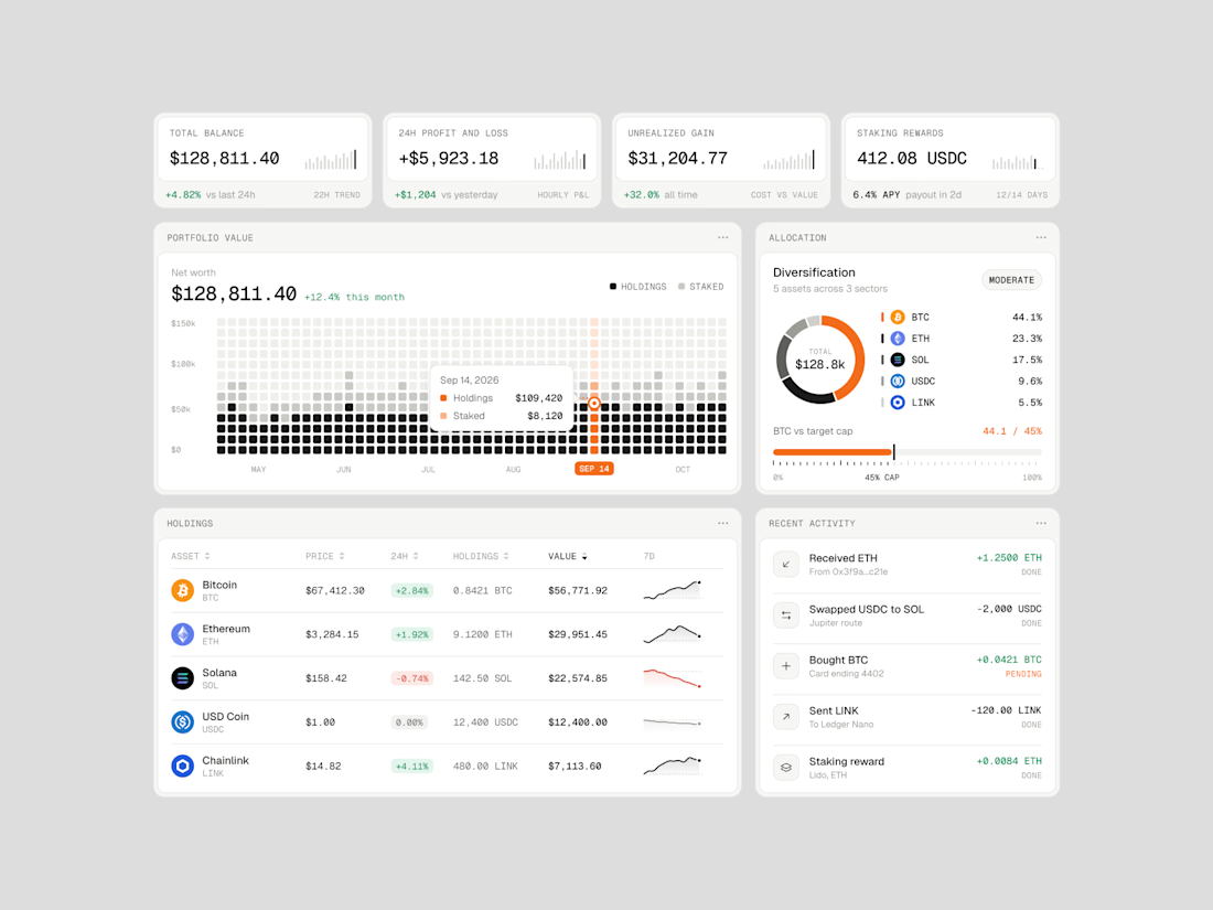
Exploring how complex financial data can feel simple, structured, and easy to navigate.
Vault One is a crypto portfolio dashboard concept that brings together asset performance, portfolio allocation, transaction history, and key financial metrics in one workspace.
I focused on visual hierarchy, information density, and data visualization, using a neutral color palette, subtle UI details, and selective accent colors to keep the interface clean without compromising functionality.
The goal was to make the data easier to understand, not just nicer to look at.
Would love to hear your thoughts on the visual direction and layout!
#ProductDesign #UIDesign #Fintech #DashboardDesign #UXDesign