The network for creativity
Join 1.25M professional creatives like you
Connect with clients, get discovered, and run your business 100% commission-free
Creatives on Contra have earned over $150M and we are just getting started
Back to feedPost
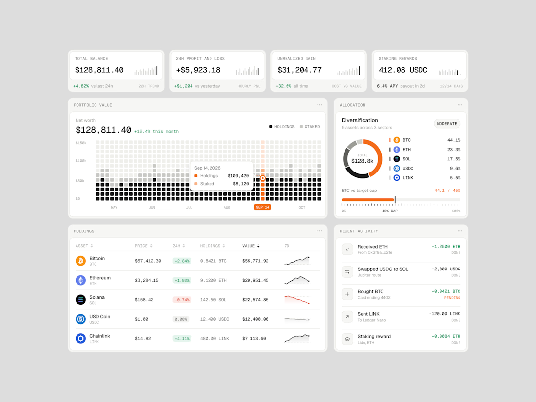
Exploring how complex financial data can feel simple, structured, and easy to navigate.
Vault One is a crypto portfolio dashboard concept that brings together asset performance, portfolio allocation, transaction history, and key financial metrics in one workspace.
I focused on visual hierarchy, information density, and data visualization, using a neutral color palette, subtle UI details, and selective accent colors to keep the interface clean without compromising functionality.
The goal was to make the data easier to understand, not just nicer to look at.
Would love to hear your thoughts on the visual direction and layout!
#ProductDesign #UIDesign #Fintech #DashboardDesign #UXDesign




much appreciation 🙌

Vault One makes dense crypto data feel surprisingly calm. The way allocation, performance and transaction history sit together without competing for attention is really well balanced. How did you decide which metric gets top priority on the main view?
The network for creativity
Join 1.25M professional creatives like you
Connect with clients, get discovered, and run your business 100% commission-free
Creatives on Contra have earned over $150M and we are just getting started








Related posts

Interactive AI Analytics Dashboard | SaaS Product Design
A modern, animated AI-powered eCommerce analytics dashboard designed to help businesses track sales performance, monitor revenue, understand customer behavior, and make data-driven decisions.
The design combines a clean SaaS interface, intuitive data visualization, interactive dashboard elements, and smooth animations to create a more engaging user experience. Every section is designed to make complex analytics easier to understand while maintaining a professional, scalable, and user-friendly layout.

Super clean work!


A little behind the scenes of a site launch video I'm working on 👀


𝗧𝗿𝗮𝗱𝗶𝘁𝗶𝗼𝗻𝗮𝗹 𝗙𝗶𝗴𝗺𝗮 𝗱𝗲𝘀𝗶𝗴𝗻 𝗶𝘀 𝗱𝗲𝗮𝗱 ! ! !
As a designer, I love how AI is changing the way we work.
We’re moving from simply sending clients static designs on Figma to building clickable prototypes that bring their vision to life.
Now, a founder can actually experience how their website will look and feel before development is complete.
They can click through pages, explore interactions, and see animations in action.
And for developers? The handover becomes much smoother because they can see how everything is supposed to work, not just how it should look.
Less guesswork. Better collaboration. A clearer vision.
Honestly, it’s a win-win for everyone.
I think every designer and developer should embrace AI in 2026. Not to replace our skills, but to expand what we can create with them. 🚀
So are you still team traditional Figma design ? Or you now use Ai to advance your design work ?

Awesome work!